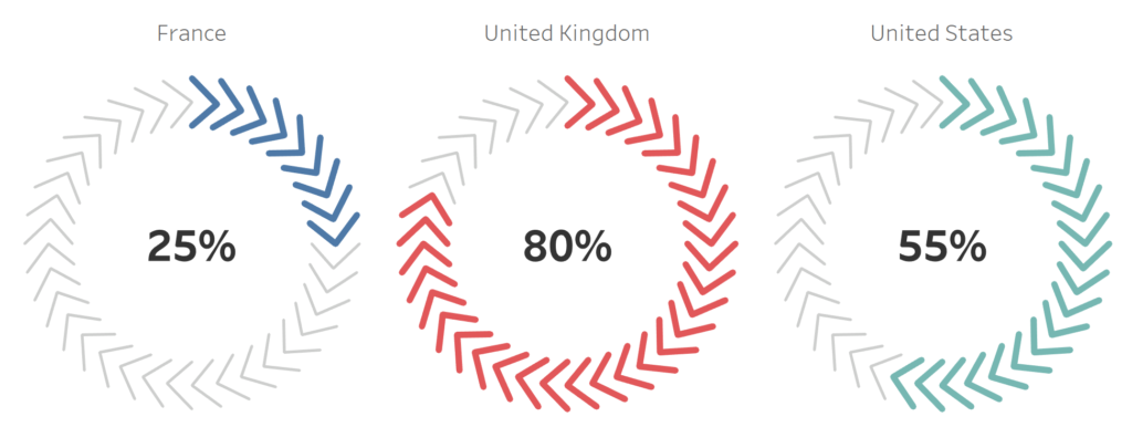
I saw the following data visualisation and thought that I had to create it, but once I created this I had no idea what I would call it. Baseball Stitches, Chevron Circle, Arrow Pie Chart, Arrow Doughnut and a host of others suggested by the community. As such, I settled on the Arrow Doughnut Chart, this I am sure will change of course.
Note: This is an alternative type of data visualisation, and sometimes pushed for by clients. Please always look at best practices for data visualisations before deploying this into production.
Data
Load the following data into Tableau Desktop / Public.
Country,Value,Link
United States,0.55,1
United Kingdom,0.8,1
France,0.25,1
Once your data is copied into Tableau, right-click on the data source and click on Edit Data Source… with the Data Source Editor open, paste the following, scaffold.
Link,Path,Position
1,1,1
1,360,1
1,1,1.2
1,360,1.2
1,1,1.4
1,360,1.4
Note: If you are using Tableau 2020.2 or great i.e. have access to new Relationship Model, you will need to double-click on the originally pasted data source to open up before pasting in the Path Data.
Make sure that you are using an inner join and the Link column is used to link the two data sources.
Note: we need two records for each Metric as we are going to be drawing lines and using densification to get more points on our canvas. For more information, check out our article on Data Densification.
Calculated Fields
With our data set loaded into Tableau, we are going to create the following Calculated Fields and Bins:
Create Path (bin)
- Right click on Path, go to Create and select Bins…
- In the Edit Bins dialogue window:
- Set New field name to Path (bin).
- Set Size of bins to 10.
- Click Ok.
Index
INDEX()-1TC_Values
WINDOW_MAX(MAX([Value]))TC_Position
WINDOW_MAX(MAX([Position]))Zero
0X
SIN(RADIANS(([Index]+IIF([TC_Position]=1.2,1,0))/WINDOW_MAX([Index])*360))*[TC_Position]Y
COS(RADIANS(([Index]+IIF([TC_Position]=1.2,1,0))/WINDOW_MAX([Index])*360))*[TC_Position]Color
IF [Index]/WINDOW_MAX([Index]) < [TC_Values] THEN
    WINDOW_MAX(MAX([Country]))
ELSE
    "Grey"
END
Size
IF [Index]/WINDOW_MAX([Index]) < [TC_Values] THEN
    1
ELSE
    0
END
So now that we have created a lot of Calculated fields, we will now put this together into a Worksheet.
Worksheet
We will now build our first worksheet:
- Change the Mark Type to Line.
- Drag Country to Columns.
- Drag Path (bin) onto Columns.
- Right-click on the object, ensure that Show Missing Values is checked.
- Drag this object onto the Detail Mark.
- Drag Position onto the Path Mark.
- Right-click on this object and change this to a Discrete Dimension.
- Drag X onto Columns.
- Right-click on the object, go to Compute Using and select Path (bin).
- Drag Y onto Rows.
- Right-click on the object, go to Compute Using and select Path (bin).
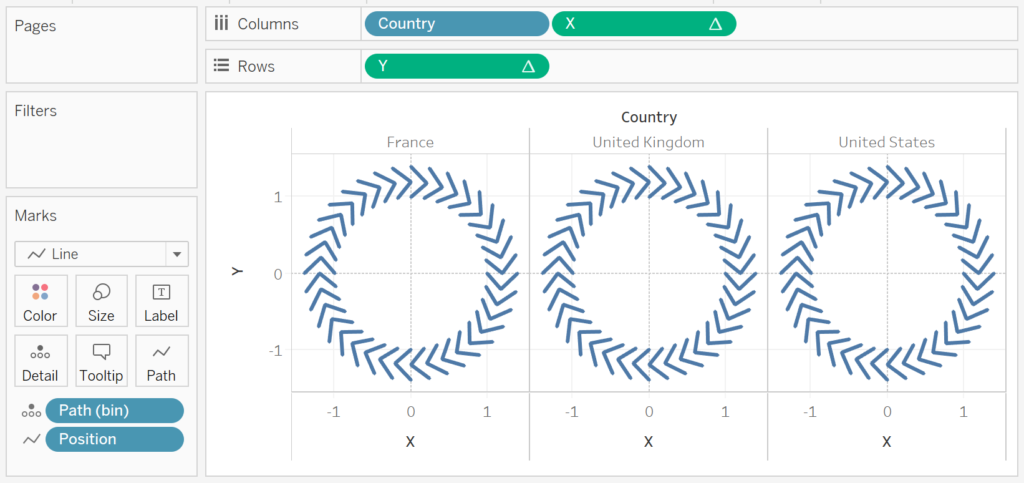
You should now see something like the following:

Now we will adjust the data visualisation:
- Drag Color onto the Color Mark.
- Right-click on the object, go to Compute Using and select Path (bin).
- Drag Size onto the Size Mark.
- Right-click on the object, go to Compute Using and select Path (bin).
- Drag Zero onto Rows.
- Change the Mark Type of SUM(Zero) to Text.
- On the bottom right-hand corner you should see 3 nulls; click on this and select Show data at default position.
- Drag Value onto the Text Mark.
- Change the Aggregation type to Max.
- Change the format to Percentage.
- Right-click on SUM(Zero) in Rows and select Dual Axis.
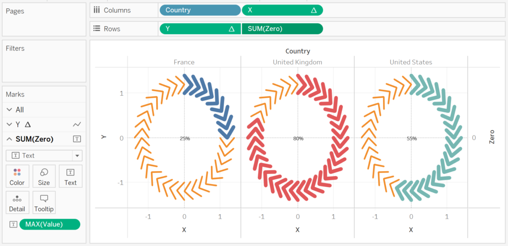
Now you will have the following:

Now we will adjust the cosmetics:
- Hide the Head Axis.
- Hide the Grid Lines.
- Hide the Zero Lines.
- Edit the Color.
- Edit the Size.
- Edit the Text size.
and here we go…

and boom we are done, this was a fun blog and you can see my version of this visualisation on Tableau Public at https://public.tableau.com/profile/toan.hoang#!/vizhome/ArrowDoughnutChart/ArrowDoughnutChart
Summary
I hope you all enjoyed this article as much as I enjoyed writing it and as always do share the love. Do let me know if you experienced any issues recreating this Visualisation, and as always, please leave a comment below or reach out to me on Twitter @Tableau_Magic.
If you like our work, do consider supporting us on Patreon, and for supporting us, we will give you early access to tutorials, exclusive videos, as well as access to current and future courses on Udemy:
- Patreon: https://www.patreon.com/tableaumagic
Also, do be sure to check out our various courses:
- Creating Bespoke Data Visualizations (Udemy)
- Introduction to Tableau (Online Instructor-Led)
- Advanced Calculations (Online Instructor-Led)
- Creating Bespoke Data Visualizations (Online Instructor-Led)


Thx a lot Toan the Magician, got the chart perfectly, waiting for more
Awesome, I cannot wait to see this chart type being used more and more 🙂
Yes Toan, I am trying to implement this charts for clients and showcase the drawings to them
Awesome Toan but was wondering what happens if its more that 100% can we show a spiral ?
Thanks for these amazing charts. i would like to know about can i able to use these for client data or any . if it yes how i can able to .
for example i want to use country field from sample store then how it can be done. your suggestions really appreciated.
You can, but be cautious. You will need to prepare your data and put it in the same form.
Thank you for response , rather than doing data transformation or preparing the data shall we can use for server data like SQL/Salesforce data .if it so then it’s something beyond the box. My request is that mos of the times we get the data which is can’t prepare or nothing we can make changes. at that time dealing with available data by creating some advance calculations if we make advance charts this is something badly we needed.
Hi I’m facing difficulty in order to change the format of text mark to percentage. Do u can help me out?
Change the text to a decimal, then you should be able to format as a percentage. Please post a question to our Tableau Magicians Facebook group.
I do not understand Link,Path,Position. Can you help me!
Path is used for data densification l, position is used to give the distance from the center, link is used to join the data sources.
I have not understood Link, Path, and Position fields in the arrow doughnut chart
Can i replace with another?
Can you give me the data source please?
Hello Toan,
I am getting size always 1 therefore side is not changing on value. kindly suggest on it.
Hello Toan,
I just wanted to ask in case we have count of dimension which is always 1 as value then how can we create arrow donut chart(in case of value field is always 1)
Hi Jitendra, I am not sure about the question.
Hello Toan,
I mean the value field which you have used has decimal number. in case if its value is 1 numeric number only then how could be the calculations like below:
Country,Value,Link
United States,1,1
United Kingdom,1,1
France,1,1
The Link needs to be 1, but the value should be a decimal percentage. In this tutorial, you should be able to use 1 and still complete the tutorial.
chart is not building sir same function i have put in same data source shown on video sir i am searching the problem but i will again try again another shapes chart is formed
Please send me your packaged workbook to toan.hoang@tableau.toanhoang.com