


")


I wanted to have some fun and build up a Polar Chart, however, I had an accident and decided to run with it, and this is the resulting data visualisation. I hope you enjoy this one.
Note: This is an alternative type of data visualisation, and sometimes pushed for by clients. Please always look at best practices for data visualisations before deploying this into production.
Data
We will start by loading the Sample Superstore data into Tableau Desktop / Tableau Public.
Note: If you have Tableau Desktop, you can use the Sample data source, but if you are using Tableau Public, download and load the following data source.
Once your data is loaded into Tableau, right-click on the data source and click on Edit Data Source… with the Data Source Editor open, paste the following:
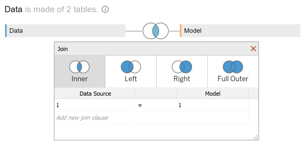
Path,Distance
100,1
0,1
100,0
0,0
Note: If you are using Tableau 2020.2 or great i.e. have access to new Relationship Model, you will need to double-click on the originally pasted data source to open up before pasting in the Path Data.
You should get an error as there is no joining column, however, click on Add new join clause, go to Create Join Calculation, type 1 and click OK. Do this for the right-hand side as well. Ensure that you have Inner join selected and you should see the following:
Calculated Fields
With our data set loaded into Tableau, we are going to create the following Bins, Parameters and Calculated Fields:
@Distance from Center Parameter
- Set Name as @Distance from Center
- Set Data type as Interger
- Set Current value as 5
@Line Weight Parameter
- Set Name as @Line Weight
- Set Data type as Float
- Set Current value as 0.01
- Set Allowable values as Range
- Set Minimum to 0.01
- Set Maximum to 0.1
- Set Step size to 0.01
@Path Factor Parameter
- Set Name as @Path Factor
- Set Data type as Integer
- Set Current value as 20
- Set Allowable values as Range
- Set Minimum to 5
- Set Maximum to 100
@Spacing Parameter
- Set Name as @Spacing
- Set Data type as Integer
- Set Current value as 20
- Set Allowable values as Range
- Set Minimum to 20
- Set Maximum to 100
- Set Step size as 10
Path (bin)
- Right-click on Path, go to Create and select Bins…
- In the Edit Bins dialogue window:
- Set New field name to Path (bin)
- Set Size of bins to @Path Factor
- Click Ok
Distance (bin)
- Right-click on Distance, go to Create and select Bins…
- In the Edit Bins dialogue window:
- Set New field name to Path (bin)
- Set Size of bins to @Line Weight
- Click Ok
Order Month
DATEPART('month',[Order Date])Index (Distance)
INDEX()Index (Path)
(INDEX()-1) * [@Path Factor]Step Size
3.6 / 12 * (100-[@Spacing]) / 100TC_Order Month
WINDOW_MAX(MAX([Order Month]))TC_Sales
WINDOW_SUM(SUM([Sales]))/4TC_Total Sales
WINDOW_SUM(SUM([Sales]))/4TC_Percentage
[TC_Sales] / [TC_Total Sales]TC_Starting Point
(([TC_Order Month]-1)*360/12)X
SIN(RADIANS(([Index (Path)]*[Step Size])+[TC_Starting Point]))*([Index (Distance)]+[@Distance from Center])Y
COS(RADIANS(([Index (Path)]*[Step Size])+[TC_Starting Point]))*([Index (Distance)]+[@Distance from Center])TC_Size
IF ([Index (Distance)]-1) / WINDOW_MAX([Index (Distance)]-1) <= WINDOW_MAX([TC_Percentage]) THEN
    1
ELSE
    0
END
TC_Color
IF ([Index (Distance)]-1) / WINDOW_MAX([Index (Distance)]-1) <= [TC_Percentage] THEN
    WINDOW_MAX(MAX([Order Month]))
ELSE
    NULL
END
TC_Filter
IF ([Index (Distance)]-1) / WINDOW_MAX([Index (Distance)]-1) <= WINDOW_MAX([TC_Percentage]) THEN
    TRUE
ELSE
    FALSE
END
With this done, let us start creating our data visualisation.
Worksheet
We will now build our worksheet:
- Change the Mark Type to Line
- Drag Order Date onto the Filters Shelf and Filter on 2018
- Drag Order Month onto the Detail Mark
- Drag Distance (bin) onto the Columns Shelf
- Right-click on this pill and ensure that Show Missing Values is selected
- Drag this pill onto the Detail Mark
- Drag Path (bin) onto the Columns Shelf
- Right-click on this pill and ensure that Show Missing Values is selected
- Drag this pill onto the Detail Mark
- Drag X onto the Columns Shelf
- Right-click on this pill, go to Compute Using and select Path (bin)
- Drag Y onto the Rows Shelf
- Right-click on this pill, go to Compute Using and select Path (bin)
You should now see the following:

We are not going to end the Table Calculations for the X and Y objects, now be careful as this is quite delicate:
- Right-click on the X-pill and select Edit Table Calculation…
- In Nested Calculations select TC_Order Month
- In Compute Using select Specific Dimensions
- Ensure that Path (bin) and Distance (bin) are both selected and that Path (bin) is on top
- In Nested Calculations select Index (Path)
- In Compute Using select Specific Dimensions
- Ensure that Path (bin) is selected
- In Nested Calculations select Index (Distance)
- In Compute Using select Specific Dimensions
- Ensure that Distance (bin) is selected
- In Nested Calculations select TC_Order Month
- Right-click on the Y-pill and select Edit Table Calculation…
- In Nested Calculations select TC_Order Month
- In Compute Using select Specific Dimensions
- Ensure that Path (bin) and Distance (bin) are both selected and that Path (bin) is on top
- In Nested Calculations select Index (Path)
- In Compute Using select Specific Dimensions
- Ensure that Path (bin) is selected
- In Nested Calculations select Index (Distance)
- In Compute Using select Specific Dimensions
- Ensure that Distance (bin) is selected
- In Nested Calculations select TC_Order Month
We should now see the following (this is pretty cool already, but we are only just getting there):

Now we are going to add a little colour and sizing:
- Drag TC_Color onto the Colour Mark
- Right-click on the TC_Color pill and select Edit Table Calculation…
- In Nested Calculations select TC_Color
- In Compute Using select Specific Dimensions
- Ensure that Path (bin) and Distance (bin) are both selected and that Path (bin) is on top
- In Nested Calculations select Index (Distance)
- In Compute Using select Specific Dimensions
- Ensure that Distance (bin) is both selected
- In Nested Calculations select TC_Sales
- In Compute Using select Specific Dimensions
- Ensure that Path (bin) and Distance (bin) are both selected and that Path (bin) is on top
- In Nested Calculations select TC_Total Sales
- In Compute Using select Specific Dimensions
- Ensure that Path (bin), Distance (bin) and Orders Month are selected; ensure that Path (bin) is on top, Order Month is on Bottom
- In Nested Calculations select TC_Color
- Drag TC_Size onto the Size Mark
- Right-click on the TC_Color pill and select Edit Table Calculation…
- In Nested Calculations select TC_Color
- In Compute Using select Specific Dimensions
- Ensure that Path (bin) and Distance (bin) are both selected and that Path (bin) is on top
- In Nested Calculations select Index (Distance)
- In Compute Using select Specific Dimensions
- Ensure that Distance (bin) is both selected
- In Nested Calculations select TC_Sales
- In Compute Using select Specific Dimensions
- Ensure that Path (bin) and Distance (bin) are both selected and that Path (bin) is on top
- In Nested Calculations select TC_Total Sales
- In Compute Using select Specific Dimensions
- Ensure that Path (bin), Distance (bin) and Orders Month are selected; ensure that Path (bin) is on top, Order Month is on Bottom
- In Nested Calculations select TC_Color
You want something like the following:

Yes, it looks a little funny now, but don’t worry, the last step is coming:
- Draft TC_Filter onto the Detail Mark
- Right-click on the TC_Filter pill and select Edit Table Calculation…
- In Nested Calculations select TC_Filter
- In Compute Using select Specific Dimensions
- Ensure that Path (bin), Distance (bin) and Orders Month are selected; ensure that Path (bin) is on top, Order Month is on Bottom
- In Nested Calculations select Index (Distance)
- In Compute Using select Specific Dimensions
- Ensure that Distance (bin) is both selected
- In Nested Calculations select TC_Sales
- In Compute Using select Specific Dimensions
- Ensure that Path (bin) and Distance (bin) are both selected and that Path (bin) is on top
- In Nested Calculations select TC_Total Sales
- In Compute Using select Specific Dimensions
- Ensure that Path (bin), Distance (bin) and Orders Month are selected; ensure that Path (bin) is on top, Order Month is on Bottom
- In Nested Calculations select TC_Filter
- Now that we have adjusted the TC_Filter pill, drag this onto the Filters Shelf and select True
We should now have the following:

The last step is to adjust the cosmetics:
- Hide the Axis Headers
- Hide the Grid Lines
- Hide the Zero Lines
- Adjust the Sizes
- Adjust the Colours
- Adjust the Tool Tips
We should now have our final data visualisation:

Extra Credit: Try changing the Mark Type to Circles or Lines, just for fun
and boom, we are done! I hope you enjoyed creating this data visualization and learned some cool techniques as well. As always, you can find this data visualisation on Tableau Public at https://public.tableau.com/profile/toan.hoang#!/vizhome/RadialColumnChartVariation/RadialColumnChartVariation
Summary
I hope you all enjoyed this article as much as I enjoyed writing it and as always do share the love. Do let me know if you experienced any issues recreating this Visualization, and as always, please leave a comment below or reach out to me on Twitter @Tableau_Magic. Do also remember to tag me in your work if you use this tutorial.
If you like our work, do consider supporting us on Patreon, and for supporting us, we will give you early access to tutorials, exclusive videos, as well as access to current and future courses on Udemy: https://www.patreon.com/tableaumagic
 Table Calculation")


Hi Magician yet another wonderful chart thanks a lot for the variation. I am facing issues while recreating, have shared the workbook to you through mail, could you pls reply to that.
How could I change this to show the split by Sub Category instead of Order month?
I also need to show only 10 parts, instead of 12. (I was able to fix that using the step size), but the colors were overlapping, so I filtered on the month and removed last two months..