


")


This is one that has been in my backlog for ages, and while I am sure there will be updates to this (I want to make this a little more dynamic), I wanted to write this tutorial for you to enjoy. In this tutorial, we will create a Circular Network Chart in Tableau.
Note: This is an alternative type of data visualisation, and sometimes pushed for by clients. Please always look at best practices for data visualisations before deploying this into production.
Data
We will start by loading our data into Tableau Desktop / Tableau Public.
From,To,Starting,Ending,Value
A,B,1,2,96
A,C,1,3,47
A,D,1,4,41
A,H,1,8,61
A,I,1,9,13
A,J,1,10,51
B,D,2,4,93
B,E,2,5,82
B,F,2,6,19
B,H,2,8,71
B,J,2,10,32
C,D,3,4,87
C,F,3,6,5
C,H,3,8,19
C,J,3,10,51
D,E,4,5,17
D,H,4,8,62
D,I,4,9,30
D,J,4,10,12
E,F,5,6,91
E,G,5,7,22
E,J,5,10,69
F,I,6,9,18
F,J,6,10,91
G,H,7,8,61
G,J,7,10,90
H,I,8,9,14
H,J,8,10,60
Once your data is loaded into Tableau, right-click on the data source and click on Edit Data Source… with the Data Source Editor open, paste our model data:
Path
0
1
Note: If you are using Tableau 2020.2 or great i.e. have access to new Relationship Model, you will need to double-click on the originally pasted data source to open up before pasting in the Path Data.
You should get an error as there is no joining column, however, click on Add new join clause, go to Create Join Calculation, type 1 and click OK. Do this for the right-hand side as well. Ensure that you have Inner join selected and you should see the following:

Note: we will be performing data densification and therefore we will perform a cross-join between the data source and the model.
Calculated Fields
With our data set loaded into Tableau, we are going to create the following Calculated Fields:
Path (bin)
- Right-click on Path, go to Create and select Bins…
- In the Edit Bins dialogue window:
- Set New field name to Path (bin)
- Set Size of bins to 1
- Click Ok
Route
[From]+"-"+[To]Index
INDEX()TC_Starting
WINDOW_MAX(MAX([Starting]))TC_Ending
WINDOW_MAX(MAX([Ending]))TC_Circumference
360 / WINDOW_MAX(MAX([Ending]))X
IF [Index] = 1 THEN
    SIN(RADIANS([TC_Starting]*[TC_Circumference]))
ELSE
    SIN(RADIANS([TC_Ending]*[TC_Circumference]))
END
Y
IF [Index] = 1 THEN
    COS(RADIANS([TC_Starting]*[TC_Circumference]))
ELSE
    COS(RADIANS([TC_Ending]*[TC_Circumference]))
END
With this done, let us start creating our data visualisation.
Worksheet
We will now build our worksheet:
- Change the Mark Type to Line
- Drag Path (bin) onto the Column Shelf
- Right-click on this pill and ensure that Show Missing Values is selected
- Drag this pill onto the Path Mark
- Drag Route onto the Detail Mark
- Drag X onto the Columns Shelf
- Right-click on this pill, go to Compute Using and select Path (bin)
- Drag Y onto the Rows Shelf
- Right-click on this pill, go to Compute Using and select Path (bin)
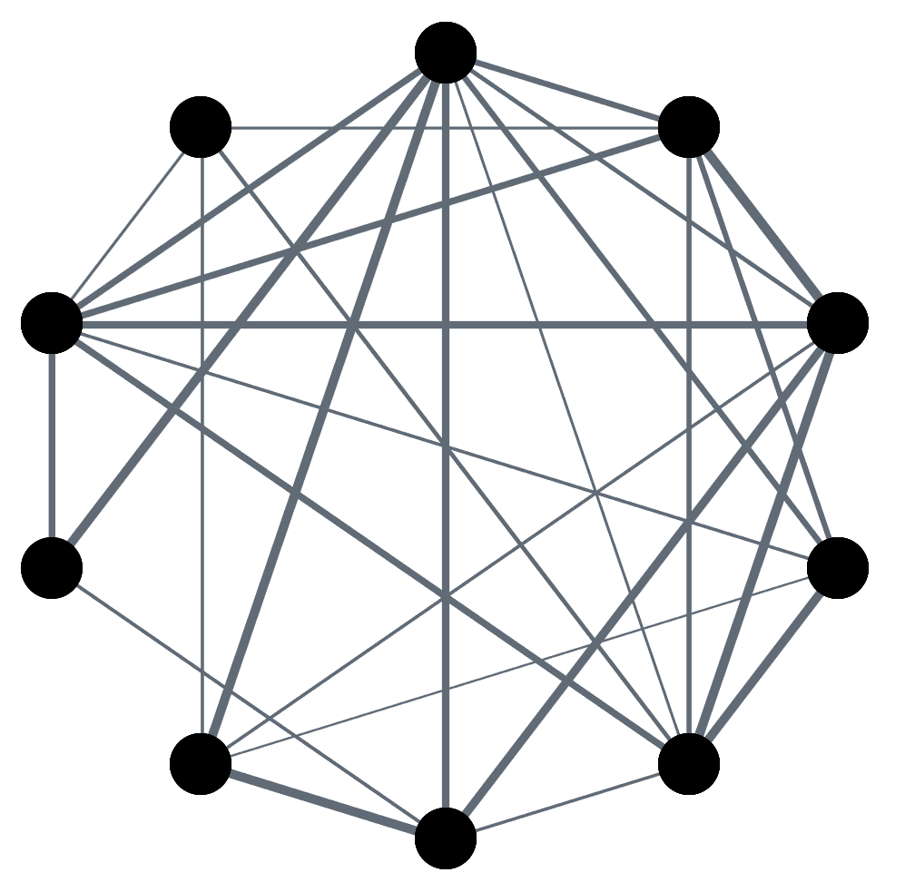
If all goes well, you should see the following:

Ok, this is pretty cool, and I assure you that I will be doing something with this in due course, but let us move on.
- Right-click on the X-pill and select Edit Table Calculations…
- In Nested Calculations select TC_Circumference
- In Compute Using select Specific Dimensions. Ensure that you select Path (bin) and Route, and that Path (bin) is on top.
- Right-click on the Y-pill and select Edit Table Calculations…
- In Nested Calculations select TC_Circumference
- In Compute Using select Specific Dimensions. Ensure that you select Path (bin) and Route, and that Path (bin) is on top
- Drag Value onto the Size Mark
Pretty simple, and you should now see the following:

We are getting closer, but now we need to add our large circles:
- Duplicate the X pill on the Columns Shelf; keep your finger on Ctrl (or Command) and click drag and drop the X pill to duplicate this pill with all the settings.
- Click on the X (2) Mark Panel
- Change the Mark Type to Circle
- Remove Value from the Size Mark
- Adjust the Size
You should now see the following:

We will now add the final touches to our data visualisation:
- Right-click on the X and select Dual Axis; make sure you right-click on the Axis Header and select Synchronize Axis
- Hide the Axis Headers
- Hide the Row Dividers and Columns Dividers
- Hide the Grid Lines and Zero Lines
- Adjust the Colors
You should now want to see the following:
and boom, we are done! I hope you enjoyed creating this data visualization and learned some cool techniques as well. As always, you can find this data visualisation on Tableau Public at https://public.tableau.com/profile/toan.hoang#!/vizhome/CircularNetworkGraph/CircularNetworkGraph
Summary
I hope you all enjoyed this article as much as I enjoyed writing it and as always do share the love. Do let me know if you experienced any issues recreating this Visualization, and as always, please leave a comment below or reach out to me on Twitter @Tableau_Magic. Do also remember to tag me in your work if you use this tutorial.
If you like our work, do consider supporting us on Patreon, and for supporting us, we will give you early access to tutorials, exclusive videos, as well as access to current and future courses on Udemy: https://www.patreon.com/tableaumagic
 Table Calculation")


Thank You Magician
Trying to understand the path part of this tutorial (I have Tableau 2020.3, so the data source editor is different)-could you be more specific in the step-by-step?
Hi Ryan, you have the New Relationship model, and therefore will need to double logic table to get to the physical joins. I am planning to update all my tutorials so. Kind Regards, Toan