


")


I love drawing in Tableau and a few months ago, I saw an image of a Sunflower and I wondered if there is a mathematical way to create this, I found a few examples using the Fermat Spiral. I then saw a pudding chart and thought cool, I am going to try and create this dynamically in Tableau.
Note: I am not a mathematician.
Note: This is an alternative type of data visualisation, and sometimes pushed for by clients. Please always look at best practices for data visualisations before deploying this into production.
Data
We will start by loading the Sample Superstore data into Tableau.
Note: If you have Tableau Desktop, you can use the Sample data source, but if you are using Tableau Public, download and load the following data source.
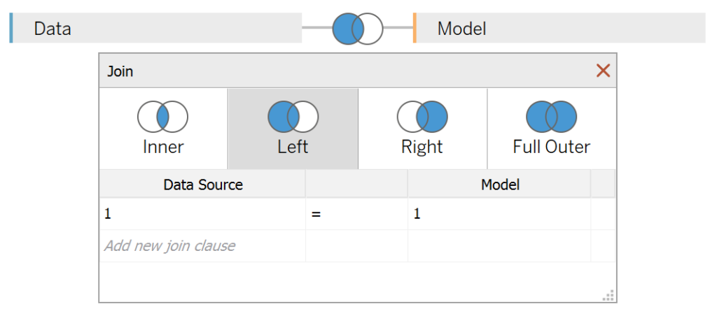
Once your data is loaded into Tableau, right-click on the data source and click on Edit Data Source… with the Data Source Editor open, paste the following:
Path
1
101
Note: If you are using Tableau 2020.2 or great i.e. have access to new Relationship Model, you will need to double-click on the originally pasted data source to open up before pasting in the Path Data.
You should get an error as there is no joining column, however, click on Add new join clause, go to Create Join Calculation, type 1 and click OK. Do this for the right-hand side as well. Ensure that you have Inner join selected and you should see the following:
Note: we need additional records as we are going to be drawing lines and using densification to get more points on our canvas. For more information, check out our article on Data Densification.
Calculated Fields
With our data set loaded into Tableau, we are going to create the following Bin, Calculated Fields, and Parameter:
A parameter named Factor:
- Set Data type as Float.
- Set Current value as 1.
- Set Allowable values as Range.
- Set Minimum as 0.01.
- Set Maximum as 1.
Path (bin)
- Right-click on Path, go to Create and select Bins…
- In the Edit Bins dialogue window:
- Set New field name to Path (bin).
- Set Size of bins to Factor.
- Click Ok.
Index
INDEX()-1TC_Segment Sales
WINDOW_SUM(SUM([Sales]))/2TC_Total Sales
WINDOW_SUM(SUM([Sales]))/2TC_Percentage of Sales
[TC_Segment Sales]/[TC_Total Sales]X
COS([Index])*SQRT([Index])Y
SIN([Index])*SQRT([Index])TC_Color
IF [TC_Percentage of Sales]*100 >= [TC_Rank] THEN
   WINDOW_MAX(MAX([Segment]))
ELSE
    "Grey"
END
TC_Rank
RANK_UNIQUE([Y], "asc")With this done, let us start creating our data visualisation.
Worksheet
We will now build our first worksheet:
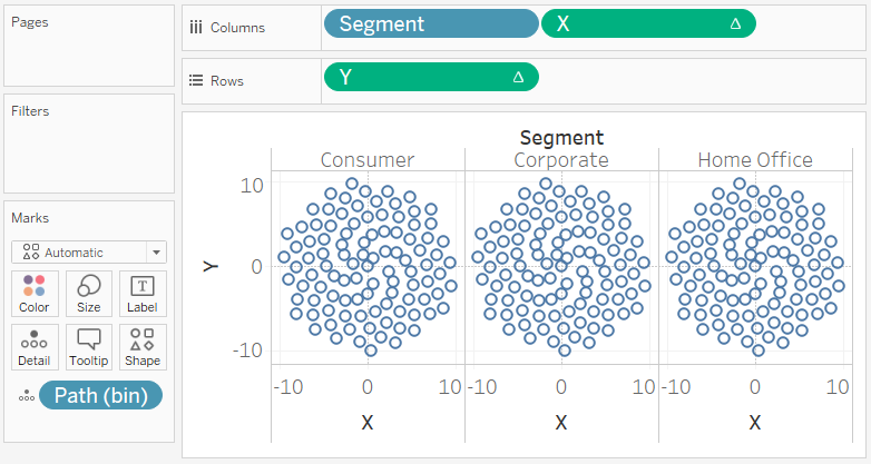
- Drag Segment onto Columns.
- Drag Path (bin) onto Rows.
- Right-click on this object and ensure that Show Missing Values is checked.
- Drag this object onto the Detail Mark.
- Drag X onto Columns.
- Right-click on this object, go to Compute Using and select Path (bin).
- Drag Y onto Rows.
- Right-click on this object, go to Compute Using and select Path (bin).
If all goes well, you should now see the following:
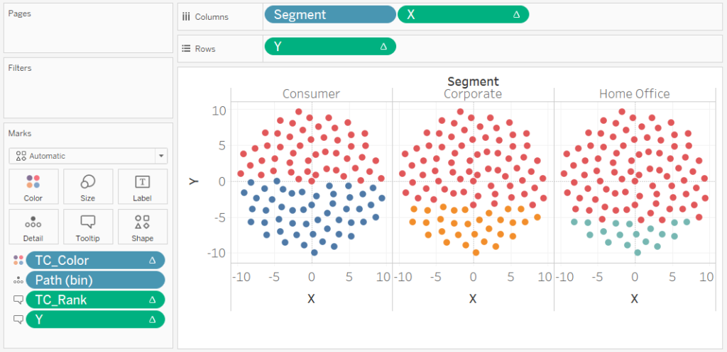
We now want to make some adjustments to add a Color.
- Change the Mark Type to Shape, and select a Filled Circle.
- Drag TC_Color onto the Color Mark. Right-click on this object and go to Edit Table Calculations.
- In Nested Calculations select Index.
- In Compute Using select Specific Dimensions.
- Only check Path (bin).
- In Nested Calculations select TC_Segment Sales.
- In Compute Using select Specific Dimensions.
- Check Segment and Path (bin). Ensure that Segment is on Top.
- Set Restarting every to Segment.
- In Nested Calculations select TC_Total Sales.
- In Compute Using select Specific Dimensions.
- Check Segment and Path (bin). Ensure that Segment is on Top.
- Ensure that Restarting every is set to None.
- In Nested Calculations select TC_Rank.
- In Compute Using select Specific Dimensions.
- Check Segment and Path (bin). Ensure that Segment is on Top.
- Set Restarting every to Segment.
- In Nested Calculations select TC_Color.
- In Compute Using select Specific Dimensions.
- Check Segment and Path (bin). Ensure that Segment is on Top.
- Set Restarting every to Segment.
- In Nested Calculations select Index.
If all goes according to plan, we should now see the following.
and we are pretty much there, we just need to work on our cosmetics:
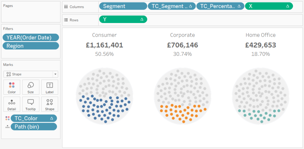
- Adjust the Colors.
- Hide the Zero Line.
- Hide the Grid Line.
- Remove Tool Tips.
- Add the TC_Segment Sales and TC_Percentage of Sales to Columns and make these dimensions.
- Add a circle background image.
You can keep working on this, but you want to have the following:
you can experiment with the Factor parameter, yes, don’t forget about that Try reducing the value, and you can end up with the following.

Or how about putting Index onto the Colour Mark, and setting the Compute Using to Path (bin)?

cool huh, but here is my favourite:
- Move TC_Color back onto the Colour Mark.
- Change the Mark Type to Line.
- Drag Index onto the Path Mark.
- Right-click on this object, go to Compute Using and select Path (bin).
- Change the Factor parameter to 0.75.
- Change the Color to Red.
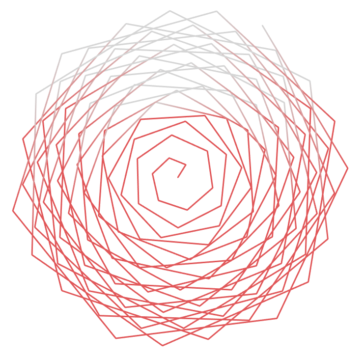
and boom, we are done! I hope you enjoyed the random accidental art we saw throughout this tutorial, and as always, you can find this data visualisation on Tableau Public at https://public.tableau.com/profile/toan.hoang#!/vizhome/FermatSpiralChart/FermatSpiral
Summary
I hope you all enjoyed this article as much as I enjoyed writing it and as always do share the love. Do let me know if you experienced any issues recreating this Visualisation, and as always, please leave a comment below or reach out to me on Twitter @Tableau_Magic. Do also remember to tag me in your work if you use this tutorial.
If you like our work, do consider supporting us on Patreon, and for supporting us, we will give you early access to tutorials, exclusive videos, as well as access to current and future courses on Udemy:
- Patreon: https://www.patreon.com/tableaumagic
Also, do be sure to check out our various courses:
- Creating Bespoke Data Visualizations (Udemy)
- Introduction to Tableau (Online Instructor-Led)
- Advanced Calculations (Online Instructor-Led)
- Creating Bespoke Data Visualizations (Online Instructor-Led)


 in Tableau")


