
Sometimes, I will get an idea stuck in my head, an image, a type of data visualisation, and I will obsess about it until I have figured out how to create this in Tableau. The following is an example of this and based on feedback, I have written a tutorial about how to Create Bar Charts combined with a Trend.
Note: This is an alternative type of data visualisation, and sometimes pushed for by clients. Please always look at best practices for data visualisations before deploying this into production.
WARNING: This is a purely experimental chart type, and this tutorial is for learning purposes only. I still do not know if I would be able to find a use-case for this.
Data
We will start by loading the Sample Superstore data into Tableau.
Note: If you have Tableau Desktop, you can use the Sample data source, but if you are using Tableau Public, download and load the following data source.
Calculated Fields
With our data set loaded into Tableau, we are going to create the following Calculated Fields:
Index
FLOAT(INDEX())LOD_Sales by Year
{ FIXED YEAR([Order Date]),[Segment]: SUM([Sales]) } / { FIXED YEAR([Order Date]): SUM([Sales]) }Columns
(MAX(DATEPART('week', [Order Date]))-1.0)*MAX([LOD_Sales by Year])TC_Line Height
SUM([Sales])/WINDOW_MAX(SUM([Sales]))TC_Segment Sales
WINDOW_SUM(SUM([Sales]))With this done, let us start creating our data visualisation.
Worksheet
We will now build our first worksheet:
- Change the Mark Type to Bar.
- Drag Order Date on to the Filter Shelf and select the 2 more recent years. In this example, select choose 2017 and 2018.
- Drag Order Date onto Rows.
- Make sure this is set to Years.
- Drag Segment onto Rows.
- Drag Segment onto the Color Mark.
- Drag Order Date onto the Detail Mark and set to be Week Number.
- Drag Columns onto the Columns Shelf.
- Drag Index onto Rows.
- Right-click on this object and go to Edit Table Calculations…
- In Compute Using, select Specific Dimensions and uncheck everything.
If all goes well, you should now see the following.

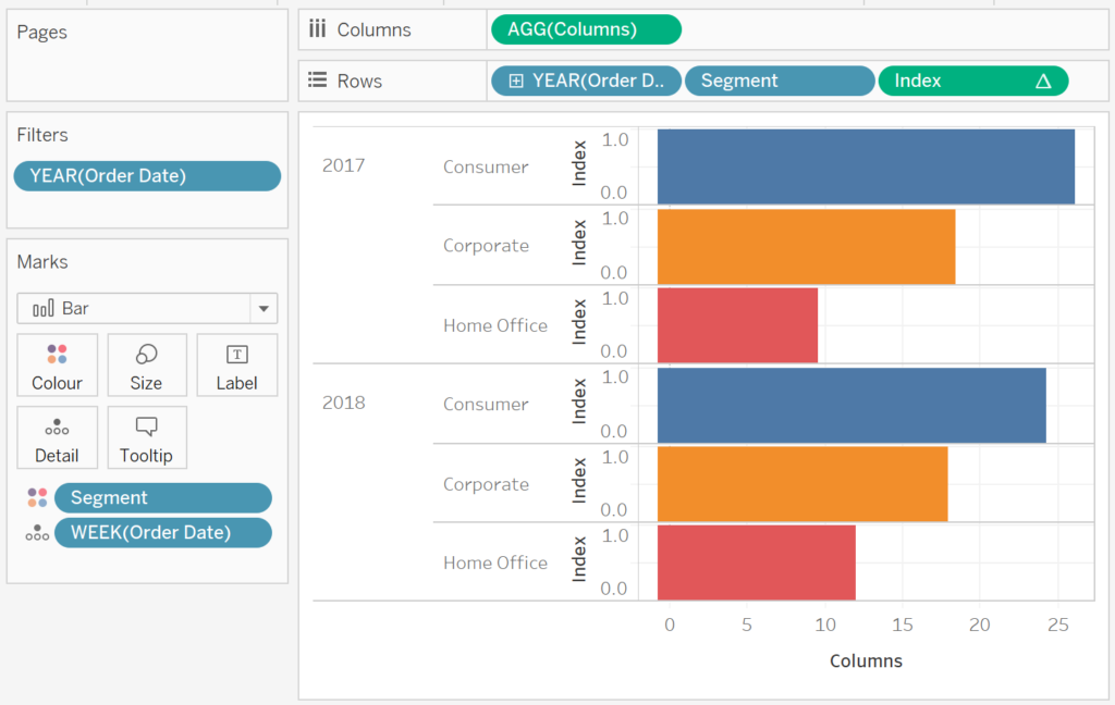
Yes, this is a lot of work to simulate a simple bar chart, but the real fun is about to begin.
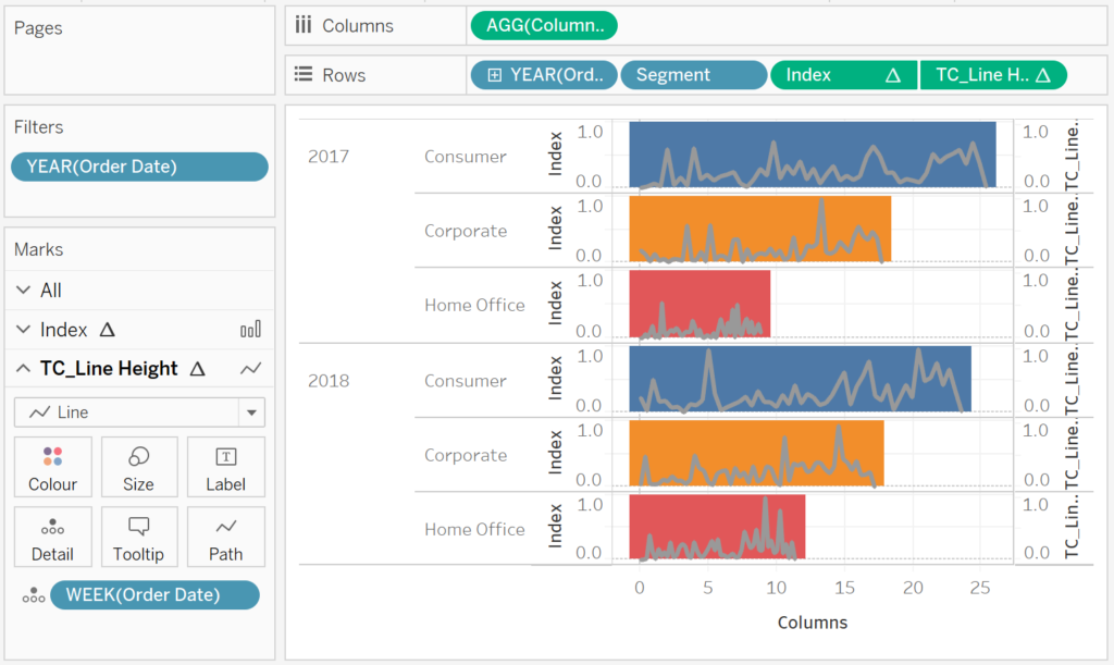
We will now add the trend line to our worksheet:
- Drag the TC_Line Height onto Rows.
- Right-click on this object, go to Compute Using and select Order Date.
- Right-click on the TC_Line Height and select Dual Axis.
- Right-click on the Axis header and select Synchronise Axis.
- Remove Measure Names from the Color in both Mark Panels.
- In the TC_Line Height Mark Panel
- Change the Mark Type to Line.
- Remove the Color from the TC_Line Height Marks Panel.
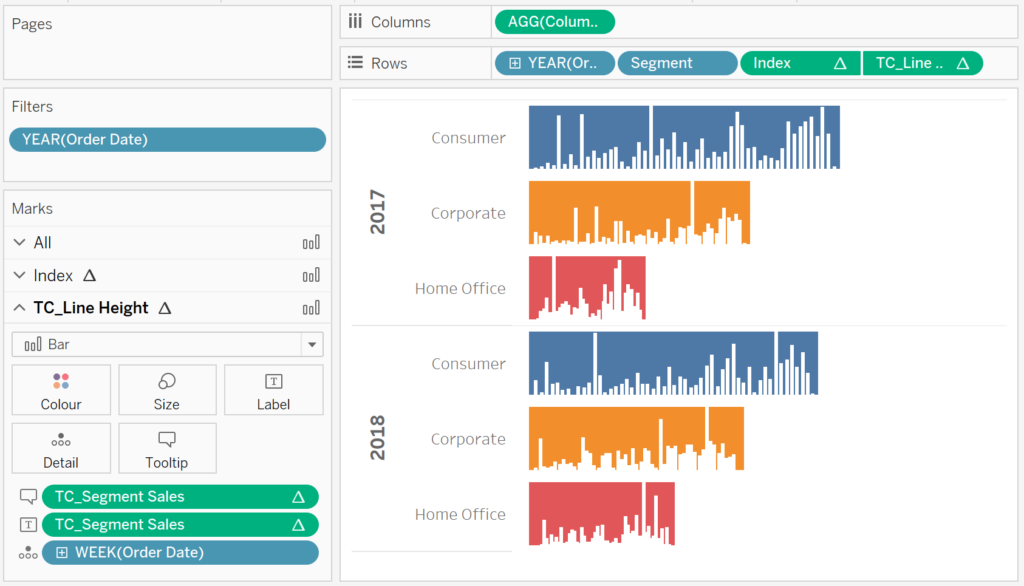
If all goes well, we should now have the following:

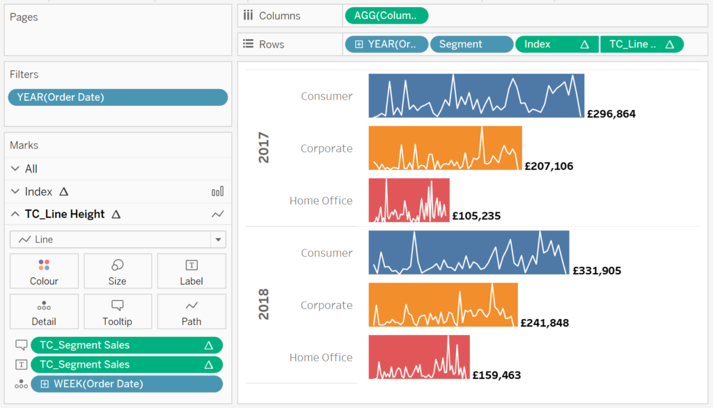
Now we will adjust the cosmetics to have our desired result.
- Hide the Axis Headers.
- Hide the Grid Lines.
- Hide the Zero Line.
- Adjust the ToolTips.
- Adjust the Colors
- Adjust the Labels.
- Add a Label to the end of the Line.
You want to end up with the following:

How about using a line chart instead?


Or how about using Bar Charts?
in any case, I have to stress that this is super experimental, so please take this as a learning exercise. and with that said, boom we are done, and you can find my data visualisation on Tableau Public at https://public.tableau.com/profile/toan.hoang#!/vizhome/BarTrendChart/BarTrendChart
Summary
I hope you all enjoyed this article as much as I enjoyed writing it and as always do share the love. Do let me know if you experienced any issues recreating this Visualisation, and as always, please leave a comment below or reach out to me on Twitter @Tableau_Magic. Do also remember to tag me in your work if you use this tutorial.
If you like our work, do consider supporting us on Patreon, and for supporting us, we will give you early access to tutorials, exclusive videos, as well as access to current and future courses on Udemy:
- Patreon: https://www.patreon.com/tableaumagic
Also, do be sure to check out our various courses:
- Creating Bespoke Data Visualizations (Udemy)
- Introduction to Tableau (Online Instructor-Led)
- Advanced Calculations (Online Instructor-Led)
- Creating Bespoke Data Visualizations (Online Instructor-Led)