


")


This is another chart type that been requested, and while I created and published this on Tableau Public a while ago, I have only just gotten around to writing the tutorial. So I really hope you enjoy this tutorial.
Note: This is an alternative type of data visualisation, and sometimes pushed for by clients. Please always look at best practices for data visualisations before deploying this into production.
Data
Download and load the following data into Tableau Desktop / Tableau Public.
Note: If you have Tableau Desktop, you can use the Sample Superstore to follow this tutorial.
Calculated Fields
With our data set loaded into Tableau, we are going to create the following Calculated Fields and Parameters:
Depth Parameter
- Set Name as Depth.
- Set Data type as Integer.
- Set Allowable values to Range.
- Set Minimum to 2.
- Set Maximum to 7.
- Set Current value to 7.
- Click OK.
Distance from Center Parameter
- Set Name as Distance from Center.
- Set Data type as Integer.
- Set Allowable values to Range.
- Set Minimum to 2.
- Set Maximum to 7.
- Set Current value to 7.
- Click OK.
Now create the following Calculated Fields:
Index
(INDEX()-1)Multiplier
360/53Note: this is used to evenly space the weeks out.
Item
IF ([Index]%[Depth]) < [Depth]/2 THEN
    ROUND([Index]/[Depth],0)
ELSE
    ROUND([Index]/[Depth],0)-1
END
* [Multiplier]
Distance
([Index]%[Depth])+[Distance from Center]X
SIN(RADIANS([Item]))*[Distance]Y
COS(RADIANS([Item]))*[Distance]and that is all, we will now build our Worksheet.
Worksheet
We will now build our worksheet:
- Drag Order Date onto the Filter Pane and select 2018.
- Change the Mark Type to Circle.
- Drag Order Date onto Rows.
- Right-click on this object and select Show Missing Values.
- Drag this object onto the Color Mark.
- Right-click on this object and convert to a Discrete Month.
- Drag Order Date onto Rows.
- Right-click on this object and select Show Missing Values.
- Drag this object onto the Detail Mark.
- Right-click on this object and select Exact Date.
- Drag X onto Columns.
- Right-click on this object, go to Compute Using and select Order Date.
- Drag Y onto Rows.
- Right-click on this object, go to Compute Using and select Order Date.
Note: When working with dates, always consider the Show Missing Values settings.
If all goes well, you should see the following:
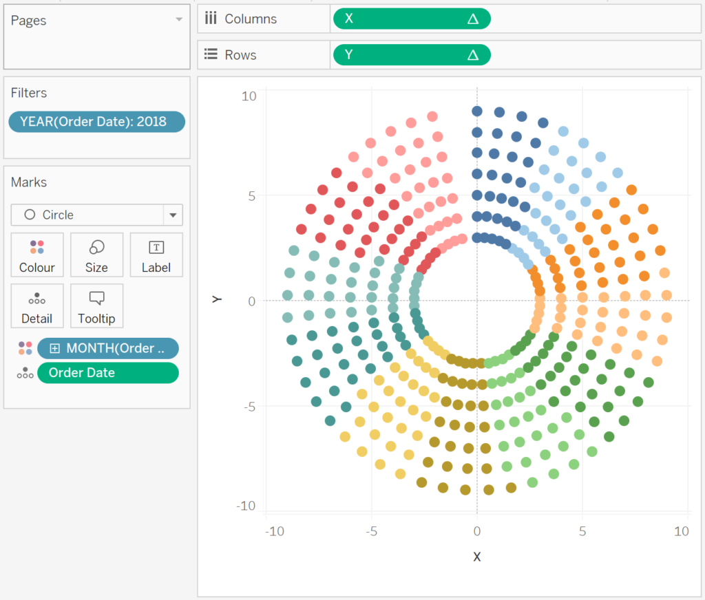
Now we will update the cosmetics:
- Hide the Headers.
- Hide the Row Dividers.
- Hide the Column Dividers.
- Hide the Grid Lines.
- Hide the Zero Lines.
- Adjust the Tool Tips.
- Drag Sales onto the Size Mark.
- Adjust the Size.
- Adjust the Opacity to 80%.
You should now see the following:

and boom, we are done, have some fun change the Distance and Depth parameters, and as always, you can find my data visualisation on Tableau Public at https://public.tableau.com/profile/toan.hoang#!/vizhome/CalendarCircleChart/CalendarCircleChart
Summary
I hope you all enjoyed this article as much as I enjoyed writing it and as always do share the love. Do let me know if you experienced any issues recreating this Visualisation, and as always, please leave a comment below or reach out to me on Twitter @Tableau_Magic.
If you like our work, do consider supporting us on Patreon, and for supporting us, we will give you early access to tutorials, exclusive videos, as well as access to current and future courses on Udemy:
- Patreon: https://www.patreon.com/tableaumagic
Also, do be sure to check out our various courses:
- Creating Bespoke Data Visualizations (Udemy)
- Introduction to Tableau (Online Instructor-Led)
- Advanced Calculations (Online Instructor-Led)
- Creating Bespoke Data Visualizations (Online Instructor-Led)
 Table Calculation")


Hi Toang,
Thx for another gem from the magician, I feel there is something wrong withe above calculations, could you pls help me with issue
I will double check, but please send me a workbook with your issue.
I share the link but its showing here
Hi Magician,
I have shared my workbook to admin@tableau.toanhoang.com, request you to help me on the issue
I share the link but its not showing here
Navidran ya te salio?
Hi Toan,
First of all, thank you for the great sharing.
But, I’m really curious about the [distance] field.
Could you please help us out on that specific field?
I could create it by case when or if else, however I don’t think that coding is not smart enough comparing with yours.
I do appreciate.
Hi there, the distance is just a parameter which will give the distance from the center, This basically creates more space in the middle if you need it. On some dashboards, I have made the distance value large and put a detail worksheet in the middle and used hover actions.
Hi Toan,
Again thank you for your reply. Really appreciate.However I do suffer a problem when creating this chart. I followed your tutorial closely, well I can only work out with a single ring. I was wondering if you could make this chart temporarily downloadable so that I could figure out what wrong with it.
Thank you…soooooo much.
Please send me what you have to admin@tableau.toanhoang.com and I will have a look at it over the weekend.
Hi Tableau Magic! Thanks for this amazing tutorial! I was wondering how can I get rid of “circles” represented as days when you have zero sales in that particular date. For some reason, the circles / marks still appear even if the sales numbers are zero. Is there a way to tweak this? Thank you so much!