


")


I am really having a fun moment with Dendrogram Charts, and in this tutorial, we are going to combine a Dendrogram Chart with Rounded Bar Charts to create a very nice looking effect. I hope you enjoy this tutorial and I cannot wait to see what you build using this.
Note: This is an alternative type of data visualisation, and sometimes pushed for by clients. Please always look at best practices for data visualisations before deploying this into production.
Data
We will start by loading the Sample Superstore data into Tableau Desktop / Tableau Public.
Note: If you have Tableau Desktop, you can use the Sample data source, but if you are using Tableau Public, download and load the following data source.
Once your data is loaded into Tableau, right-click on the data source and click on Edit Data Source… with the Data Source Editor open, paste the following:
Path
0
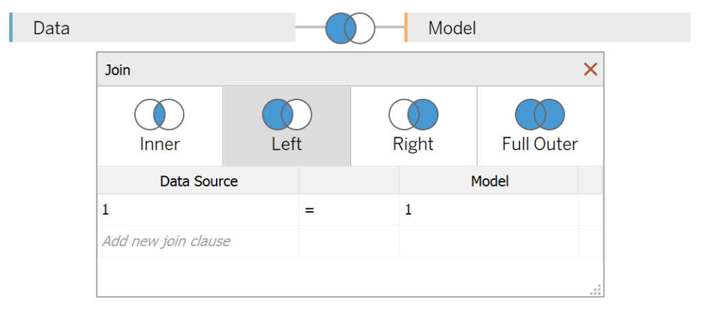
200Note: If you are using Tableau 2020.2 or great i.e. have access to new Relationship Model, you will need to double-click on the originally pasted data source to open up before pasting in the Path Data.
You should get an error as there is no joining column, however, click on Add new join clause, go to Create Join Calculation, type 1 and click OK. Do this for the right-hand side as well. Ensure that you have Inner join selected and you should see the following:
Note: we need additional records as we are going to be drawing lines and using densification to get more points on our canvas. For more information, check out our article on Data Densification.
Calculated Fields
With our data set loaded into Tableau, we are going to create the following Bin and Calculated Fields:
Path (bin)
- Right-click on Path, go to Create and select Bins…
- In the Edit Bins dialogue window:
- Set New field name to Path (bin)
- Set Size of bins to 1
- Click Ok
TC_Sales
WINDOW_SUM(SUM([Sales]))/2TC_Total Sales
WINDOW_SUM(SUM([Sales]))/2TC_Percentage
[TC_Sales]/[TC_Total Sales]TC_Percentage (Adjusted)
[TC_Percentage]/WINDOW_MAX([TC_Percentage])TC_Rank
RANK_UNIQUE([TC_Sales],"desc")X
((INDEX()-1)*0.12)-6TC_Sigmoid
1/(1+EXP(-[X]))Y
[TC_Sigmoid]*([TC_Rank]-(WINDOW_MAX([TC_Rank])+1)/2)/100TC_Size
IF [X] >=6 AND [X] <= 6+(10*[TC_Percentage (Adjusted)]) THEN
    1
ELSE
    0
END
With this done, let us start creating our data visualisation.
Worksheet
We will now build our first worksheet:
- Change the Mark Type to Line
- Drag Sub-Category onto the Color Mark
- Drag Path (bin) onto the Columns Shelf
- Right-click on this pill and ensure that Show Missing Values is selected
- Drag this object onto the Detail Mark
- Drag X onto the Columns Shelf
- Right-click on this pill, go to Compute Using and select Path (bin)
- Drag Y onto the Rows Shelf
- Right-click on this pill, go to Compute Using and select Path (bin)
You should now see the following:

We will now adjust the Y pill Table Calculation:
- Right-click on the Y pill and select Edit Table Calculation:
- In Nested Calculation select Y
- In Compute Using select Specific Dimensions
- Select only Sub-Category
- In Nested Calculations select TC_Rank
- In Compute Using select Specific Dimensions
- Select only Sub-Category
- In Nested Calculation select Y
You should see the following:

We have now built the Dendrogram, so will now work on creating the Rounded Bar Chart:
- Drag TC_Size onto the Size Mark
- Right-click on this pill, go to Compute Using and select Path (bin)
- Right-click on the TC_Size pill on the Size Mark and go to Edit Table Calculation:
- In Nested Calculations select TC_Total Sales
- In Compute Using select Specific Dimensions
- Ensure that Sub-Category and Path (bin) are both selected, and Sub-Category is on top
- In Nested Calculations select TC_Percentage (Adjusted)
- In Compute Using select Specific Dimensions
- Ensure that Sub-Category and Path (bin) are both selected, and Sub-Category is on top
- In Nested Calculations select TC_Total Sales
You should now see the following:

We will now make our final adjustments:
- Hide the X-Axis and Y-Axis Headers
- Hide the Grid Lines
- Hide the Zero Lines
- Add a Label to the End of the Line
- Disable the Tooltips
- Adjust the Size
We will now finally have the following:

and boom, we are done! I hope you enjoyed creating this data visualization and learned some cool techniques as well. As always, you can find this data visualisation on Tableau Public at https://public.tableau.com/profile/toan.hoang#!/vizhome/DendrogramwithRoundedBarCharts/DendrogramwithRoundedBarCharts
Summary
I hope you all enjoyed this article as much as I enjoyed writing it and as always do share the love. Do let me know if you experienced any issues recreating this Visualization, and as always, please leave a comment below or reach out to me on Twitter @Tableau_Magic. Do also remember to tag me in your work if you use this tutorial.
If you like our work, do consider supporting us on Patreon, and for supporting us, we will give you early access to tutorials, exclusive videos, as well as access to current and future courses on Udemy:
- Patreon: https://www.patreon.com/tableaumagic
Also, do be sure to check out our various courses:
- Creating Bespoke Data Visualizations (Udemy)
- Introduction to Tableau (Online Instructor-Led)
- Advanced Calculations (Online Instructor-Led)
- Creating Bespoke Data Visualizations (Online Instructor-Led)


 Table Calculation")


Did you sort at the end to flip it upside down?
I cannot actually recall, you can sort, but I think I flipped the axis.
Good evening,
after inserting the path 0 200 from the clipboard and creating the left join (p.s. you wrote inner join, but screenshot says left join) and saving the file, straight after that my entire source is lost. Can you imagine why? I have Desktop and used your orders.csv.
Text file properties?
J.A.
I am not sure why the entire dataset would dissappear, but it should be inner join, to be honest, given the way we have prepped our data, there should be a 100% match.
Yes this happens to me too. After which i use a excel sheet to put in the values for PATH.
Do you have a tutorial on how to make the labels line up so nicely?
All you have to do is add a label to the end of the line, and then adjust the columns axis to give space enough for the text to show up clearly. I hope that helps.
Yes, thank you! I figured it out. Last question: How do I sort the graph to my largest segment is on top?
You can either reverse the Y-Axis or change the TC_Rank calculated field.
Thank you again. This is a really great tutorial!
Your welcome 🙂
Re last comment this doesnt make any sense sorry. Also i’m having the same issue as Robert with my order being upside down and cant see anyway to change it
I have enabled the download of my workbook. Please have a look and hopefully, it will make more sense.
No sorry I’m still getting the same outcome and really don’t know how to get the labels as shown on your viz nor changing the order. I’m also seeing the values being different. I noticed on your workbook you’re data source is ‘Orders+ (Multiple Connections)’. However, I cant see the data sources. Whereas I am seeing ‘Sample – Superstore’ even with the Path data pasted in and joined.
Hi Dale, please send your packaged workbook to toan.hoang@tableau.toanhoang.com, and I will try to have a look.
Hi Dale, you may show header of Y axis, right click–> edit axis–>select reveresd. This should flip the order
Thank you I was having the same problem and this worked!
Hello Toan – How would I remove the lines coming after round bar chart ? I just want it to appear number directly after round shape bar chart,not the line and then numbers ?
Hi Toan, Great tutorial but I wanted to ask how do create this for several measures instead of a dimension (for your case by sub-category)?
That is possible but will require data preparation.
Hi Toan, thank you for this idea. I have created this and it works perfectly with my data. However I have 3 level of hierarchy which I want to kind link so that one click can do the job. Please could you let me know if that’s possible. I have seen you two level of dendrogram on your page but appreciate if we can do this with this sample store. In any case I would greatly appreciate your thoughts and suggestion.
Hi Seema, it is possible and the two level dendrogram will be coming on the 1st June.
This is awesome – Love the Viz – Thanks Toan for sharing the steps very nicely
Your welcome Rajavel
Thank you so much sir,I am a civil engineering student but I have keen interest in data analytics.That is why I started learning tableau and searching how to create dendrograph in tableau and find your post .I must you explain very well and I able to design the graph in tableau.Sir also suggest me how can I start my career as business analyst as my core field is civil engineering.
The first thing is to join the Tableau Live Europe Conference, it is on today: https://www.tableau.com/en-gb/community/events/tableau-live-europe
Should the bars represent the volume size? For example, longer bar represents the larger volume? When I reverse the axis, I show the largest amount on top with the shortest bar. How can I fix it so I have the longest bar with the largest volume?
I am not able to line up the labels. I went through the comment section and followed some steps but I still cannot line them at the end of the line. Any tips??
What is the best way of making this work when you already have a percentage calculated? Or if you have a layout like below:
Category Count Total Count
A 1 10
B 6 12
C 2 8
Hopefully that lines up well enough!