


")


When I created my Cryptocurrency Dashboard, I decided to have some fun with gradient backgrounds. When combined with animations, this creates a very cool effect, so here you go, a nice and simple tutorial on creating gradient backgrounds in Tableau.
Data
We will start by loading the following data into Tableau.
Color
Blue
Orange
Green
Red
Purple
Grey
Once your data is loaded into Tableau, right-click on the data source and click on Edit Data Source… with the Data Source Editor open, paste the following:
Path,Position
360,0
0,0
360,1
0,1
Note: If you are using Tableau 2020.2 or great i.e. have access to new Relationship Model, you will need to double-click on the originally pasted data source to open up before pasting in the Path Data.
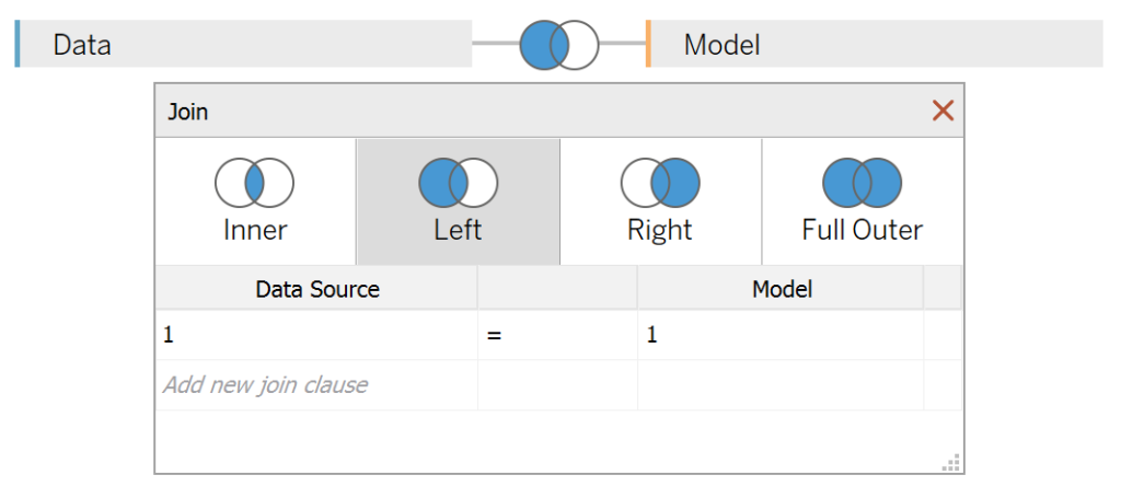
You should get an error as there is no joining column, however, click on Add new join clause, go to Create Join Calculation, type 1 and click OK. Do this for the right-hand side as well. Ensure that you have Inner join selected and you should see the following:
Note: we need additional records as we are going to be drawing lines and using densification to get more points on our canvas. For more information, check out our article on Data Densification.
Calculated Fields
With our data set loaded into Tableau, we are going to create the following Bins and Calculated Fields:
Path (bin)
- Right-click on Path, go to Create and select Bins…
- In the Edit Bins dialogue window:
- Set New field name to Path (bin).
- Set Size of bins to 1.
- Click Ok.
Position (bin)
- Right-click on Position, go to Create and select Bins…
- In the Edit Bins dialogue window:
- Set New field name to Position (bin).
- Set Size of bins to 0.1.
- Click Ok.
Index
INDEX()-1Distance
INDEX()-1X
[Index]Y
[Position]X (Circle)
SIN(RADIANS([Index]))*[Distance]Y (Circle)
COS(RADIANS([Index]))*[Distance]Gradient Color (Bar)
WINDOW_MAX(MAX([Color]))+STR([Index])Gradient Color (Circle)
WINDOW_MAX(MAX([Color]))+STR([Distance])Gradient Color (Circle Reversed)
WINDOW_MAX(MAX([Color]))+STR(100-[Distance])With this done, let us start creating our data visualisation.
Worksheet
We will now build our Horizontal and Vertical backgrounds:
- Change the Mark Type to Line
- Drag Color onto the Filter Pane and select Blue
- Drag Path (bin) onto the Columns Shelf
- Right-click on this pill and ensure that Show Missing Values is selected.
- Drag this pill onto the Detail Mark
- Drag Position onto the Path Mark
- Right-click on this pill and convert this to a Discrete Dimension
- Drag X onto the Columns Shelf
- Right-click on this pill, go to Compute Using and select Path (bin)
- Drag Y onto the Rows Shelf
If all goes well, you should now see the following:

Now, we will need to add the gradient:
- Drag Gradient Color (Bar) onto the Color Mark
- Right-click on this pill, go to Compute Using and select Path (bin)
- Click on the Color Mark and Edit Color
- In Select Color Palette select Blue
- Click on Assign Palette and click OK
- Repeat this for each Color
You should be able to see the following:

Now we will edit the cosmetics:
- Fix the Y-Axis to be from 0 to 1
- Fix the X-Axis to be from 0 to 360
- Hide the X and Y-Axis
- Remove the Tool Tips
You should now be able to see the following:

or if you reverse the Rows and Columns, you will see the following:

Note: we can connect this to our actual data (see our Cryptocurrency Dashboard Full Tutorial).
We will now build our circular Gradient Background.
- Create a New Worksheet
- Change the Mark Type to Line
- Drag the Color Mark and set the value to Blue
- Drag Path (bin) onto the Columns Shelf
- Right-click on this pill and ensure that Show Missing Values is selected
- Drag this pill onto the Detail Mark
- Drag Position (bin) onto the Columns Shelf
- Right-click on this pill and ensure that Show Missing Values is selected
- Drag this pill onto the Detail Mark
- Drag X (Circle) onto the Columns Shelf
- Right-click on this pill, go to Compute Using and select Path (bin)
- Drag Y (Circle) onto the Rows Shelf
- Right-click on this pill, go to Compute Using and select Path (bin)
You should now see the following:

We will now adjust the Table Calculations:
- Right-click on the X (Circle) pill on the Columns Shelf and select Edit Table Calculations:
- In Nested Calculation select Distance
- In Compute Using to Specific Dimensions
- Select Position (bin)
- In Nested Calculation select Distance
- Right-click on the Y(Circle) pill on the Columns Shelf and select Edit Table Calculations:
- In Nested Calculation select Distance
- In Compute Using to Specific Dimensions
- Select Position (bin)
- In Nested Calculation select Distance
You should see the following:

We will now make some adjustments:
- In the Data Pane, edit the Position (bin) by setting the Size of bin to 0.01
- Drag Gradient Color (Circle) onto the Color Mark; right-click on this pill and select Edit Table Calculations
- In Nested Calculations select Gradient Color (Circle)
- In Compute Using select Specific Dimensions
- Select Path (bin) and Position (bin) and ensure that Path (bin) is on top
- In Nested Calculations select Distance
- In Compute Using select Specific Dimensions
- Select Position (bin)
- In Nested Calculations select Gradient Color (Circle)
If all goes well, you should now see the following:

Like in the previous example, click on the Color Mark and Edit the Colors; as such, you want to end up with the following:

We will not adjust the cosmetics:
- Fix the Y-Axis to be from -70 to 70
- Fix the X-Axis to be from -70 to 70
- Hide the X and Y-Axis
- Remove the Tool Tips
You will now have the following:

Now, if we can repeat this with the Gradient Color (Circle Reversed) and we will have the following:

and boom, we are done! I hope you enjoyed creating this data visualization and learned some cool techniques as well. As always, you can find this data visualisation on Tableau Public at https://public.tableau.com/profile/toan.hoang#!/vizhome/GradientBackgrounds/GradientBackgrounds
Summary
I hope you all enjoyed this article as much as I enjoyed writing it and as always do share the love. Do let me know if you experienced any issues recreating this Visualization, and as always, please leave a comment below or reach out to me on Twitter @Tableau_Magic. Do also remember to tag me in your work if you use this tutorial.
If you like our work, do consider supporting us on Patreon, and for supporting us, we will give you early access to tutorials, exclusive videos, as well as access to current and future courses on Udemy:
- Patreon: https://www.patreon.com/tableaumagic
Also, do be sure to check out our various courses:
- Creating Bespoke Data Visualizations (Udemy)
- Introduction to Tableau (Online Instructor-Led)
- Advanced Calculations (Online Instructor-Led)
- Creating Bespoke Data Visualizations (Online Instructor-Led)


Hey Toan,
Great tutorial! Two questions: (1) In my attempt I have white space between the lines whereas yours seems pretty solid across the board. Is there something I’m missing to have the same outcome as you? (2) Is it possible to do this with specific/custom color versus the provided Blue, Green, etc. palettes?
Thanks,
Tom
Hi Tom, you can increase the number of lines by editing the Bins, this way you can fill out your page, 2) you can create your own custom color palettes and then use which ever colors you fancy. Check out my tutorial on creating Custom colour palettes for Tableau. Kind Regards,
Toan