


")


Gradients are not best practice for data visualisations. To put it out there immediately. However, it is something that is often asked for when creating infographics, or when the key objective is to create a cool and fun design. In this tutorial, we are going to use data densification to build our gradient Bar Charts.
Note: This is an alternative type of data visualisation, and sometimes pushed for by clients. Please always look at best practices for data visualisations before deploying this into production.
Data
We will start by loading the Sample Superstore data into Tableau.
Note: If you have Tableau Desktop, you can use the Sample data source, but if you are using Tableau Public, download and load the following data source.
Once your data is loaded into Tableau, right-click on the data source and click on Edit Data Source… with the Data Source Editor open, paste the following:
Path,Position
1,0
101,0
1,1
101,1
Note: If you are using Tableau 2020.2 or great i.e. have access to new Relationship Model, you will need to double-click on the originally pasted data source to open up before pasting in the Path Data.
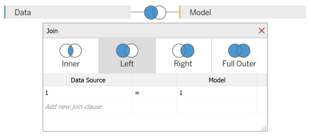
You should get an error as there is no joining column, however, click on Add new join clause, go to Create Join Calculation, type 1 and click OK. Do this for the right-hand side as well. Ensure that you have Inner join selected and you should see the following:
Note: we need additional records as we are going to be drawing lines and using densification to get more points on our canvas. For more information, check out our article on Data Densification.
Calculated Fields
With our data set loaded into Tableau, we are going to create the following Bin and Calculated Fields:
Path (bin)
- Right-click on Path, go to Create and select Bins…
- In the Edit Bins dialogue window:
- Set New field name to Path (bin).
- Set Size of bins to 0.1.
- Click Ok.
Index
INDEX()-1TC_Position
FLOAT(WINDOW_MAX(MAX([Position])))TC_Sales
WINDOW_SUM(SUM([Sales]))/2TC_Total Sales
WINDOW_SUM(SUM([Sales]))/2TC_Percentage of Sales
[TC_Sales]/[TC_Total Sales]TC_Columns
If  [Index]/1000 < [TC_Percentage of Sales] THEN
    [Index]
END
With this done, let us start creating our data visualisation.
Worksheet
We will now build our first worksheet:
- Change our Mark Type to Line.
- Drag Path (bin) to Rows.
- Right-click on this object and ensure that Show Missing Values is checked.
- Drag this object onto the Detail Mark.
- Drag Position onto the Path Mark.
- Drag TC_Columns onto the Column Shelf.
- Right-click on this object, go to Compute Using and select Path (bin).
- Drag TC_Position onto the Rows Shelf.
- Right-click on this object, go to Compute Using and select Path (bin).
- Drag Index onto the Color Mark.
- Right-click on this object, go to Compute Using and select Path (bin).
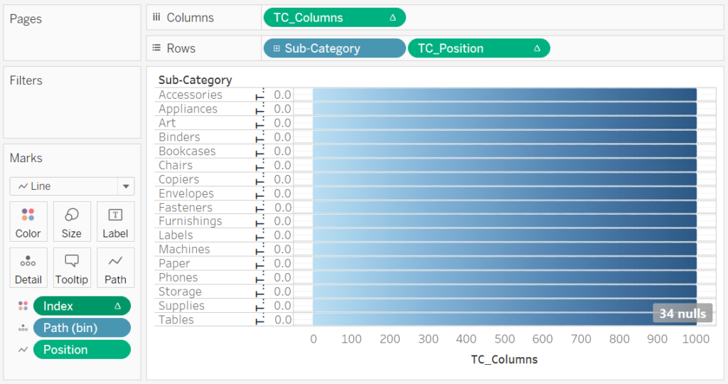
If all goes well, you should now have the following:
Now we will adjust our Table Calculations:
- Right-click on the TC_Column, and go to Edit Table Calculations.
- In Nested Calculations select TC_Sales.
- In Compute Using select Specific Dimensions.
- Check Sub-Category and Path (bin). Ensure that Sub-Category in on top.
- In Restarting every select Sub-Category.
- In Nested Calculations select TC_Total Sales.
- In Compute Using select Specific Dimensions.
- Check Sub-Category and Path (bin). Ensure that Sub-Category in on top.
- In Restarting every select None.
- Click on the >32K null and select Filter Data.
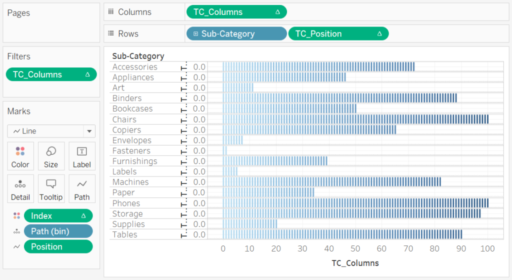
You will now have the following:
We now have the basic, we need to adjust the cosmetics.
- Hide the Axis Headers.
- Hide the Grid Lines.
- Hide the Zero Lines.
- Shrink the Size of your visualisation.
- Adjust the Size of your lines.
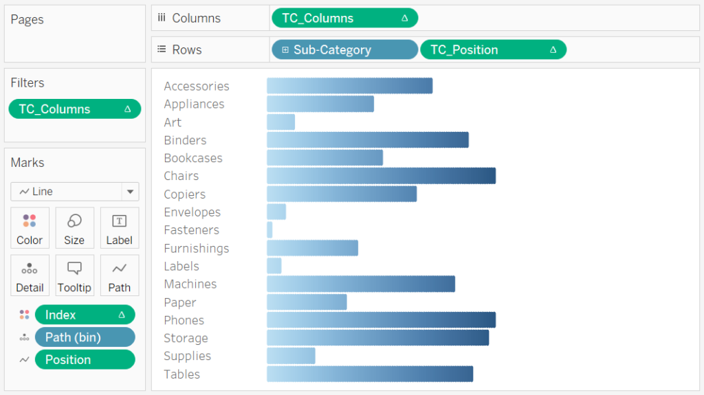
We should now have the following:
Adding some additional labels, we will have our final product:
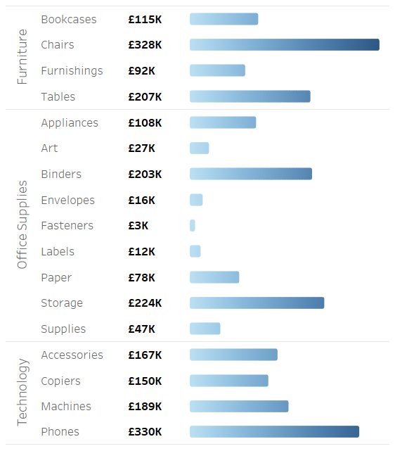
and boom, we are done! As always, you can find this data visualisation on Tableau Public at https://public.tableau.com/profile/toan.hoang#!/vizhome/GradientBarCharts/GradientBarCharts
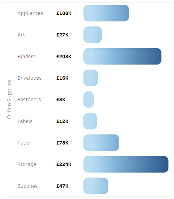
One interesting observation, if you increase the size a lot, you get the following:
Summary
I hope you all enjoyed this article as much as I enjoyed writing it and as always do share the love. Do let me know if you experienced any issues recreating this Visualisation, and as always, please leave a comment below or reach out to me on Twitter @Tableau_Magic. Do also remember to tag me in your work if you use this tutorial.
If you like our work, do consider supporting us on Patreon, and for supporting us, we will give you early access to tutorials, exclusive videos, as well as access to current and future courses on Udemy:
- Patreon: https://www.patreon.com/tableaumagic
Also, do be sure to check out our various courses:
- Creating Bespoke Data Visualizations (Udemy)
- Introduction to Tableau (Online Instructor-Led)
- Advanced Calculations (Online Instructor-Led)
- Creating Bespoke Data Visualizations (Online Instructor-Led)

 Table Calculation")


")


Hi Toan,
Could you please help me with download of this workbook
Hey, send me an email to toan.hoang@tableau.toanhoang.com and I will send it to you tonight.
Hi Toan, I ran into a collation error when try to join the two tables, it said collation mismatch. What should I do next? Thanks