
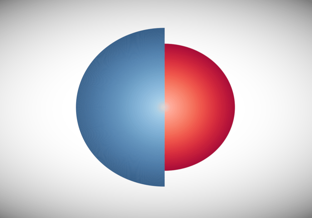
Recently, I explored the idea of gradients in my Gradient Bar Chart tutorial. After release, I was asked to explore gradients a bit more, so I decided to look at circles and to revisit an old favourite of mine, and in this tutorial, we will create Gradient Half Circle Charts in Tableau.
Note: This is an alternative type of data visualisation, and sometimes pushed for by clients. Please always look at best practices for data visualisations before deploying this into production.
Apart from double densification and a very cool look, I really think this is a for fun data visualisation, maybe in an infographic.
Data
We will start by loading the following data into Tableau.
Category,Value
Category B,80
Category A,100
Once your data is loaded into Tableau, right-click on the data source and click on Edit Data Source… with the Data Source Editor open, paste the following:
Circle,Path
0,0
0,100
180,0
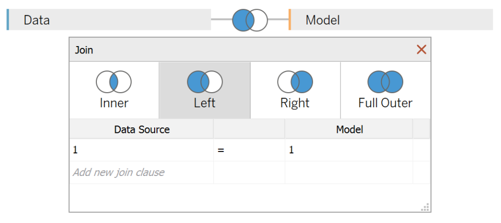
180,100Note: If you are using Tableau 2020.2 or great i.e. have access to new Relationship Model, you will need to double-click on the originally pasted data source to open up before pasting in the Path Data.
You should get an error as there is no joining column, however, click on Add new join clause, go to Create Join Calculation, type 1 and click OK. Do this for the right-hand side as well. Ensure that you have Inner join selected and you should see the following:

Note: we need additional records as we are going to be drawing lines and using densification to get more points on our canvas. For more information, check out our article on Data Densification.
Calculated Fields
With our data set loaded into Tableau, we are going to create the following Bin and Calculated Fields:
Path (bin)
- Right-click on Path, go to Create and select Bins…
- In the Edit Bins dialogue window:
- Set New field name to Path (bin).
- Set Size of bins to 1.
- Click Ok.
Circle (bin)
- Right-click on Path, go to Create and select Bins…
- In the Edit Bins dialogue window:
- Set New field name to Circle (bin).
- Set Size of bins to 0.5.
- Click Ok.
Index
(INDEX()-1)/2Note: This will be used to draw half circle lines.
Distance
INDEX()-1Note: This will be used to draw increasingly larger lines.
Category Index
IF INDEX() = 1 THEN
    -1
ELSE
    1
END
Note: This will be used to flip the circle around.
TC_Value
WINDOW_SUM(SUM([Value]))X
SIN(RADIANS([Index]))*[Distance]*[TC_Value]*[Category Index]Y
COS(RADIANS([Index]))*[Distance]*[TC_Value]TC_Color
[Category Index]*[Index]With this done, let us start creating our data visualisation.
Worksheet
We will now build our first worksheet:
- Change the Mark Type to Circle.
- Drag Category to the Detail Mark.
- Drag Circle (bin) onto Columns.
- Right-click on this object and ensure that Show Missing Values is selected.
- Drag this object onto the Detail Mark.
- Drag Path (bin) onto Columns.
- Right-click on this object and ensure that Show Missing Values is selected.
- Drag this object onto the Detail Mark.
- Drag X onto Columns.
- Right-click on this object, go to Compute Using and select Circle (bin).
- Drag Y onto Rows.
- Right-click on this object, go to Compute Using and select Circle (bin).
- Reduce the size to the minimum possible.
If all goes well, you should see the following:


We are going to do some serious editing of the Table Calculations to achieve our desired effect, follow very carefully:
- Right-click on X and select Edit Table Calculations.
- In Nested Calculations select Distance.
- Ensure that only Path (bin) is selected.
- In Nested Calculations select TC_Value.
- Ensure that both Circle (bin) and Path (bin) is selected.
- Leave At the level as Deepest.
- Leave Restarting every as None.
- In Nested Calculations select Distance.
- Ensure that only Category is selected.
- In Nested Calculations select Distance.
We should now have the following:


We will now edit the Table Calculation for Y:
- Right-click on X and select Edit Table Calculations.
- In Nested Calculations select Distance.
- Ensure that only Path (bin) is selected.
- In Nested Calculations select TC_Value.
- Ensure that both Circle (bin) and Path (bin) is selected.
- Leave At the level as Deepest.
- Leave Restarting every as None.
- In Nested Calculations select Distance.
We are getting closer, and we should now see the following:


Now we are going to adjust the colour:
- Drag TC_Color onto the Color Mark, right-click on this object select Edit Table Calculations.
- In Nested Calculations select Index.
- Ensure that only Path (bin) is selected.
- In Nested Calculations select Category Index.
- Ensure that only Category is selected.
- In Nested Calculations select Index.
You should now see the following:


And now we are pretty much done with our Gradient Half Circles, however, we will need to adjust the cosmetics:
- Hide the Axis Headers.
- Hide the Grid Lines.
- Hide the Zero Line.
- Add a Tool Tip.
- Have some fun with Colors.
You will want to end with something like the following:

and boom, we are done! I hope you enjoyed this tutorial, and as always, you can find this data visualisation on Tableau Public at https://public.tableau.com/profile/toan.hoang#!/vizhome/GradientHalfCircles/GradientHalfCircles
Summary
I hope you all enjoyed this article as much as I enjoyed writing it and as always do share the love. Do let me know if you experienced any issues recreating this Visualisation, and as always, please leave a comment below or reach out to me on Twitter @Tableau_Magic. Do also remember to tag me in your work if you use this tutorial.
If you like our work, do consider supporting us on Patreon, and for supporting us, we will give you early access to tutorials, exclusive videos, as well as access to current and future courses on Udemy:
- Patreon: https://www.patreon.com/tableaumagic
Also, do be sure to check out our various courses:
- Creating Bespoke Data Visualizations (Udemy)
- Introduction to Tableau (Online Instructor-Led)
- Advanced Calculations (Online Instructor-Led)
- Creating Bespoke Data Visualizations (Online Instructor-Led)