


")


I want to end my second wave of Tableau Tutorials with something a little special. I have to admit that to create the following data visualisation, I had to make several attempts as well as bang my head onto a table a few times, but in the end, here we have it, a Dynamic Parallel Set Data Visualisation in Tableau.
Note: This is an alternative type of data visualisation, and sometimes pushed for by clients. Please always look at best practices for data visualisations before deploying this into production.
Data
We will start by loading the Sample Superstore data into Tableau Desktop / Tableau Public.
Note: If you have Tableau Desktop, you can use the Sample data source, but if you are using Tableau Public, download and load the following data source.
Once your data is loaded into Tableau, right-click on the data source and click on Edit Data Source… with the Data Source Editor open, paste the following:
Path
1
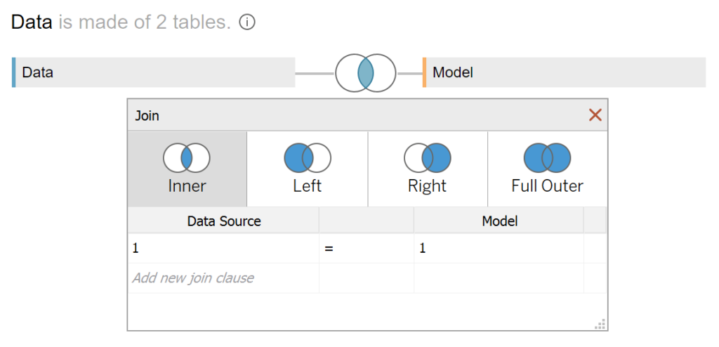
4Note: If you are using Tableau 2020.2 or great i.e. have access to new Relationship Model, you will need to double-click on the originally pasted data source to open up before pasting in the Path Data.
You should get an error as there is no joining column, however, click on Add new join clause, go to Create Join Calculation, type 1 and click OK. Do this for the right-hand side as well. Ensure that you have Inner join selected and you should see the following:
Calculated Fields
With our data set loaded into Tableau, we are going to create the following Bins, Parameters and Calculated Fields:
@Color Dimension Parameter
- Set Name as @Color Dimension
- Set Data type as String
- Set Allowable values as List and add the following:
- Region
- Segment
- Set Current value as Segment
Path (bin)
- Right-click on Path, go to Create and select Bins…
- In the Edit Bins dialogue window:
- Set New field name to Path (bin)
- Set Size of bins to 1
- Click Ok
Region + Segment
[Region]+"-"+[Segment]Segment + Region
[Segment]+"-"+[Region]Color
IF [@Color Dimension] = "Region" THEN
    [Region]
ELSE
    [Segment]
END
Index
INDEX()Region Index
INDEX()Segment Index
INDEX()TC_Sales
WINDOW_SUM(SUM([Sales])) / 2TC_Sales (Left)
IF [X] = 0 THEN
    WINDOW_SUM(SUM([Sales]))
ELSE
    0
END / 2
TC_Sales (Right)
IF [X] = 1 THEN
    WINDOW_SUM(SUM([Sales]))
ELSE
    0
END / 2
TC_Running Sales (Left)
RUNNING_SUM([TC_Sales (Left)]) - [TC_Sales (Left)]TC_Running Sales (Right)
RUNNING_SUM([TC_Sales (Right)]) - [TC_Sales (Right)]X
IF [Index] = 1 OR [Index] = 4 THEN
    0
ELSE
    1
END
Y
IF [X] = 0 THEN
    IF [Index] = 1 THEN
        [TC_Running Sales (Left)]
    ELSEIF [Index] = 4 THEN
        [TC_Running Sales (Left)] + [TC_Sales (Left)]
    END
ELSE
    IF [Index] = 2 THEN
        [TC_Running Sales (Right)]
    ELSEIF [Index] = 3 THEN
        [TC_Running Sales (Right)] + [TC_Sales (Right)]
    END
END
Note: this is actually where the magic happens. We are drawing a polygon based on four points and treating each of the points differently to get our desired effect.
With this done, let us start creating our data visualisation.
Worksheet
We will now build our worksheet:
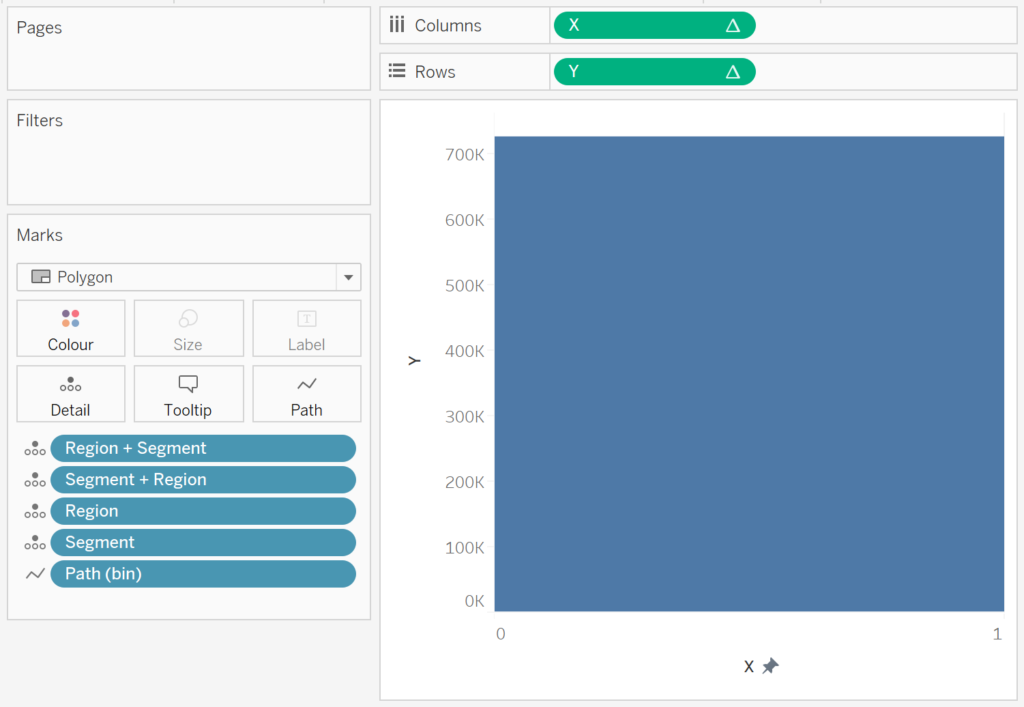
- Change the Mark Type to Polygon
- Drag Path (bin) onto the Columns Shelf
- Right-click on this pill and ensure that Show Missing Values is selected
- Drag this pill onto the Path Mark
- Drag Region + Segment onto the Detail Mark
- Drag Segment + Region onto the Detail Mark
- Drag Region onto the Detail Mark
- Drag Segment onto the Detail Mark
- Drag X onto the Columns Shelf
- Right-click on this pill, go to Compute Using and select Path (bin)
- Drag Y onto the Rows Shelf
- Right-click on this pill, go to Compute using and select Path (bin)
- Double click on the X-Axis Header, and fix the values to be from 0 to 1
You should now see the following:
We will now adjust the Y Table Calculation to get our designed effect.
- Drag Color onto the Color Mark
- Right-click on the Y pill and go to Edit Table Calculation…
- In Nested Calculations select TC_Running Sales (Left)
- In Compute Using select Specific Dimensions and check all boxes.
- Reorder to the following:
- Region
- Region + Segment
- Segment
- Segment + Region
- Path (bin)
- Color
- Set At the Level to Region + Segment
- In Nested Calculations select TC_Running Sales (Right)
- In Compute Using select Specific Dimensions and check all boxes.
- Reorder to the following:
- Segment
- Segment + Region
- Region
- Region + Segment
- Path (bin)
- Color
- Set At the Level to Segment + Region
- In Nested Calculations select TC_Running Sales (Left)
We should end up with the following:

Now, we just need to adjust the cosmetics:
- Hide the Y Axis Header
- Hide the X Axis Header
- Set the transparency to 50%
- Hide all Grid Lines, Zero Lines, Row and Column Dividers
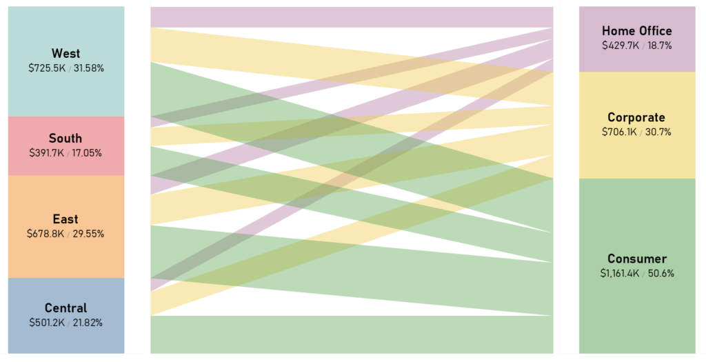
You will now have the centerpiece to our data visualisation:

We will now rapidly create our first additional Worksheets:
- Create a New Worksheet called Segment
- Drag Sales onto the Rows Shelf
- Drag Segment onto the Color Mark
- Drag Segment onto the Label Mark
- Drag Sales onto the Label Mark
- Because we used Data Densification, double click on this pill and divide it by 2
- Drag Sales onto the Label Mark
- Right-click on this pill, go to Quick Table Calculation and select Percentage of Total
- Format the Label
We want the following:

We will now rapidly create our second additional Worksheets:
- Create a New Worksheet called Region
- Drag Sales onto the Rows Shelf
- Drag Region onto the Color Mark
- Drag Region onto the Label Mark
- Drag Sales onto the Label Mark
- Because we used Data Densification, double click on this pill and divide it by 2
- Drag Sales onto the Label Mark
- Right-click on this pill, go to Quick Table Calculation and select Percentage of Total
- Format the Label
We want the following:

We will now add all through of these worksheets into a dashboard and format to perfection:
and boom, we are done! I hope you enjoyed creating this data visualization and learned some cool techniques as well. As always, you can find this data visualisation on Tableau Public at https://public.tableau.com/profile/toan.hoang#!/vizhome/ParallelSets/ParallelSets
Summary
I hope you all enjoyed this article as much as I enjoyed writing it and as always do share the love. Do let me know if you experienced any issues recreating this Visualization, and as always, please leave a comment below or reach out to me on Twitter @Tableau_Magic. Do also remember to tag me in your work if you use this tutorial.
If you like our work, do consider supporting us on Patreon, and for supporting us, we will give you early access to tutorials, exclusive videos, as well as access to current and future courses on Udemy: https://www.patreon.com/tableaumagic


")
Magician yet another variety, thanks a lot