
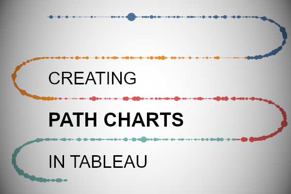
This is a tutorial that I have been wanting to write for over a year, however, the mathematics behind this really eluded me. Then one lazy Sunday, I decided to have a go at creating a Path Chart and was able to really simplify this technique and make it super generic. Seriously, I was surprised at the result and sure I will be using this more and more in my data visualisation. I really hope you enjoy this.
Note: This is an alternative type of data visualisation, and sometimes pushed for by clients. Please always look at best practices for data visualisations before deploying this into production.
Data
We will start by loading the Sample Superstore data into Tableau Desktop / Tableau Public.
Note: If you have Tableau Desktop, you can use the Sample data source, but if you are using Tableau Public, download and load the following data source.
Calculated Fields
With our data set loaded into Tableau, we are going to create the following Parameters and Calculated Fields:
Spacing Parameter
- Set Name as Spacing
- Set Data type to Integer
- Set Allowable values to Range
- Set Minimum to 1
- Set Maximum to 20
- Set Step size to 1
- Set Current value to 8
- Click Ok
Curve Distance Parameter
- Set Name as Curve Distance
- Set Data type to Integer
- Set Allowable values to Range
- Set Minimum to 0
- Set Maximum to 100
- Set Step size to 10
- Set Current value to 30
- Click Ok
Index
(INDEX()-1)*[Spacing]Segment Number
INT([Index]/180)Y
IF [Segment Number]%2 = 0 THEN
    -[Segment Number]
ELSE
    (-[Segment Number]+COS(RADIANS([Index]-180)))
END
Note: we use the Modulus operator to determine how far down we go.
X
IF [Segment Number]%4 = 0 THEN
    [Index]-(180*[Segment Number])
ELSEIF [Segment Number]%4 = 1 THEN
    180+SIN(RADIANS([Index]-180))*[Curve Distance]
ELSEIF [Segment Number]%4 = 2 THEN
    (([Segment Number]+1)*180)-[Index]
ELSEIF [Segment Number]%4 = 3 THEN
    SIN(RADIANS([Index]-180))*-[Curve Distance]
END
Ok, so this is where you will start thinking WTF… however, it is not as hard as you think. Essentially, our path has 4 segments:
- A straight line from left to right
- The curve on the right
- A straight line from right to left
- The curve on the left.
We treat each of segment differently, and heavily leverage the Segment Number, Index and Modulus operator to make sure we get everything right and moving in the right order, however, through using this calculation, we make this chart extremely dynamic.
Note: we are hardcoding the number of points of each segment to 180, and use the Index mixed with the Spacing parameter here.
With this done, let us start creating our data visualisation.
Worksheet
We will now build our first worksheet:
- Change the Mark Type to Circle
- Drag Order Date onto the Color Mark
- Drag Order Date onto the Detail Mark
- Right-click on this pill, and convert this to a Continuous Week
- Drag X onto the Columns Shelf
- Right-click on this pill, go to Compute Using and select Order Date
- Drag Y onto the Rows Shelf
- Right-click on this pill, go to Compute Using and select Order Date
If all goes well, you should now see the following.


Yep, as easy as that. and the only thing that is remaining is to adjust the cosmetics:
- Hide the X-Axis Header and the Y-Axis Header
- Hide the Grid Lines and Zero Lines
- Hide the Row Dividers and Column Dividers
- Drag Sales onto the Size Mark
- Adjust the Tooltips
You should now have the following:


Now, have some fun by adjusting the Order Date on your Detail Mark. Right-click on this pill and convert this to Month, Day or any continuous date you would like, and, adjust the Parameter settings.
You can also change the Mark Type to Line which creates a fun effect:


As you can see, the calculations may be complicated but usage is pretty straight forward! and with that said, I hope you enjoyed creating this data visualization and learned some cool techniques as well. As always, you can find this data visualisation on Tableau Public at https://public.tableau.com/profile/toan.hoang#!/vizhome/PathChart/PathChart
Summary
I hope you all enjoyed this article as much as I enjoyed writing it and as always do share the love. Do let me know if you experienced any issues recreating this Visualization, and as always, please leave a comment below or reach out to me on Twitter @Tableau_Magic. Do also remember to tag me in your work if you use this tutorial.
If you like our work, do consider supporting us on Patreon, and for supporting us, we will give you early access to tutorials, exclusive videos, as well as access to current and future courses on Udemy:
- Patreon: https://www.patreon.com/tableaumagic
Also, do be sure to check out our various courses:
- Creating Bespoke Data Visualizations (Udemy)
- Introduction to Tableau (Online Instructor-Led)
- Advanced Calculations (Online Instructor-Led)
- Creating Bespoke Data Visualizations (Online Instructor-Led)