


")


This is a quick tutorial on creating a Radial Column Chart in Tableau. I have seen so many interesting ways that this has been used, so I really hope you enjoy this quick and simple tutorial.
Note: This is an alternative type of data visualisation, and sometimes pushed for by clients. Please always look at best practices for data visualisations before deploying this into production.
Data
We will start by loading the Sample Superstore data into Tableau.
Note: If you have Tableau Desktop, you can use the Sample data source, but if you are using Tableau Public, download and load the following data source.
Once your data is loaded into Tableau, right-click on the data source and click on Edit Data Source… with the Data Source Editor open, paste the following:
Position
1
2
Note: If you are using Tableau 2020.2 or great i.e. have access to new Relationship Model, you will need to double-click on the originally pasted data source to open up before pasting in the Path Data.
You should get an error as there is no joining column, however, click on Add new join clause, go to Create Join Calculation, type 1 and click OK. Do this for the right-hand side as well. Ensure that you have Inner join selected and you should see the following:
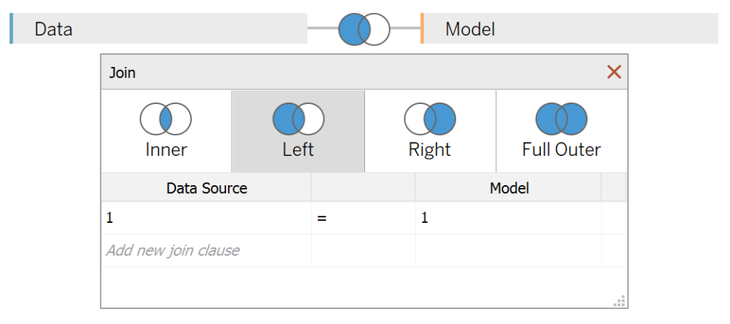
Note: we need additional records as we are going to be drawing lines and using densification to get more points on our canvas. For more information, check out our article on Data Densification.
Calculated Fields
With our data set loaded into Tableau, we are going to create the following Calculated Fields:
Index
INDEX()-1TC_Position
WINDOW_MAX(MAX([Position]))TC_Sales
WINDOW_SUM(SUM([Sales]))/2TC_Total Sales
WINDOW_SUM(SUM([Sales]))/2TC_Percentage of Total Sales
[TC_Sales]/[TC_Total Sales]TC_Distance
[TC_Percentage of Total Sales]/WINDOW_MAX([TC_Percentage of Total Sales])TC_Step Size
(360-(360/WINDOW_MAX([Index])))/WINDOW_MAX([Index])This nifty calculation spaces our lines so that each line is evenly distributed around the circle. This takes into account the total number of Dimensions so is dynamic.
X
IF MAX([Position]) = 1 THEN
    SIN(RADIANS([Index]*[TC_Step Size]))
ELSE
    SIN(RADIANS([Index]*[TC_Step Size]))*(1+[TC_Distance])
END
Y
IF MAX([Position]) = 1 THEN
    COS(RADIANS([Index]*[TC_Step Size]))
ELSE
    COS(RADIANS([Index]*[TC_Step Size]))*(1+[TC_Distance])
END
With this done, let us start creating our data visualisation.
Worksheet
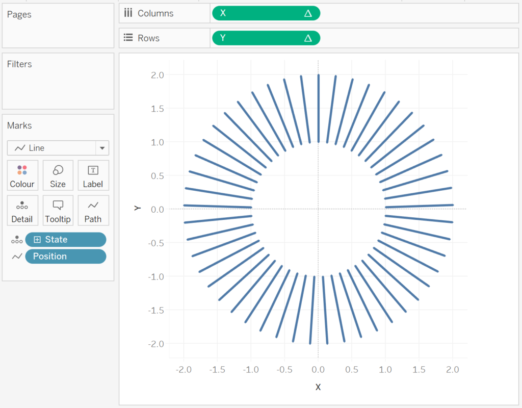
We will now build our first worksheet:
- Change the Mark Type to Line.
- Drag Position onto the Path Mark. Ensure that this is a Discrete Dimension.
- Drag State onto the Detail Mark. Remove the Country Pill.
- Drax X onto the Columns Shelf.
- Right-click on this object, go to Compute Using and select State.
- Drax Y onto the Rows Shelf.
- Right-click on this object, go to Compute Using and select State.
If all goes well, you should now see the following:
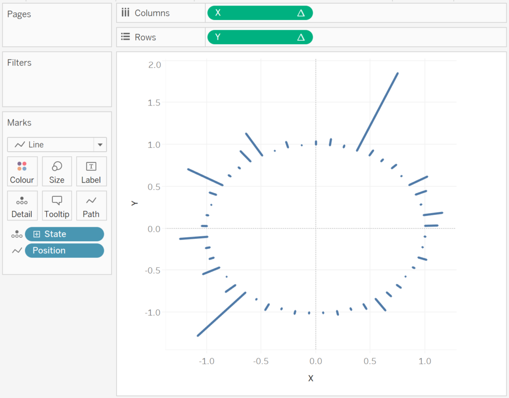
We will now adjust the Table Calculation to get what we are looking for:
- Right-click on X and go to Edit Table Calculations.
- In Nested Calculations select TC_Sales.
- In Compute Using select Table (across).
You should now see the following, how simple was that?
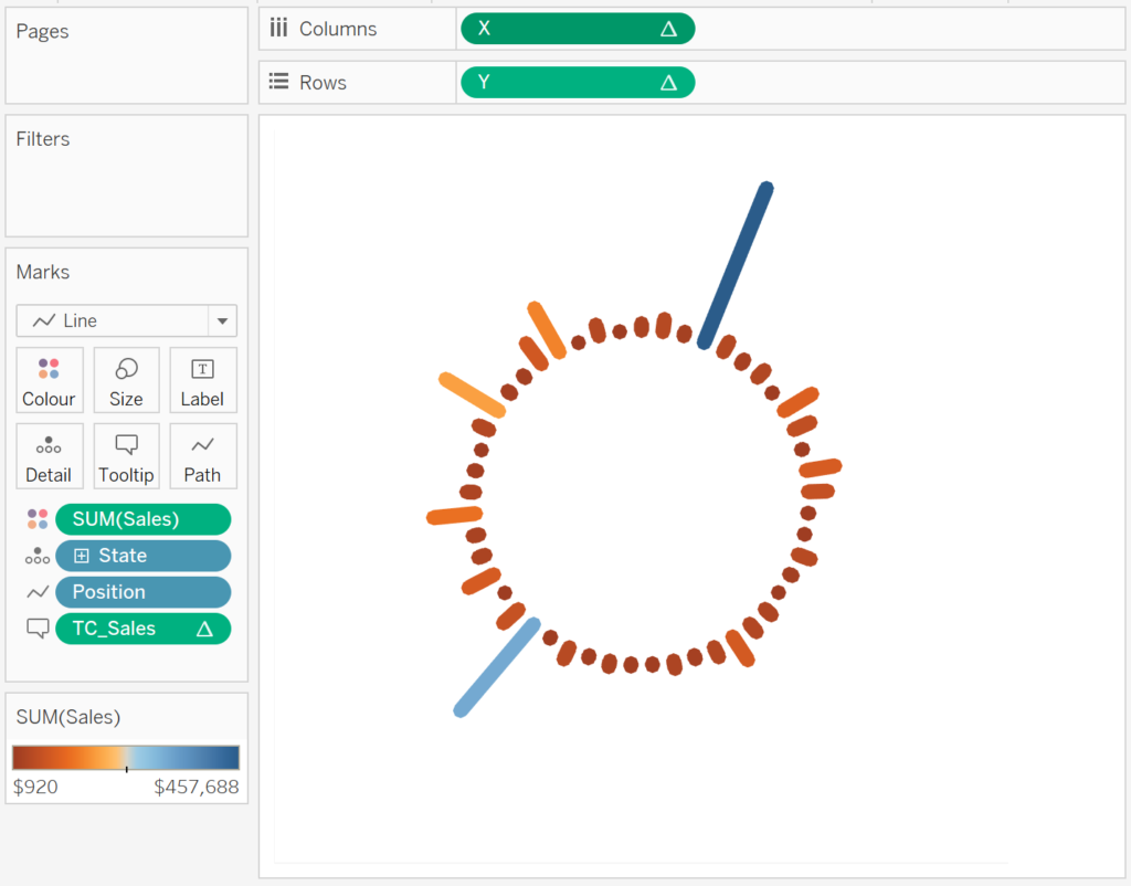
Now we will adjust the Cosmetics:
- Hide the Headers.
- Hide the Grid Lines.
- Hide the Zero Lines.
- Adjust the Size.
- Adjust the Tooltip.
- Adjust the Color.
You will want to end up with something like the following:
and boom, we are done! I hope you enjoyed this tutorial, and as always, you can find this data visualisation on Tableau Public at https://public.tableau.com/profile/toan.hoang#!/vizhome/RadialColumnChart/RadialColumnChart
Summary
I hope you all enjoyed this article as much as I enjoyed writing it and as always do share the love. Do let me know if you experienced any issues recreating this Visualisation, and as always, please leave a comment below or reach out to me on Twitter @Tableau_Magic. Do also remember to tag me in your work if you use this tutorial.
If you like our work, do consider supporting us on Patreon, and for supporting us, we will give you early access to tutorials, exclusive videos, as well as access to current and future courses on Udemy:
- Patreon: https://www.patreon.com/tableaumagic
Also, do be sure to check out our various courses:
- Creating Bespoke Data Visualizations (Udemy)
- Introduction to Tableau (Online Instructor-Led)
- Advanced Calculations (Online Instructor-Led)
- Creating Bespoke Data Visualizations (Online Instructor-Led)


 Table Calculation")


thanks for this. what is the formula for the TC Distance calc?
Thanks for noticing, I have added the TC_Distance calculation to the bog Thank you.
Hi Toan,
How is TC_Distance calculated? I can see it under X and Y calculations but don’t see a separate calculation for TC_Distance. Thank you for this tutorial.
Ignore the previous comment. Found it after I refreshed my page. Thank you.
How come TC_sales and TC_total_sales are alike?
It is the same thing but the Tableau Calculations settings are different.
I’ve started to study your Udemy courses, I’m very happy with it. Thank you !
Is there a way to make the inner circle smaller? I’ve tried Marc Reid’s version, yet to no avail. It would be awesome if we could control its size! Thank you for your amazing posts!