


")


I saw this a while ago and thought that I would write a tutorial about creating Radial Stacked Bar Charts in Tableau; this is a Stacked Bar Chart based on Percentage of Totals but drawn in a circular shape. This was loads of fun to create, so I hope you really enjoy it.
Note: This is an alternative type of data visualisation, and sometimes pushed for by clients. Please always look at best practices for data visualisations before deploying this into production.
Data
We will start by loading the Sample Superstore data into Tableau.
Note: If you have Tableau Desktop, you can use the Sample data source, but if you are using Tableau Public, download and load the following data source.
Once your data is loaded into Tableau, right-click on the data source and click on Edit Data Source… with the Data Source Editor open, paste the following:
Path
1
202
Note: If you are using Tableau 2020.2 or great i.e. have access to new Relationship Model, you will need to double-click on the originally pasted data source to open up before pasting in the Path Data.
You should get an error as there is no joining column, however, click on Add new join clause, go to Create Join Calculation, type 1 and click OK. Do this for the right-hand side as well. Ensure that you have Inner join selected and you should see the following:
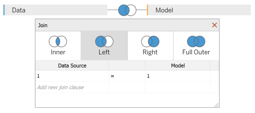
Note: we need additional records as we are going to be drawing lines and using densification to get more points on our canvas. For more information, check out our article on Data Densification.
Calculated Fields
With our data set loaded into Tableau, we are going to create the following Bin and Calculated Fields:
Path (bin)
- Right-click on Path, go to Create and select Bins…
- In the Edit Bins dialogue window:
- Set New field name to Path (bin).
- Set Size of bins to 1.
- Click Ok.
Index
INDEX()-1TC_Step Size
3.6/12TC_Date Part
WINDOW_MAX(MAX(DATEPART('month', [Order Date])))-1TC_Segment Sales
WINDOW_SUM(SUM([Sales]))/2Note: as we are using data densification, we are going to be doubling our values, therefore, we need to divide by to get the correct values.
TC_Total Segment Sales
WINDOW_SUM(SUM([Sales]))/2TC_Percent Segment Sales
[TC_Segment Sales]/[TC_Total Segment Sales]TC_Starting Point
[TC_Date Part]*[TC_Step Size]*100TC_Previous Percentage
RUNNING_SUM([TC_Percent Segment Sales])-[TC_Percent Segment Sales]X
IF [Index] <= 100 THEN
    SIN(RADIANS(([Index]*[TC_Step Size])+[TC_Starting Point]))*(1+[TC_Previous Percentage])
ELSE
    SIN(RADIANS(((201-[Index])*[TC_Step Size])+[TC_Starting Point]))*(1+[TC_Percent Segment Sales]+[TC_Previous Percentage])
END
Y
IF [Index] <= 100 THEN
    COS(RADIANS(([Index]*[TC_Step Size])+[TC_Starting Point]))*(1+[TC_Previous Percentage])
ELSE
    COS(RADIANS(((201-[Index])*[TC_Step Size])+[TC_Starting Point]))*(1+[TC_Percent Segment Sales]+[TC_Previous Percentage])
END
With this done, let us start creating our data visualisation.
Worksheet
We will now build our first worksheet:
- Drag Order Date onto the Filter Shelf and select 2018.
- Change the Mark Type to Polygon.
- Drag Path onto the Columns Shelf.
- Right-click on this object and ensure that Show Missing Values is selected.
- Drag this object onto the Path Mark.
- Drag Segment onto the Colour Mark.
- Drag Order Date onto the Detail Mark.
- Right-click on this object, and convert this to a Discrete Month.
- Drag X onto Columns.
- Right-click on this object, go to Compute Using and select Path (bin).
- Drag Y onto Rows.
- Right-click on this object, go to Compute Using and select Path (bin).
If all goes well, you should now see the following:
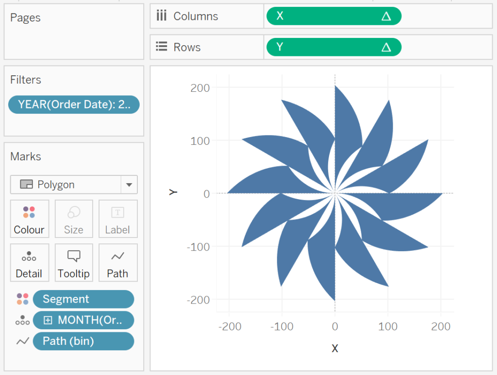
Seriously, how cool is this…!!! However, this is not exactly what we are going for, and I want us to adjust the Table Calculations.
- Right-click on X and go to Edit Table Calculations…
- In Nested Calculations select TC_Previous Percentage.
- In Compute Using select Specific Dimensions, ensure that only Segment is selected.
- In Nested Calculations select TC_Segment Sales.
- In Compute Using select Specific Dimensions, ensure that Segment and Path (bin) is checked and that Segment is on top.
- Set At the level to Deepest, and Restarting every to Segment.
- In Nested Calculations select TC_Total Segment Sales.
- In Compute Using select Specific Dimensions, ensure that Segment and Path (bin) is checked and that Segment is on top.
- Set At the level to Deepest, and Restarting every to None.
- In Nested Calculations select TC_Previous Percentage.
We are going to repeat this for the Y Table Calculation:
- Right-click on X and go to Edit Table Calculations…
- In Nested Calculations select TC_Previous Percentage.
- In Compute Using select Specific Dimensions, ensure that only Segment is selected.
- In Nested Calculations select TC_Segment Sales.
- In Compute Using select Specific Dimensions, ensure that Segment and Path (bin) is checked and that Segment is on top.
- Set At the level to Deepest, and Restarting every to Segment.
- In Nested Calculations select TC_Total Segment Sales.
- In Compute Using select Specific Dimensions, ensure that Segment and Path (bin) is checked and that Segment is on top.
- Set At the level to Deepest, and Restarting every to None.
- In Nested Calculations select TC_Previous Percentage.
If all goes well, you should now see the following:
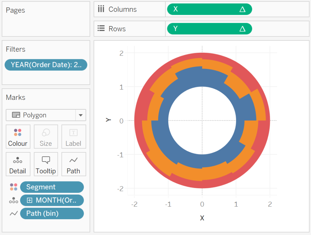
Take some time to research the understand the Table Calculations. Basically:
- We are calculating the Sales for each month for each Segment.
- We are calculating the total Sales for each Month.
- We are calculating the Percentage value for each Segment.
- We are then stacking these onto of each other.
Now, we that said, we just need to adjust the Cosmetics, and we are done.
- Hide the Axis Headers.
- Hide the Zero Lines.
- Hide the Gridlines.
- Add Tooltips.
- Add a White Border.
You should now have the following:
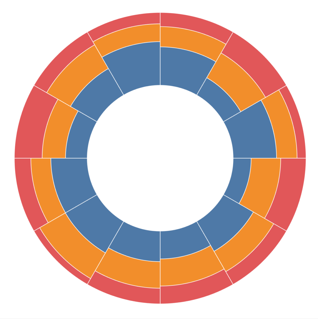
This shows the Percentage split by Sales by Order Month by Segment and boom, we are done! I hope you enjoyed the random accidental art we saw throughout this tutorial, and as always, you can find this data visualisation on Tableau Public at https://public.tableau.com/profile/toan.hoang#!/vizhome/RadialStackedBarCharts_15709881125870/RadialStackedBarCharts
Summary
I hope you all enjoyed this article as much as I enjoyed writing it and as always do share the love. Do let me know if you experienced any issues recreating this Visualisation, and as always, please leave a comment below or reach out to me on Twitter @Tableau_Magic. Do also remember to tag me in your work if you use this tutorial.
If you like our work, do consider supporting us on Patreon, and for supporting us, we will give you early access to tutorials, exclusive videos, as well as access to current and future courses on Udemy:
- Patreon: https://www.patreon.com/tableaumagic
Also, do be sure to check out our various courses:
- Creating Bespoke Data Visualizations (Udemy)
- Introduction to Tableau (Online Instructor-Led)
- Advanced Calculations (Online Instructor-Led)
- Creating Bespoke Data Visualizations (Online Instructor-Led)

 Table Calculation")


Hi Toan,
Big fan of your tutorials. Please keep them coming!
Had a question regarding the present tutorial – Why is the step size taken as 3.6/12
Regards,
John
Each circle has 100 points, so we multiple by 3.6 to get our 360 degree circle. Then as we want 12 slices, we divide by 12.
Got it!
My follow-up question would be – Any particular reason why we chose 100 points?
If I alter the number of points, to say, 200 or 360 and also make necessary changes to the calculated field TC_Starting Point, the viz breaks.
Got it!
My follow-up question would be – Any particular reason why we chose 100 points?
If I alter the number of points, to say, 200 or 360 and also make necessary changes to the calculated field TC_Starting Point, the viz breaks.
I typically use 100 points, but it is a balance between rendering speed and smoothness. You can also tweak the number of points buy adjusting the bins value.
In Nested Calculations select TC_Total Segment Sales.
In Compute Using select Specific Dimensions, ensure that Segment and Path (bin) is checked.
Can be simplified as it.
Thanks for your sharing.
I made a mistake,you are right.
If I have some time this weekend, I will send you across some examples. Please send me an email to toan.hoang@tableau.toanhoang.com
Hi Toan, Really love this viz but I’m having trouble re-creating it with your tutorial. Would you be willing to share this Tableau workbook? When I go to the Tableau Public site I can’t download it. Would certainly appreciate it. Thanks.
-Scott
macdonsc@ohsu.edu
Hi Scott, please send me an email to toan.hoang@tableau.toanhoang.com and I will forward you the workbook tonight.
Hey Toan, Can you please explain at what grannularity the ‘TC_Previous Percentage’ field is getting computed and it’s significance in X, Y calculations.
Hi Rahul, the X and Y coordinates allow us to use data densification to draw our shapes. Thr TC Previous Percentage is used as a look up to know where the shapes are relative to each other.
I looked at the calculated measure created above as a crosstab to understand these calculations better and figured this is same as PREVIOUS_VALUE(0) + ZN((LOOKUP(TC_Percent Segment Sales, -1))) when calculated using dimension ‘Segment’. However I’m still not able to understand how RUNNING_SUM([TC_Percent Segment Sales])-[TC_Percent Segment Sales] is doing the same thing.
Think about what running sum will do, it is a cumulative sum. However, if we subtract the current value, it will give us the cumulative value excluding the current.
//RUNNING_SUM([TC_Percent Segment Sales])-[TC_Percent Segment Sales]
//ZN(LOOKUP(RUNNING_SUM([TC_Percent Segment Sales]),-1))
//ZN(LOOKUP(([TC_Percent Segment Sales]+PREVIOUS_VALUE(0)),-1))
Three expressions are equal
Really awesome vizzes and very creative
Thank you 🙂
In Nested Calculations select TC_Segment Sales.
In Compute Using select Specific Dimensions, ensure that Path (bin) is checked.
Can be simplified as it.
Thanks for your sharing.
please help me, i need labels to be displayed likes sale of each segment and category.
what is the logic behind , path? why is it 1 and 202 here and 1 and 271 in radial bar chart?
Hi Rajeev, it depends on the degrees that I want to draw. Do I want 270 points around a circle? (3 quarters) or 100 points.
i need labels to be displayed likes sale of each segment and category, can you elaborate on it
You can try annotations as a form of labelling, this is really more for interactive dashboards, so tool tips as opposed to labels.
totally agree with that, thank you 🙂
Hi Toan! Thanks for sharing this amazing tutorial. I was just trying to add the text labels to each segment but couldn’t find a way to do it. Is there any way to add the labels on each segment? Thanks!!
Hi Luciano, when it comes to bespoke data visualisation, labels are tough. For the most part, you can either try tooltips or annotation.
Hi Toan! Thanks for your all great sharings, I really tap into them. I was able to create this visualization with 115 slices and each one stands for a year but I want first year to start from “12” o’clock position but it located around “8” o’clock. You think is there any way to change this starting point? B’cuz Tableau doesn’t let me spin it around. 🙂
You can try adding a fixed number to the TC_Date Part, that should push things around.
That worked! thank you so much..
Your welcome 🙂