


")


If you have looked at the various tutorials on drawing in Tableau, you would have noticed a commonly used technique called Data Densification. While I used this topic, the vast majority of my questions and emails are related to this and more importantly how can developers perform data densification on their own data sets. In this article, I will go through what Data Densification is in-depth and how we can apply this to our data sets and SQL statements.
Data Densification
Densification is defined by Websters as increasing the density of something. Data Densification is therefore to increase the density of data. In real-terms it means adding additional data points for our data set.
So let us build our knowledge of densification by going through an example by loading the following data into Tableau Desktop / Public.
| Value |
| 0 |
| 360 |
Once loaded
- Right-click and convert Value into a Dimension
- Drag Value onto Rows.
You will see the following:
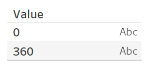
As you can see we now have two data points, but what if we want additional data points, for example, we want evenly spaced data points between 0 and 360?
- Right-click on Value, go to Create and select Bins.
- Set New field name to Value (bin).
- Set Size of bins to 20.
- Click OK.
- Replace Value with Value (Bin).
- Right-click on the object and ensure that Show Missing Values is selected.
You should see the following:
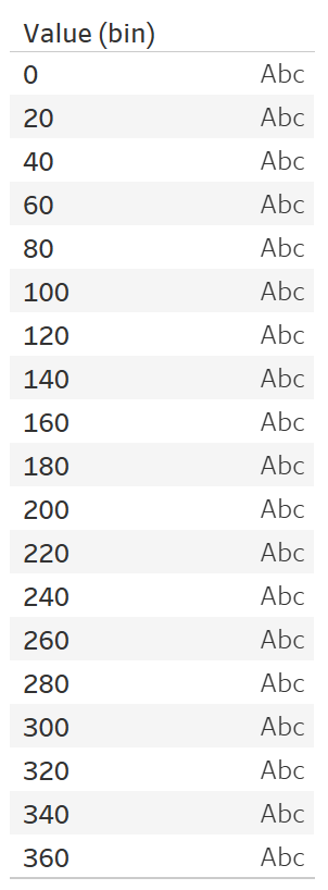
As you can see we have created what appears to be additional data points. However, if we drag Value into Text we get the following:
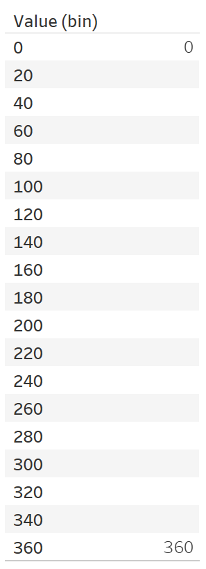
As you can see this is not entirely desired, but that is because there are only two values in our data set regardless of the Bins splits. Now let us do the following:
- Create a Calculated Field called Index with the following formula: INDEX()-1.
- Drag Index onto Text.
You will now get the following:
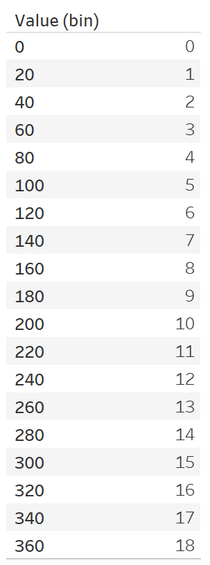
Because we are now using the INDEX Table Calculation we can now create additional points that we can work with for additional calculations. Now we are going to draw something to demonstrate the possibilities.
- Right-click on Value (bin) and select Edit.
- Set Size of bins to 1.
- Click OK.
- Create a new Calculated Field called Y with the following formula: SIN(RADIANS([Index]))
- Clear a new Worksheet.
- Change the Mark Type to Line.
- Drag Value (bin) to Columns.
- Right-click on the object and ensure that Show Missing Values is selected.
- Drag this object onto Detail.
- Drag Index onto Columns.
- Right-click on this object, go to
Compute Using and select Value (bin).
- Right-click on this object, go to
- Drag Y onto Rows.
- Right-click on this object, go to
Compute Using and select Value (bin).
- Right-click on this object, go to
If all goes well you should now see teh following:
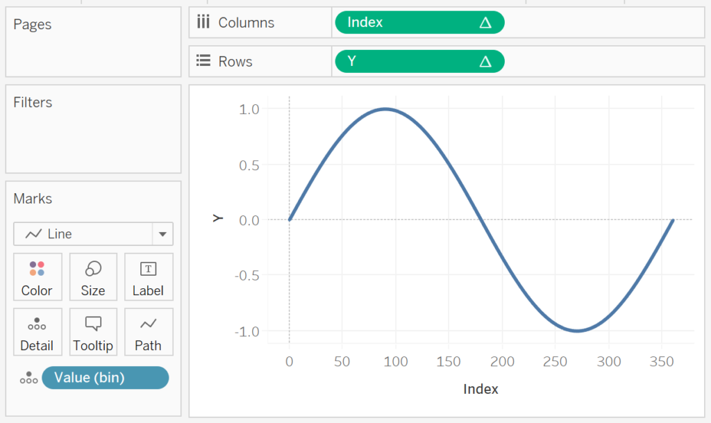
Note: the compute using ensures that Value (bin) is our visualisation by the Index and Y Table Calculations.
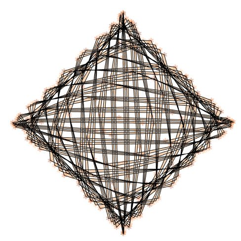
In this example, we are drawing a simple SIN curve, however, the following was drawn using the same data set.
Data Set Preparation
Thus far, we have explored the ability to create additional data points. If you have had a chance to go through some of my drawing tutorials, you would see something like the following:
| Country | Value | Path |
| United Kingdom | 80 | 1 |
| United Kingdom | 80 | 360 |
| United States | 100 | 1 |
| United States | 100 | 360 |
| Germany | 150 | 1 |
| Germany | 150 | 360 |
As you can see, we have two rows per data file, as we have a Path column that will enable our Data Densification. We will need to get our data into this shape, and for the rest of this article, we will look
Database Tables / Database Cartesian Join
Create a database table called Data as
| Country | Value |
| United Kingdom | 80 |
| United States | 100 |
| Germany | 150 |
Create a database table called Densification as:
| Path |
| 0 |
| 360 |
Perform a Cartesian join at a Database level / or Custom SQL in Tableau by writting the following:
SELECT
	*
FROM
	Data
	JOIN Densification
As you have not specified a join condition, you will perform a Cartesian join between the two data sources, which is where all the records in Data will join with all the records in the Densification table.
Be extremely careful with Cartesian Joins. If you have 1,000 records in table A and 1,000 records in table B and perform a Cartesian Join, your result will have 1,000,000 records.
Note: This will require the creation of an additional Densification Table in the database which could be troublesome.
Database Table / Tableau Cartesian Join
You cannot perform the Cartesian join within Tableau as they only allow INNER LEFT, RIGHT and OUTER. However, we can use a workaround which requires a slight modification to our tables slightly. Create a database table called Data as
| Country | Value | Link |
| United Kingdom | 80 | 1 |
| United States | 100 | 1 |
| Germany | 150 | 1 |
Create a database table called Densification as
| Path | Link |
| 0 | 1 |
| 360 | 1 |
Load both tables in Tableau and perform an INNER join using the LINK columns to create the desired results.
Custom SQL in Tableau
This is actually my favourite technique as it does not require a Densification table to be created. Create a database table called Data as
| Country | Value |
| United Kingdom | 80 |
| United States | 100 |
| Germany | 150 |
In Tableau, write the following Custom SQL Statement:
SELECT
	*
FROM
	Data
	JOIN (SELECT 1 as PATH UNION SELECT 360) Densification
The following will create us our desired results.
Summary
I hope you all enjoyed this article as much as I enjoyed writing it, if so, please do share this article with fellow Tableau addicts and spread the love. Do let me know if you experienced any issues recreating this Visualisation, and as always, please leave a comment below or reach out to me on Twitter @Tableau_Magic.
If you like our work, do consider supporting us on Patreon, and for supporting us, we will give you early access to tutorials, exclusive videos, as well as access to current and future courses on Udemy:
- Patreon: https://www.patreon.com/tableaumagic
Also, do be sure to check out our various courses:
- Creating Bespoke Data Visualizations (Udemy)
- Introduction to Tableau (Online Instructor-Led)
- Advanced Calculations (Online Instructor-Led)
- Creating Bespoke Data Visualizations (Online Instructor-Led)
 Table Calculation")


Is there any tips on what particular value we need to use for the “path”?
The main thing to reenter is that the difference in path number and the size of your Bin goes hand in hand.
Hi Thanks for the great viz, I tried to generate Path and position using LOD
if [Id]= {FIXED [Party],[Type]: MIN([Id])}then 360 else 1 end
However, I did not succeed to get the right numbers as shown on the website. any hints?
thanks
in the double donut example!
Hi Toan,
I love the possibilities with the charts you can make after using the densification methods you describe here. I really want to use either the cylinder progress bars or the thermometer chart. My main hiccup is that I don’t understand how to use the path column when I am using data from daily sales reports that I am combining using Prep Builder. Do you have any tips?
Yes, ping me an email to admin@tableau.toanhoang.com and I will send you a sample workbook.
[…] Data Densification for Tableau Drawing […]
[…] Note: we need two records for each Country as we are going to be drawing lines and using densification to get more points on our canvas. For more information, check out our article on Data Densification. […]
This is a great chart and I am able to see the use when analyzing survey data. The challenge is to add labels and titles to the chart, not only have them available in the tooltips. If this a polygon chart how would you resolve the labels problem?
I have experimented with using lines or adding points with values, it is possible but tricky.
I have a huge dataset with multiple sheets in the dashboard, however is there any way to apply data densification only for a selected sheet to create some advanced charts & not apply it on other sheets ?
Hi Santosh, if you are doing data densification, it is always advisable to build data sources with the minimum required data in order to ensure that your dashboard performs well. For example, I have had multiple data sources, one for my bespoke, and another for my details.
Hi friend.
You missed one step:
As you can see we have created what appears to be additional data points. However, if we drag Value (YOU MUST RETURN “VALUE” TO MEASURE”) into Text we get the following:
Regards