


")


As a fun little treat, and for supporting me through Patreon, you can find downloadable links to my workbooks below. Note that I will keep this updated when I create something very cool.
1. Dexter’s Kill Count
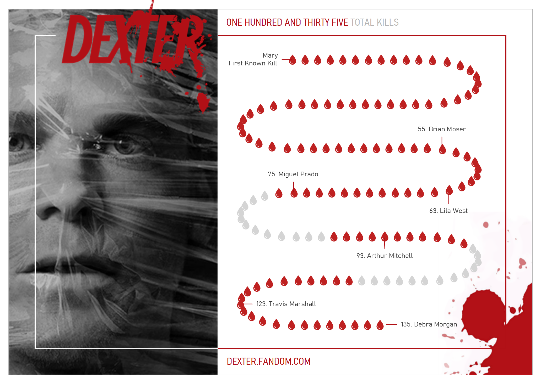
Dexter is one of my favourite TV Shows, sure, it did go downhill towards the end of the series, however, I still rewatch the first few seasons. Being inspired by the recent work of Judit Bekker, I decided to create a data visualisation charting Dexter’s 135 kills.
Based on data from the Fandom, I collated this information and then built a Path Chart to show the progression of kills; I hope you enjoy playing around with this data visualisation.
2. Democrat Primary 2020 – Race for the Whitehouse
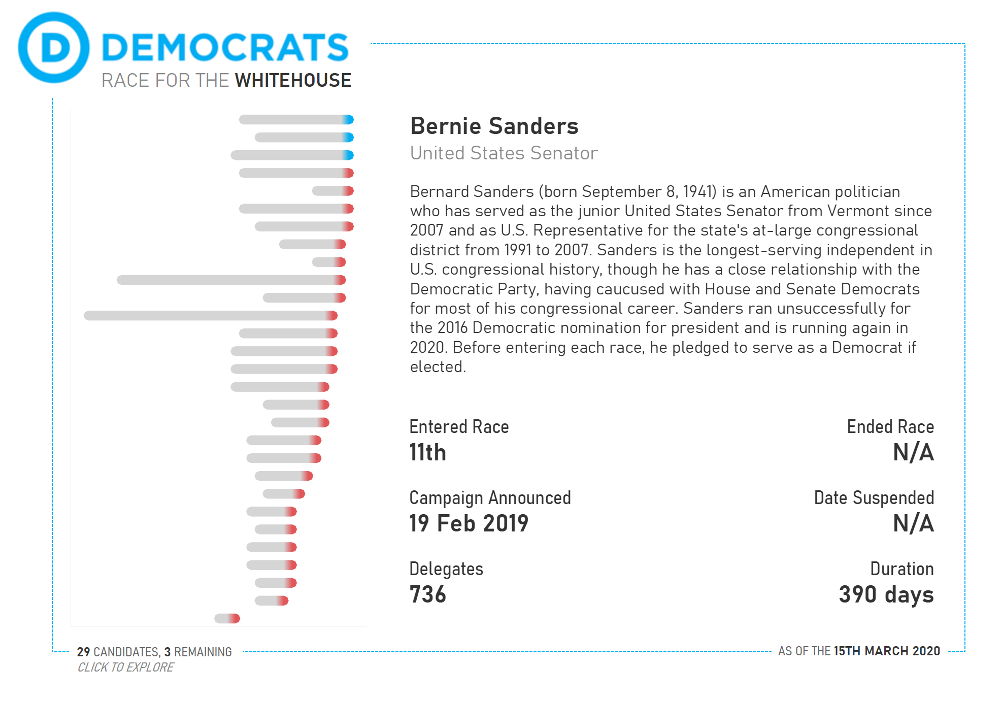
I have been following the 2020 Democrat Primary race very closely, and finally decided to build a data visualisation to show the candidates as well as additional details. Using Wikipedia, I collected a bio, position entered and suspended, entered and suspended dates, the number of delegates gained and finally the duration of the campaign.
On the left-hand side, I also created a data visualisation to show the date entered and suspended. The red indicates as a terminated race, and then blue indicates that the candidate is still in the race, yes, we still have Joe Bernie, Joe Biden and Tulsi Gabbard.
3. US Women History Miles – A Timeline
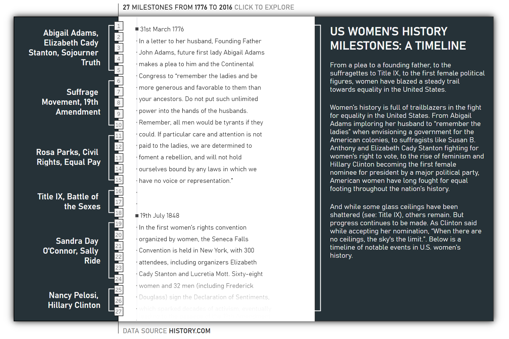
For 2020, one of my goals is to create a dashboard each month for my personal #VizInPolitcs and #VizInHistory challenge. I have been talking to my wife about the feminist movements of the early 20th century and decided to create the following visualisation based on an article I found on the History.com.
I wanted something that would stand out, so I gave the centrepiece the look and feel of a notebook. I also wanted to make use of the new 2020.1 Viz Animation features, so I included a nice scroll function which is activated by a Parameter Actions. Do check this one out.
4. #MakeoverMonday – Week 9, 2020 – Costing Kids Sleep
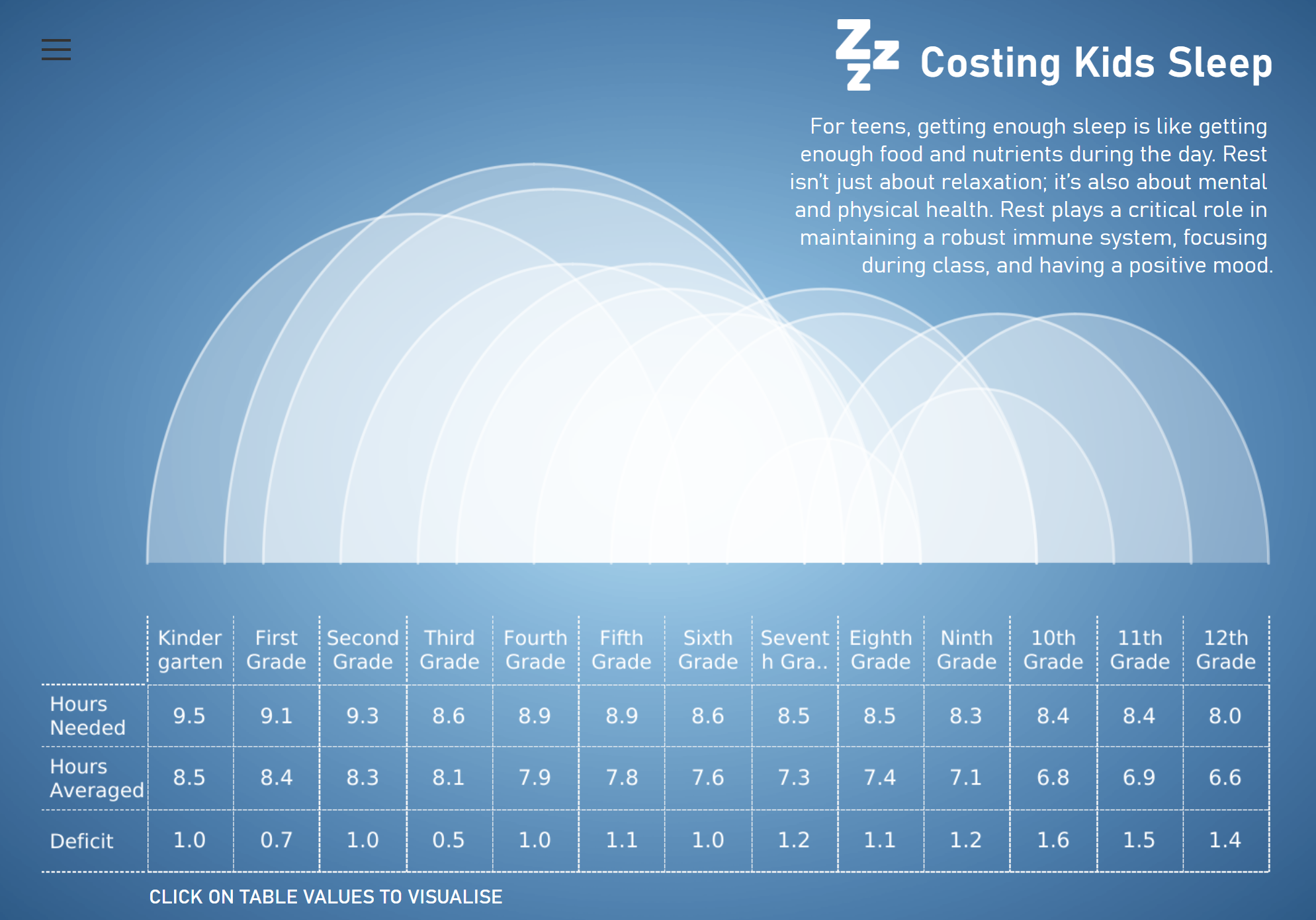
I have to admit that I do not participate in #MakeoverMonday as much as I should. However, when I see an opportunity to have fun with one of my tutorials, I like to take that opportunity with both hands.
For week 9, 2020, the topic was Kids sleep deficit and once I read the topic, all I could picture was white clouds on a blue background.
So naturally, I created a blue circle gradient background using data densification and then used my half-circle timelines to create the cloud effect. To add some additional context, I placed a table underneath with the Hours Needed, Hours Averaged, Deficit, and topped this off with a Set Action to change the colour of the cloud that is selected.
It is not an amazingly functional Data Visualisation, but it sure is pretty, and the goal of this one was to have fun.
5. UK Election History 1900-2020
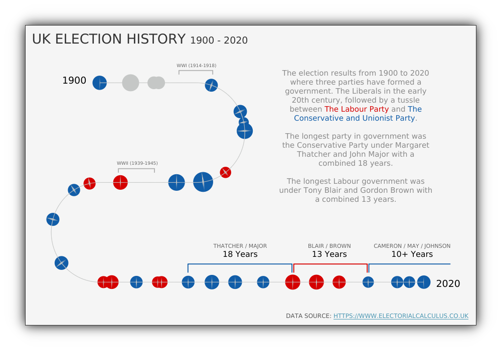
For 2020, one of my goals is to create a dashboard each month for my personal #VizInPolitcs and #VizInHistory challenge. I find politics extremely interesting and have been following Brexit, the UK Election and the US elections. For my first #VizInPolics / #VizInHistory I decided to create a visualisation from data that I found on the Electoral Calculus website.
Given that we are looking at a timeline, I really wanted a Path Chart, a chart type that I had not built before, so I wanted to have a go at it. Given the shape of the path, this was highly hardcoded, however, I was able to refine this into a full Path Tutorial. As an extra surprise, I also found that I got these little lines between the circle, which surprised me, but I decided to keep them in.
6. #MakeoverMonday – Week 4, 2020 – Bridges to Prosperity 2010/2020
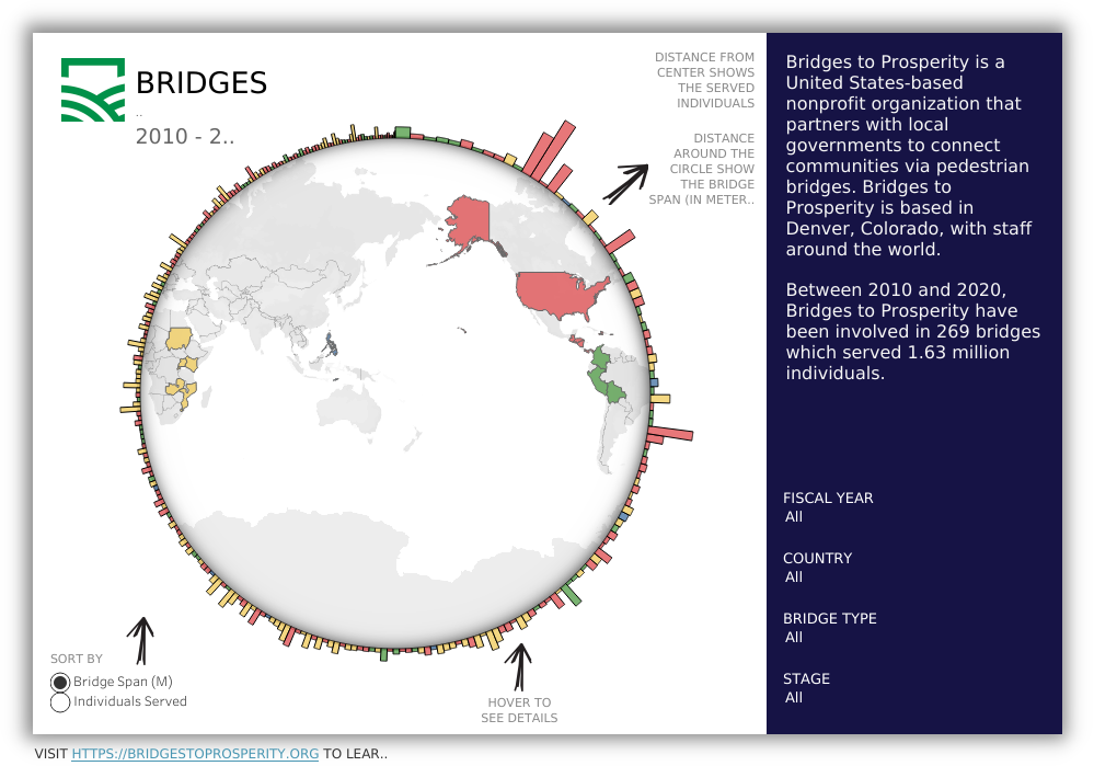
For this #MakeoverMonday, I wanted to create something new, so I used this as an excuse to create a Squared Radial Bar Chart, yep, to this point I had to not created this before, but any excuse to figure out a new chart type right; the full tutorial was released in March 2020.
This data visualisation also required some work in Gimp to create a background image; this contained the shadow, the white background, and a transparent circle so that the Map can shine through. While there was a lot of discussion about this, I think it is pretty neat and cool to create.
7. Premier League 2018/2019 – The Rise and Fall
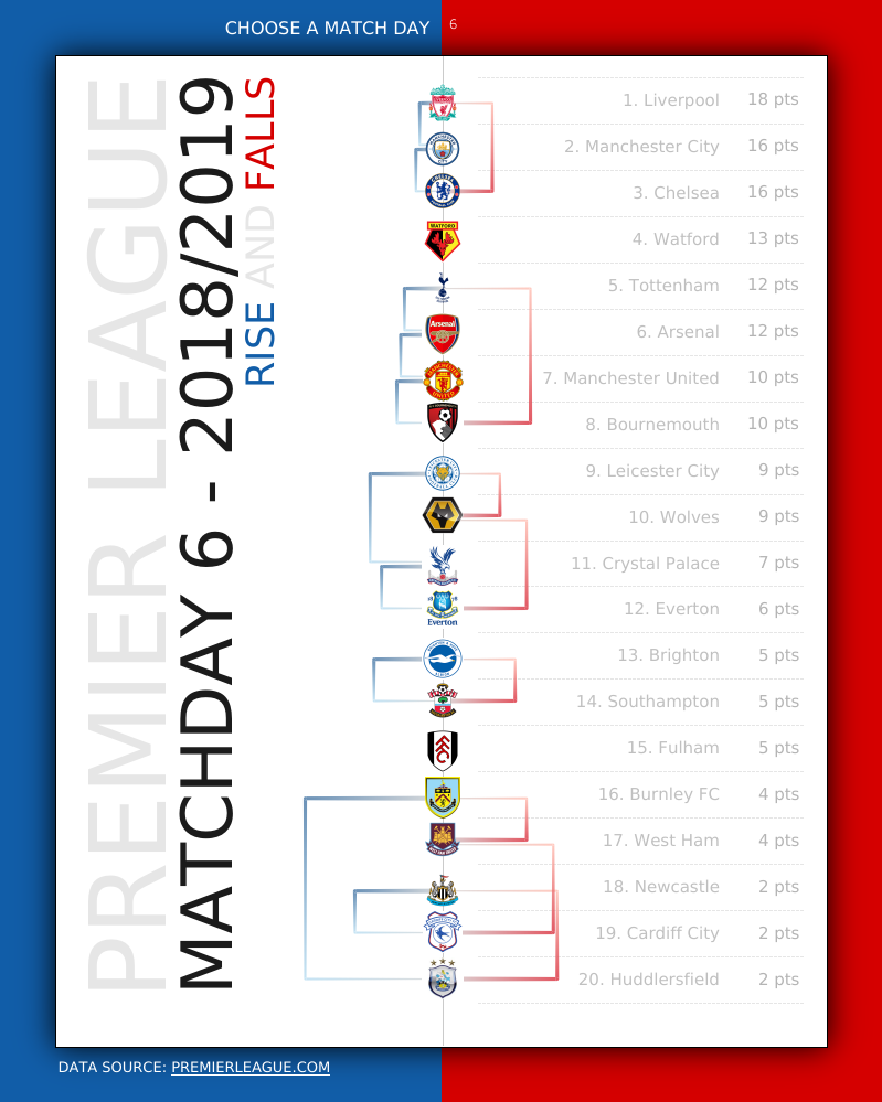
I am a football fan and do enjoy going to various matches; I do not follow any particular club, but the sport in general. So with the 2019/2020 league coming to a close in a few months, I wanted to create several data visualisations in preparation. I already had the 2018/2019 data set, so thought I would have some fun, and at the same time, explore creating Square Arc Charts; a full tutorial is due in March 2020.
The key aspect here is the Square Arc Charts on either side of the Club Crest. The left arcs (blue) being the rises, and the right arcs (red) being the falls. I also added some extra growth factors to ensure that the lines are clearly seen. One of the best things is the Tableau 2020.1 Viz Animation feature that makes this data visualisation look super cool.
8. How Contagious is the Coronavirus?
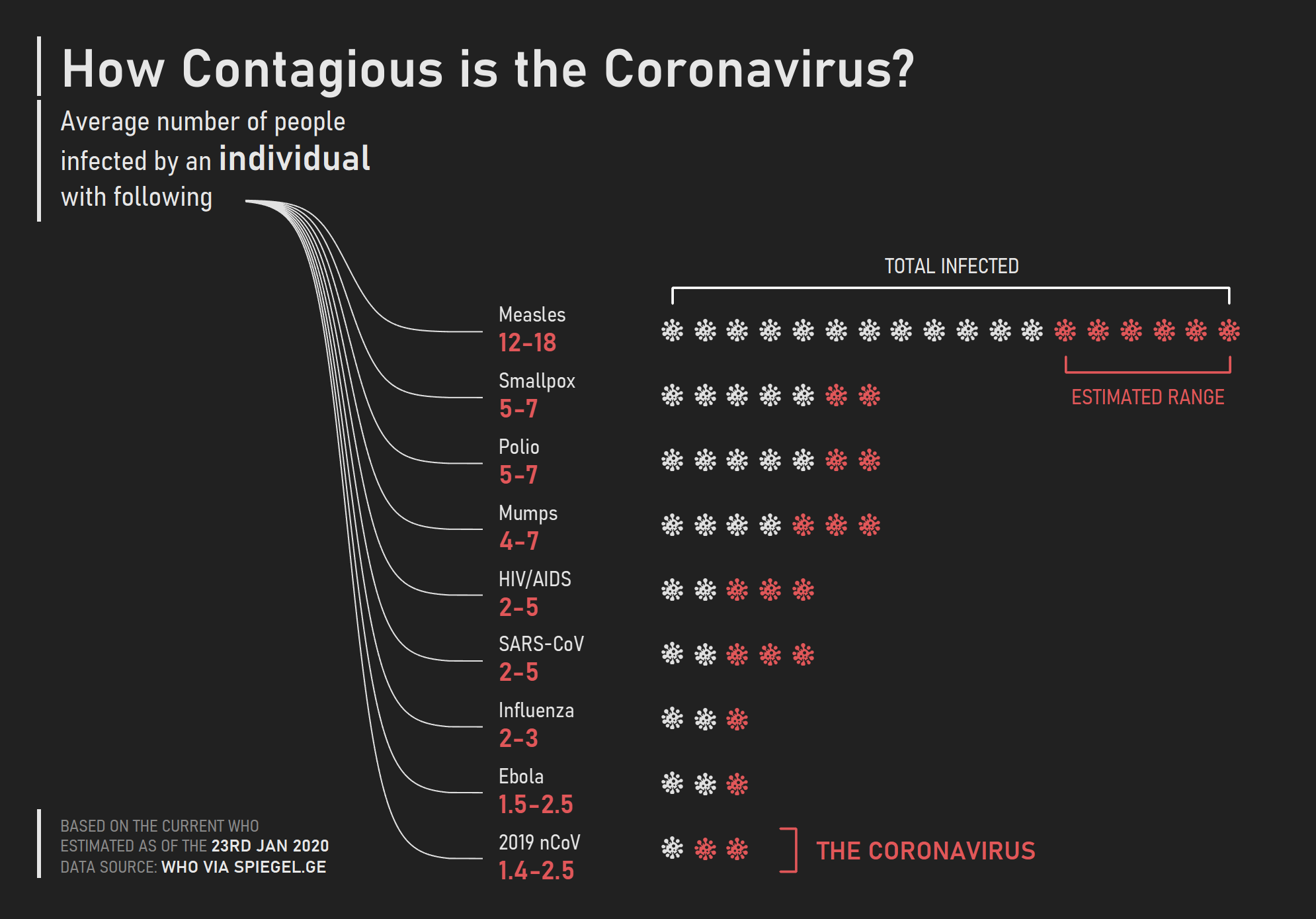
A student shared an image with me and asked how I would visualise this in Tableau using some cool Bespoke techniques. I think that public health is extremely important, however, one of the most dangerous things is the breakdown of society that often accompanied by mass hysteria.
Is this dashboard, I choose a dark background, leveraged a modified Dendrogram Chart, as well as a Shaped Bar Chart with a virus icon. I also highlighted the expected infections by an individual as well as the estimated range.
9. To Know Me
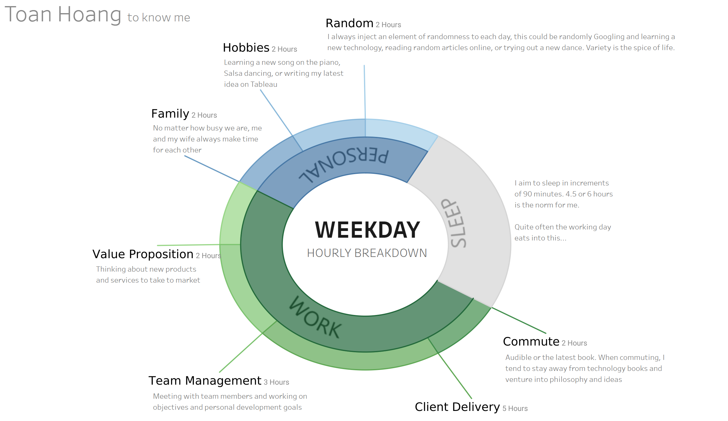
I created this data visualisation to experiment labelling a Sunburst Chart, but also as a part of my interactive Tableau Resume; I will be finishing this soon, however, I thought you might enjoy seeing how this was put together.
In this dashboard, I created this using my Sunburst tutorial, but with a small change. I added an extra point to create the extra line. The Label did not quite work, so it is floating text, but I will be looking to complete this in 2020.
Muchas Gracias Toan, Me preguntaba donde puedo obtener los libros actuales,