

Tableau Magic has experienced a fantastic launch and I am extremely grateful for your support. One of the ways I have been monitoring the growth of Tableau Magic is via Google Analytics, and via the Audience Cohort Analysis. Cohort Analysis is a subset of behavioural analytics and works by creating subsets of your total and looking at patterns. Google Analytics Audience Cohort Analysis allowed me to see the number of people who returns in subsequent weeks. I am not a huge fan of the visualisation of this data so decided to create a Drop Off Sankey Chart in Tableau. In this tutorial, we will go through the step by step process to create this.
Note: This is an alternative type of data visualisation, and sometimes pushed for by clients. Please always look at best practices for data visualisations before deploying into production.
Data
Load the following data into Tableau Desktop / Public.
| Date | Segment | Percentage | Path |
| 1 | Members | 1 | 0 |
| 1 | Members | 1 | 101 |
| 2 | Members | 0.7 | 0 |
| 2 | Members | 0.7 | 101 |
| 2 | Leavers | 0.3 | 0 |
| 2 | Leavers | 0.3 | 101 |
| 3 | Members | 0.5 | 0 |
| 3 | Members | 0.5 | 101 |
| 3 | Leavers | 0.2 | 0 |
| 3 | Leavers | 0.2 | 101 |
| 3 | Ex Members | 0.3 | 0 |
| 3 | Ex Members | 0.3 | 101 |
| 4 | Members | 0.4 | 0 |
| 4 | Members | 0.4 | 101 |
| 4 | Leavers | 0.1 | 0 |
| 4 | Leavers | 0.1 | 101 |
| 4 | Ex Members | 0.5 | 0 |
| 4 | Ex Members | 0.5 | 101 |
Note: we need two records for each Country as we are going to be drawing lines and using densification to get more points on our canvas. For more information, check out our article on Data Densification.
Calculated Fields
With our data set loaded into Tableau, we are going to create the following Calculated Fields, Bins and Parameters:
Create Path (bin)
- Right click on Path, go to Create and select Bins…
- In the Edit Bins dialogue window:
- Set New field name to Path (bin).
- Set Size of bins to 1.
- Click Ok.
Create a Parameter called Total Population
- Set Name as Total Population.
- Set Data type as .
- Set Current value as 11,545.
Create a Parameter called Sigmoid Size Factor
- Set Name as Sigmoid Size Factor.
- Set Data type as .
- Set Current value as 4.
- Set Allowable values as List.
- Add Value 1, and Display as 1.
- Add Value 2, and Display as 2.
- Add Value 4, and Display as 4.
- Add Value 8, and Display as 8.
- Add Value 12, and Display as 12.
Now let us create the following Calculated Fields:
Index
INDEX()-1TC_Percentage
WINDOW_MAX(MAX([Percentage]))TC_Curve Height
(1 /(1+EXP(-6))* (1/[Sigmoid Size Factor]))TC_Label
[TC_Percentage]*[Total Population]TC_Lookup -1
LOOKUP([TC_Percentage],-1)TC_Lookup -2
LOOKUP([TC_Percentage],-2)X
((IF [Index] < 51 THEN [Index] ELSE 101-[Index] END)*2*0.12)-6Y
IF WINDOW_MAX(MAX([Segment])) = "Members" THEN
    IIF([Index] < 51,0,[TC_Percentage])
ELSEIF WINDOW_MAX(MAX([Segment])) = "Leavers" THEN
    IF [Index] < 51 THEN
        1 /(1+EXP(-[X]))* (1/[Sigmoid Size Factor])
    ELSE
        (1 /(1+EXP(-[X]))* (1/[Sigmoid Size Factor]))+([TC_Percentage])
    END
    +[TC_Lookup -1]
ELSE
    IIF([Index] < 51,0,[TC_Percentage])
    +[TC_Lookup -1]+[TC_Curve Height]
    +[TC_Lookup -2]
END
Let us take a moment and look at this Calculation:
- We have an IF ELSE clause that handles Members, Leavers and differently.
- Members are the easiest segment where we either have the Percentage or Zero.
- Leavers require us to draw a curve based on the Sigmoid function. We use the Sigmoid Size Factor to adjust the side of the segment. We also add the previous value using Lookup -1 to position our segment correctly.
- are created by drawing a square and then adding the values for both previous segments as well as the curve height.
So now that we have created a lot of Calculated fields, we will now put this together into a Worksheet.
Worksheet
We will now build our worksheet:
- Change the Mark Type to Polygon.
- Drag Segment onto Color.
- Right-click on the object and click on Sort…
- Select Manual Sort and have the following Order:
- Members
- Leavers
- Ex Members
- Drag Path (bin) to Columns.
- Right-click on the object, ensure that Show Missing Values is checked.
- Drag this object onto the Path Mark.
- Drag X onto Columns.
- Right-click on the object, go to ompute Using and select Path (bin).
- Drag Y onto Rows.
- Right-click on the object, go to mpute Using and select Path (bin).
- Right-click on the Object and click on Edit Tableau Calculations.
- For Nested Calculations TC_Lookup -1, in Compute Using, check Segment.
- For Nested Calculations TC_Lookup -2, in mpute Using, check Segment.
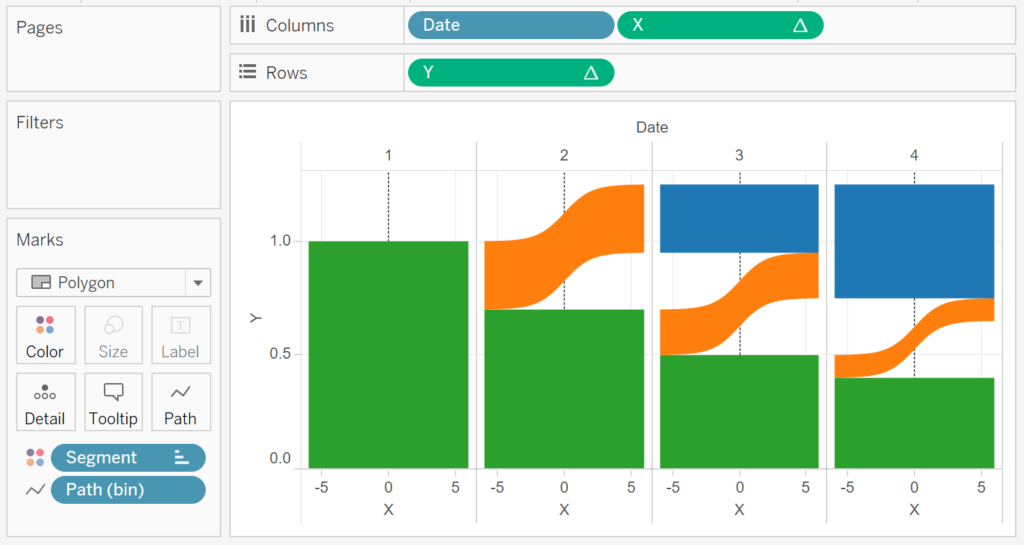
If all goes well, you should now see the following:

Now we can adjust the cosmetics to get the look and feel that we desire:
- In the Data Pane, right click on the Date object and select Aliases…
- Edit the Alias Value by putting Week in front of the Date Number.
- Fix the value of the X-Axis to be from -6 to 6.
- Hide the X-Axis header.
- Reverse the Y-Axis.
- Hide the Y-Axis header.
- Remove all Gridlines.
- Edit the Colors of the Polygons.
- Add Tooltips.
If all goes well, you should now see the following:

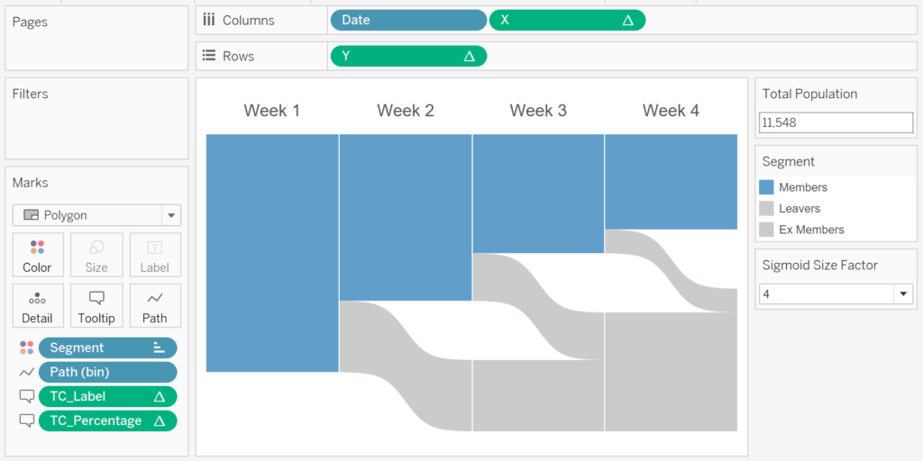
and boom, we are done. We can now see, for a given initial population, what percentage of people (or members) come back in week 2, 3 and 4, and how many people drop off and at which week.
Imagine the following scenarios:
- Gym membership: For those who joined in January, how many are still members and how many members off.
- Website Page Views: For a given landing page, how many additional pages are viewed before dropping off.
You can find my copy of this Visualisation on Tableau Public at https://public.tableau.com/profile/toan.hoang#!/vizhome/DropOffSankey/DropOffSankey
Summary
I hope you all enjoyed this article as much as I enjoyed writing it and as always do share the love. Do let me know if you experienced any issues recreating this Visualisation, and as always, please leave a comment below or reach out to me on Twitter @Tableau_Magic.
If you like our work, do consider supporting us on Patreon, and for supporting us, we will give you early access to tutorials, exclusive videos, as well as access to current and future courses on Udemy:
- Patreon: https://www.patreon.com/tableaumagic
Also, do be sure to check out our various courses:
- Creating Bespoke Data Visualizations (Udemy)
- Introduction to Tableau (Online Instructor-Led)
- Advanced Calculations (Online Instructor-Led)
- Creating Bespoke Data Visualizations (Online Instructor-Led)