

I do like having some fun with Tableau and in this we are going to use Data Densification to draw a simple WiFi Symbol. This will be quick, fun and hopefully will introduce some new techniques.
Note: As always never choose a data visualisation type and try to fit your data into it, instead, understand your data and choose the best visualization for your data consumers.
Data
Load the following data into Tableau Desktop / Public.
| Ring | Level | Path |
| A | 1 | 0 |
| A | 1 | 181 |
| B | 2 | 0 |
| B | 2 | 181 |
| C | 3 | 0 |
| C | 3 | 181 |
Note: we need two records for each Country as we are going to be drawing lines and using densification to get more points on our canvas. For more information, check out our article on Data Densification.
Calculated Fields
With our data set loaded into Tableau, we are going to create the following Calculated Fields, Bins and Parameters:
Create Path (bin)
- Right click on Path, go to Create and select Bins…
- In the Edit Bins dialogue window:
- Set New field name to Path (bin).
- Set Size of bins to 1.
- Click Ok.
Create a Parameter called Width
- Set Name as Width.
- Set Data type as Float.
- Set Current value as 0.3.
Let us now create the following Calculated Fields.
Index
INDEX()-1TC_Starting Point
WINDOW_MAX(
    MAX(
        IF [Level] = 1 THEN
            0.2
        ELSEIF [Level] = 2 THEN
            0.6
        ELSE
            1
        END
    )
)
X
IF ([Index] < 91) THEN
    SIN(RADIANS([Index]))*[TC_Starting Point]
ELSE
    SIN(RADIANS(181-[Index]))*([TC_Starting Point]+[Width])
END
Y
IF ([Index] < 91) THEN
    COS(RADIANS([Index]))*[TC_Starting Point]
ELSE
    COS(RADIANS(181-[Index]))*([TC_Starting Point]+[Width])
END
So now that we have created a lot of Calculated fields, we will now put this together into a Worksheet.
Worksheet
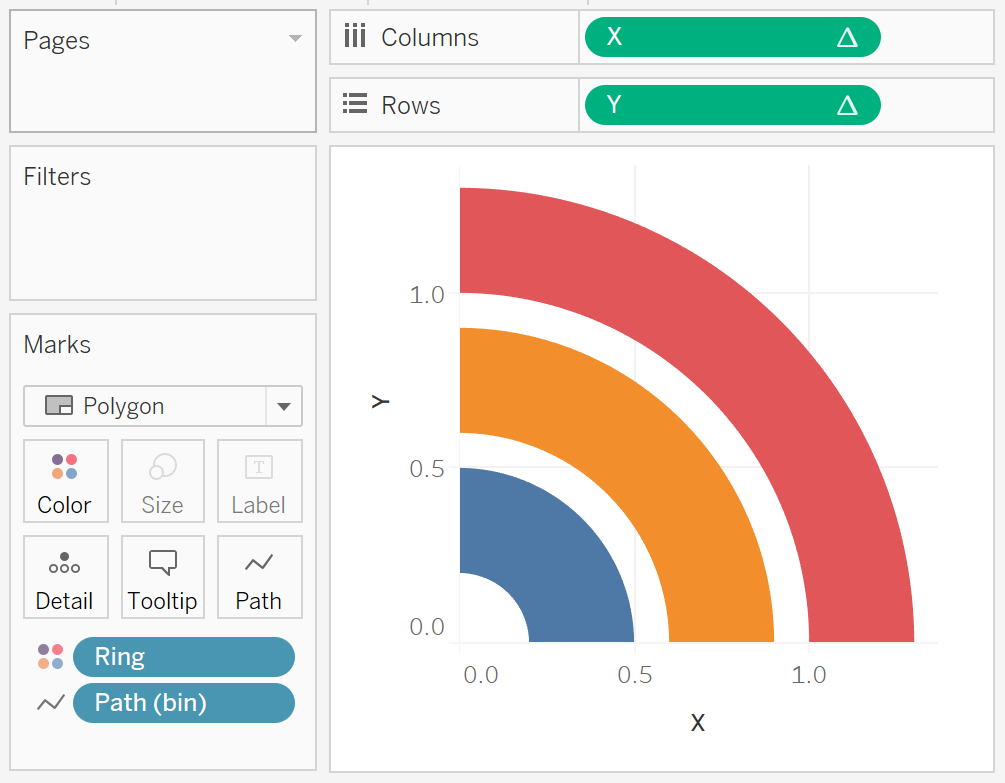
We will now build our worksheet:
- Change the Mark Type to Polygon.
- Drag Path (bin) onto Columns.
- Right-click on the object, and ensure that Show Missing Values is checked.
- Drag this object onto the Path Mark.
- Drag Ring onto Color.
- Drag X onto Columns.
- Right-click on the object, go to te Using and select Path (bin).
- Drag Y onto Rows.
- Right-click on the object, go to pute Using and select Path (bin).
If all goes well you should now see the following:

Now we just need to adjust the cosmetics:
- Remove the Gridlines.
- Remove the Axis R.
- Hide the Axis headers.
- Modify the Color.
and here you go…


and boom, we are done. You can find this visualisation on Tableau Public at https://public.tableau.com/profile/toan.hoang#!/vizhome/WiFi_4/WiFi
Now, while this may look like this is just for fun, given we have transparent backgrounds, we can create a dynamic version of this visualisation as a background for a Scatter plot, as an example.
Summary
I hope you all enjoyed this article as much as I enjoyed writing it. Do let me know if you experienced any issues recreating this Visualisation, and as always, please leave a comment below or reach out to me on Twitter @Tableau_Magic.
If you like our work, do consider supporting us on Patreon, and for supporting us, we will give you early access to tutorials, exclusive videos, as well as access to current and future courses on Udemy:
- Patreon: https://www.patreon.com/tableaumagic
Also, do be sure to check out our various courses:
- Creating Bespoke Data Visualizations (Udemy)
- Introduction to Tableau (Online Instructor-Led)
- Advanced Calculations (Online Instructor-Led)
- Creating Bespoke Data Visualizations (Online Instructor-Led)