


")


As of 2019.2, Tableau now has the MakePoint and MakeLine Functions that makes this process a lot easier. I would recommend using the technique described in this tutorial only if you are using an older version. You can find my article on Tableau 2019.2 MakePoint and MakeLine HERE
I have not done enough work on Maps, but fear not, I plan to do a lot more in 2019. This tutorial will focus on drawing Arc Maps in Tableau and show a nice curve as opposed to straight lines between points. This should be a quick and fun read, so get ready and enjoy.
Note: As always never choose a data visualisation type and try to fit your data into it, instead, understand your data and choose the best visualization for your data consumers.
Data
Load the following data into Tableau Desktop / Public.
| Flight | End Lat | End Long | Start Lat | Start Long | Path |
| London-Berlin | 52.520007 | 13.404954 | 51.507351 | -0.127758 | 0 |
| London-Berlin | 52.520007 | 13.404954 | 51.507351 | -0.127758 | 90 |
| London-Dublin | 53.349805 | -6.26031 | 51.507351 | -0.127758 | 0 |
| London-Dublin | 53.349805 | -6.26031 | 51.507351 | -0.127758 | 90 |
| London-Madrid | 40.416775 | -3.70379 | 51.507351 | -0.127758 | 0 |
| London-Madrid | 40.416775 | -3.70379 | 51.507351 | -0.127758 | 90 |
| London-Milan | 45.465422 | 9.185924 | 51.507351 | -0.127758 | 0 |
| London-Milan | 45.465422 | 9.185924 | 51.507351 | -0.127758 | 90 |
| London-Paris | 48.856614 | 2.352222 | 51.507351 | -0.127758 | 0 |
| London-Paris | 48.856614 | 2.352222 | 51.507351 | -0.127758 | 90 |
Calculated Fields
With our data set loaded into Tableau, we are going to create the following Calculated Fields:
Path (bin)
- Right-click on Path, go to Create and select Bin…
- Set New field name to Path (bin).
- Set Size of bins to 1.
- Click Ok.
Index
INDEX()-1TC_Start Lat
WINDOW_MAX(MAX([Start Lat]))TC_Start Long
WINDOW_MAX(MAX([Start Long]))TC_End Lat
WINDOW_MAX(MAX([End Lat]))TC_End Long
WINDOW_MAX(MAX([End Long]))TC_Step Size Lat
([TC_End Lat]-[TC_Start Lat])/90TC_Step Size Long
([TC_End Long]-[TC_Start Long])/90TC_Latitude
([Index]*[TC_Step Size Lat])+[TC_Start Lat]+
SIN([Index]/29)
Right-click on the the object, go to Geographic Role and select Latitude.
TC_Longitude
[Index]*[TC_Step Size Long]Right-click on the the object, go to Geographic Role and select Longitude.
Destination
TRIM( SPLIT( [Flight], "-", -1 ) )Now that we have our Calculated Fields created, let us start creating our Worksheet.
Worksheet
We are going to build two worksheets and make them overlap each other. So to build our first worksheet:
- Drag TC_Longitude onto Columns.
- Drag TC_Latitude onto Rows.
- In Show Me, select Symbol Map.
- Change the Mark Type to Line.
- Drag Flight onto Color.
- Drag Destination onto Label.
- Drag Path (bin) onto Columns.
- Right-click on the object, ensure that Show Missing Values is checked.
- Drag this object onto
Path .
- Right-click on TC_Longitude in Columns, go to
Compute Using and select Path (bin). - Right-click on TC_Latitude in Rows, go to
Compute Using and select Path (bin).
If all goes well you should not see the following:
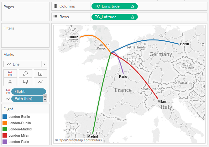
Now adjust the visualisation as you see fit, have some real fun with this, but when I published this the first time, I got the following:
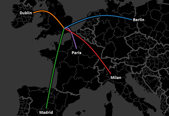
and boom, we are done, there is a little hard coding in the Calculated Fields, so go back and tweak a bit to see what you get. But this is some cool stuff huh…
You can see and interact with my visualisation on Tableau Public at https://public.tableau.com/profile/toan.hoang#!/vizhome/ArcMaps/ArcMaps
Summary
I hope you all enjoyed this article as much as I enjoyed writing it, if so, please do share this article with fellow Tableau addicts and spread the love. Do let me know if you experienced any issues recreating this Visualisation, and as always, please leave a comment below or reach out to me on Twitter @Tableau_Magic.
If you want to learn more about Creating Bespoke Data Visualisations in Tableau, do check out our course on Udemy at https://www.udemy.com/creating-bespoke-data-visualisations-in-tableau and using the coupon code TMWEB2019
 Table Calculation")


Hey, Toan!
This is awesome man! Beautiful viz my friend!
It will really be nice if you could explain some of the aspects of this viz, especially the data densificattion and the math parts. I can throw the following questions:
1. You duplicated the data to have two rows per route, one for each Path value (0 and 90). Is that the only way? How does that work? Could it be done with one row and using padding with bins? I mean a calculated field that generates 0 or 90 based on some logic, and a bin on top of it.
2. To draw the lines, are you simply drawing a SIN wave across 90 points? How to make sense of this formula: ([Index]*[TC_Step Size Lat])+[TC_Start Lat]+
SIN([Index]/29) used for TC_Latitude? Is the number 29 arbitrary? I tried values less and more and I could see why you chose 29, but what does it mean?
Most of us are lost when it comes to trigonometry in Tableau, not because of Trigo itself, but how those formulas are relevant within a Tableau challenge.
Thanks
Ashraf
Hi Ashraf,
Thanks for the message, and to answer your questions:
1) You need multiple rows for densification using Bins I am afraid. You can find my article on the website on Data Densification.
2) Yes, it was an arbitrary number, I think it was as an adjustment. Make drastic increases and decreases to this number and see the results.
Kind Regards,
Toan
Hi,
Thanks for the article, looks great.
My issues is that I cant get the start lat, long in the right place. My lat long in my data is definitely Sydney but Tableau plots it between South Africa and Brazil.
Any ideas?
Hmmm if you can, please let me know the Lats, Long and version of Tableau that you are using, and I will check it out. Also, have you considered using the Make Line calculations? Once that came in, this technique and tutorial has become a little overkill.
Syd lat is -35.1777 and long is 147.3857 and I am using version 10.3 for work reason. I havent tried Make Line but I will look it up now.
Thanks for your help
It looks like it works for me, but the Make Line and Make Point does give a better result. Please see the following downloadable workbook on Tableau Public comparing trips from London to Sydney. https://public.tableau.com/profile/toan.hoang#!/vizhome/SimonBurtAssistence/DensificationMethod