


")


There have been a lot of requests to create this tutorial, especially with the upcoming elections, yep, I am starting to get excited about the election season. As such, here is our Tableau tutorial for creating an Election Circle Chart in Tableau.
Note: This is an alternative type of data visualisation, and sometimes pushed for by clients. Please always look at best practices for data visualisations before deploying into production.
Data
Download and load the following data into Tableau Desktop / Public.
Note: this data set was taken from the following repository: https://github.com/CivilServiceUSA/us-senate
Calculated Fields
With our data set loaded into Tableau, we are going to create the following Calculated Fields and Parameters:
Depth Parameter
- Set Data type to Integer.
- Set Current value to 5.
- Set Allowable values to Range.
- Set Minimum to 2.
- Set Maximum to 7.
Dimension Parameter
- Set Data type to String.
- Set Current value to By Party.
- Set Allowable values to List.
- Create the following entries:
- Value to party, and the Display As to By Party.
- Value to gender, and the Display As to By Gender.
Distance from Center Parameter
- Set Data type to Integer.
- Set Current value to 3.
- Set Allowable values to Range.
- Set Minimum to 1.
- Set Maximum to 7.
Metric Parameter
- Set Data type to String.
- Set Current value to Time in Office.
- Set Allowable values to List.
- Create the following entries:
- Value to age, and the Display As to Senator Age.
- Value to tio, and the Display As to Time in Office.
Index
(INDEX()-1)Age
DATEDIFF('year', [Date Of Birth], TODAY())Distance
([Index]%[Depth Parameter])+[Distance from Center Parameter]Number of Items
{FIXED : COUNTD([Name]) }Multiplier
180/(MAX([Number of Items])/[Depth Parameter]-1)Item
IF ([Index]%[Depth]) < [Depth]/2 THEN
    ROUND([Index]/[Depth],0)
ELSE
    ROUND([Index]/[Depth],0)-1
END
* [Multiplier]
Years in Office
DATEDIFF('year', [Entered Office], TODAY())Size
IF [Metric Parameter] = "age" THEN
    [Age]
ELSE
    [Years in Office]
END
Color
If [Dimension Parameter] = "party" THEN
    [Party]
ELSE
    [Gender]
END
X
COS(RADIANS([Item]))*[Distance]Y
SIN(RADIANS([Item]))*[Distance]So now that we have created a lot of Calculated fields, we will now put this together into a Worksheet.
Worksheet
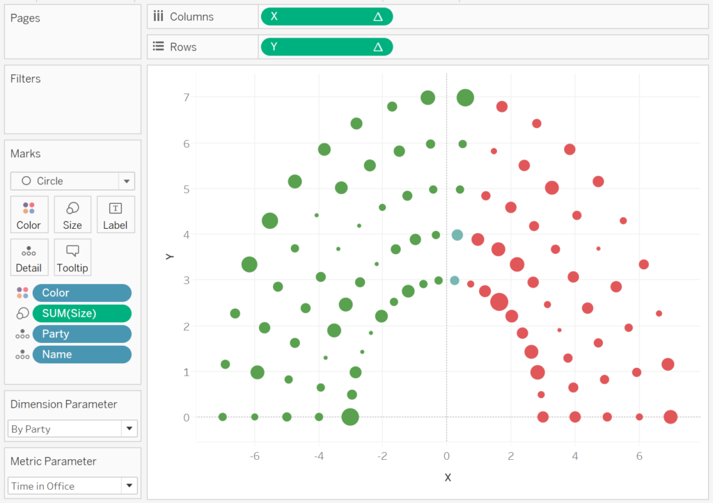
We will now build our worksheet:
- Change the Mark Type to Circle.
- Drag Color onto the Color Mark.
- Drag Party onto Detail.
- Drag Name onto Detail.
- Drag X to Columns.
- Right-click on this object and select Edit Table Calculation.
- In Compute Using select Specific Dimensions.
- Check Color, Name and Party; ensure that Color is on the Top, and Party is on the Bottom.
- In Sort order select Custom.
- Set the Dimension to Color and select Maximum.
- Drag Y to Rows.
- Right-click on this object and select Edit Table Calculation.
- In Compute Using select Specific Dimensions.
- Check Color, Name and Party; ensure that Color is on the Top, and Party is on the Bottom.
- In Sort order select Custom.
- Set the Dimension to Color and select Maximum.
If all goes well, you should see the following:
Have a little fun and explore the various parameters to see what happens. Now we will adjust the cosmetics:
- Hide Axis Headers.
- Hide Grid Lines.
- Hide Zero Lines.
- Edit the Colors.
- Add other items to, and adjust, the tooltips.
You should now see the following:
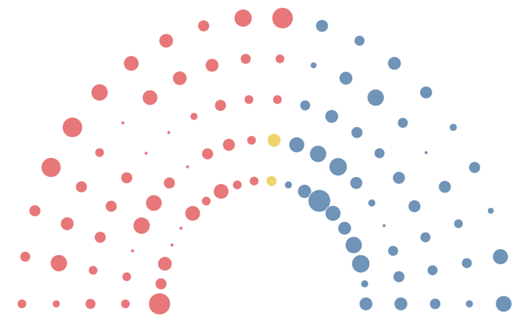
and boom we are done, this technique can be applied to various scenarios beyond an election circle. You can find my version of this visualisation on Tableau Public at
https://public.tableau.com/profile/toan.hoang#!/vizhome/ElectionCircle/ElectionCircle
Summary
I hope you all enjoyed this article as much as I enjoyed writing it and as always do share the love. Do let me know if you experienced any issues recreating this Visualisation, and as always, please leave a comment below or reach out to me on Twitter @Tableau_Magic.
If you like our work, do consider supporting us on Patreon, and for supporting us, we will give you early access to tutorials, exclusive videos, as well as access to current and future courses on Udemy:
- Patreon: https://www.patreon.com/tableaumagic
Also, do be sure to check out our various courses:
- Creating Bespoke Data Visualizations (Udemy)
- Introduction to Tableau (Online Instructor-Led)
- Advanced Calculations (Online Instructor-Led)
- Creating Bespoke Data Visualizations (Online Instructor-Led)

 Table Calculation")


Hi Toan,
A very unique article in term of visualization.
I have been struggling on some points.
1. I am unable to find the calculation “Item”, you have created “Number of Items” fields, both are same or different ?
2. I used “Numbers of Item” instead of “item” but “X” formula create aggregate non-aggregate issue.
3. And what is the calculation type ?
Thanks
I will try to have a look at this a little later.
I forgot that from my tutorial, I have now added the calculation for Item.
Thanks for sharing Toan,
I have one doubt. For calculation Item, are you referring Depth as Depth Parameter?
IF ([Index]%[Depth]) < [Depth]/2 THEN
ROUND([Index]/[Depth],0)
ELSE
ROUND([Index]/[Depth],0)-1
END
* [Multiplier]
Yes, it is the depth parameter. I will update the blog to reflect this more clearly 🙂