


")


Pareto Charts is a type of chart that combines both a Bar Chart and Line Chart; this chart type was named after Vilfredo Pareto who came up with the Pareto Principle which states that for many events, roughly 80% of the effects come from 20% of the causes, this is also known as the 80/20 rule. We will spend some time building out this type of visualisation in Tableau, and hopefully, have some fun while we are at it.
Note: As always never choose a data visualisation type and try to fit your data into it, instead, understand your data and choose the best visualization for your data consumers.
Data
We will start by loading the following data into Tableau Desktop / Tableau Public:
State,Sales
Wyoming,1603
Wisconsin,32115
West Virginia,1210
Washington,138641
Virginia,70637
Vermont,8929
Utah,11220
Texas,170188
Tennessee,30662
South Dakota,1316
South Carolina,8482
Rhode Island,22628
Pennsylvania,116512
Oregon,17431
Oklahoma,19683
Ohio,78258
North Dakota,920
North Carolina,55603
New York,310876
New Mexico,4784
New Jersey,35764
New Hampshire,7293
Nevada,16729
Nebraska,7465
Montana,5589
Missouri,22205
Mississippi,10771
Minnesota,29863
Michigan,76270
Massachusetts,28634
Maryland,23706
Maine,1271
Louisiana,9217
Kentucky,36592
Kansas,2914
Iowa,4580
Indiana,53555
Illinois,80166
Idaho,4382
Georgia,49096
Florida,89474
District of Columbia,2865
Delaware,27451
Connecticut,13384
Colorado,32108
California,457688
Arkansas,11678
Arizona,35282
Alabama,19511
Note: this is the Orders data from the Tableau Superstore Data Set. For those who are using Tableau Public.
Calculated Field
We are going to create a single Calculated Field:
Percentage of States
INDEX()/SIZE()Yep, that is all we need for this data visualisation.
Worksheet
Now let us create our worksheet:
- Change the Mark Type to Bar.
- Drag State onto Columns.
- Right-click on this object and select Sort.
- Set Sort By to Field.
- Set Sort Order to Descending.
- Close the sort dialogue box.
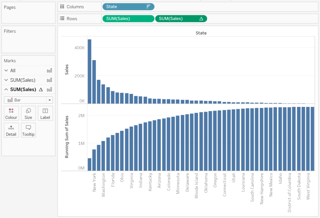
- Drag Sales onto Rows, do this twice.
- Right-click on the second Sales object in Rows, go to Quick Table Calculations and select Running Total.
You should have the following:
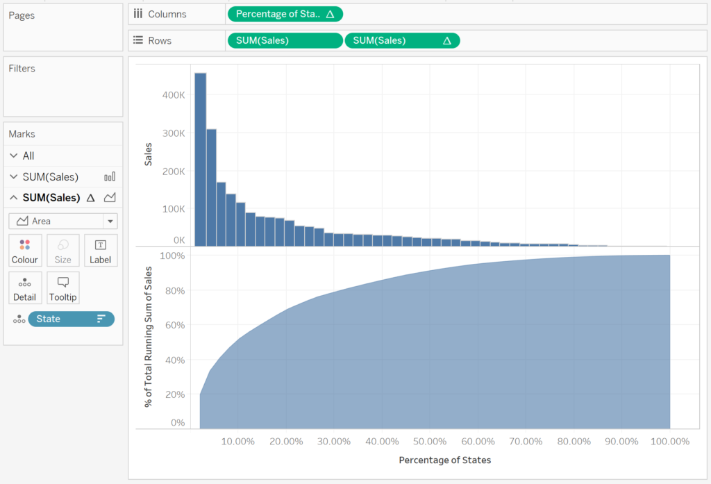
We would like to remove the State name from the Columns and replace this with the Percentage of States:
- Drag Percentage of States onto Columns.
- Drag State from Columns, and drop this Detail Mark on the All Marks Panel.
- Now we need to adjust our Table Calculations.
- Right-click on Percentage of Sales in Columns, go to Compute Using and select State.
- Right-click on the Sales object on the right, click on Edit Table Calculations.
- In Compute Using select Specific Dimensions
- Check State.
- At the bottom of this dialogue, check Add secondary calculation.
- Under Secondary Calculation Type select Percentage of Total.
- In the Secondary Calculation Type, set Compute Using to Specific Dimensions and check State.
- Close this dialogue box.
If all has gone according to plan, you should see the following:
We are almost there:
- Right-click on the second SUM(Sales) and select Dual Axis.
- Remove Measure Names from the Colour Marks.
- Adjust the formatting.
- Adjust the Tooltips.
You should now have the following:
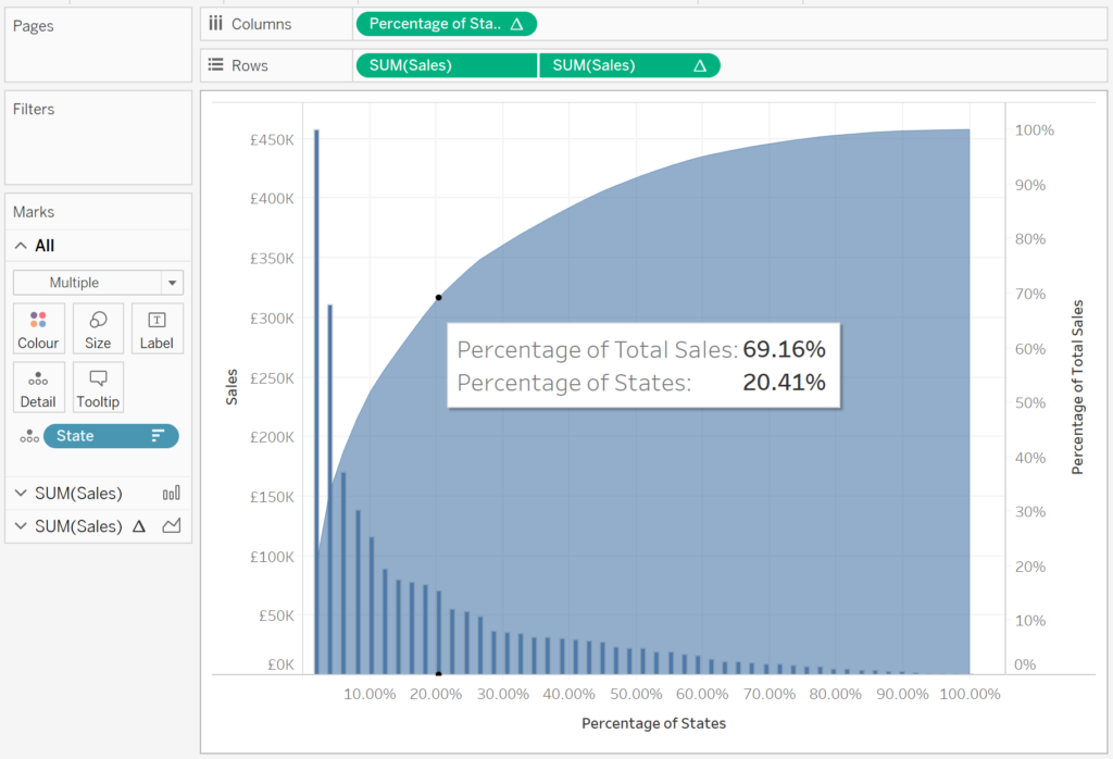
and boom, we are done, you can find my version of this Pareto Chart on Tableau Public at https://public.tableau.com/profile/toan.hoang#!/vizhome/ParetoCharts_15617676835410/ParetoChart
As you can see, based on our data set, the top ~20 percentage of states account for ~70 percentage of total sales. So not quite the 80/20 rule, but close enough, especially given that this is sample data.
Extra Credit: Add Reference Lines to the X and Y axis and connect these to Parameters. After which, use Parameter Actions to control the reference lines based on your selection, if you are using Tableau Desktop / Tableau Public 2019.2 and above.
Summary
I hope you all enjoyed this article as much as I enjoyed writing it. Do let me know if you experienced any issues recreating this Visualisation, and as always, please leave a comment below or reach out to me on Twitter @Tableau_Magic.
If you like our work, do consider supporting us on Patreon, and for supporting us, we will give you early access to tutorials, exclusive videos, as well as access to current and future courses on Udemy:
- Patreon: https://www.patreon.com/tableaumagic
Also, do be sure to check out our various courses:
- Creating Bespoke Data Visualizations (Udemy)
- Introduction to Tableau (Online Instructor-Led)
- Advanced Calculations (Online Instructor-Led)
- Creating Bespoke Data Visualizations (Online Instructor-Led)


Thx a lot Toan the Magician, yet another amazing chart
Great walkthrough! One additional step I like to do. If you right click the tab, select “Duplicate as Crosstab”, it will create another view with a table that you can sort from least to greatest in percent of the Pareto Analysis. This is really helpful if you have a lot of categories. For example, I work with a lot of recruiting data and use job role/job titles and this enables me to be able to see these more clearly.