


")


I do love drawing visualizations in Tableau and every time I see something interesting on a website, PowerPoint deck, magazine or any other presentation tool, the first thing that comes to mind is can I create this in Tableau? This was my thoughts when I saw Process Circles in PowerPoint and this step-by-step tutorial will go through the process of creating a process circle to visualise the number of opportunities at each stage of an Opportunity Pipeline, so let us get started.
Note: As always never choose a data visualisation type and try to fit your data into it, instead, understand your data and choose the best visualization for your data consumers.
Data
Load the following data into Tableau Desktop / Public.
| Opportunity Stage | Path | Number of Opportunities |
| Initial Contact | 1 | 100 |
| Initial Contact | 204 | 100 |
| Qualification | 1 | 80 |
| Qualification | 204 | 80 |
| Meeting | 1 | 45 |
| Meeting | 204 | 45 |
| Proposal | 1 | 45 |
| Proposal | 204 | 45 |
| Close | 1 | 90 |
| Close | 204 | 90 |
Note: we need two records for each stage as we are going to be drawing polygons and using densification to get more points on our canvas.
Calculated Fields
With our data set loaded into Tableau, we are going to create the following Calculated Fields and Bins:
Path (bin)
- Right click on Path, go to Create and select Bins…
- In the Edit Bins dialogue window:
- Set New field name to Path (bin).
- Set Size of bins to 1.
- Click Ok.
Index
INDEX()-1TC_Stage Number
WINDOW_MAX(MAX([Number]))TC_Total Number
WINDOW_SUM(SUM([Number]))/2TC_Step Size
[TC_Stage Number]/[TC_Total Number]*3.6TC_Starting Point
(RUNNING_SUM([TC_Stage Number])-[TC_Stage Number])
*(360/[TC_Total Number])
X
IF [Index] = 0 THEN
    SIN(((([Index]*[TC_Step Size])
    +[TC_Starting Point])+10)*PI()/180)*1.25
ELSEIF [Index] <= 101 THEN
    SIN(((([Index]*[TC_Step Size])
    +[TC_Starting Point])-1)*PI()/180)
ELSEIF [Index] = 102 THEN
    SIN(((([Index]*[TC_Step Size])
    +[TC_Starting Point])+10)*PI()/180)*1.25
ELSE
    SIN((((203-[Index])*[TC_Step Size])
    +[TC_Starting Point])*PI()/180)*1.5
END
Y
IF [Index] = 0 THEN
    COS(((([Index]*[TC_Step Size])
    +[TC_Starting Point])+10)*PI()/180)*1.25
ELSEIF [Index] <= 101 THEN
    COS(((([Index]*[TC_Step Size])
    +[TC_Starting Point])-1)*PI()/180)
ELSEIF [Index] = 102 THEN
    COS(((([Index]*[TC_Step Size])
    +[TC_Starting Point])+10)*PI()/180)*1.25
ELSE
    COS((((203-[Index])*[TC_Step Size])
    +[TC_Starting Point])*PI()/180)*1.5
END
Let us go through Y because it really does deserve our attention:
- We have 4 different points to draw:
Index is 0 which is the back of the arrow indent.Index is 102 which is the tip of the arrow.Index is between 0 and 102 which draws the inside line.Index is greater than 102 which draw the outside line.
- Multiplying the degrees by PI() and then dividing by 180 converts degrees to Radians.
- We multiply by the Step Size to ensure that we size our arrows correctly.
- We add the starting point so that our arrows align with each other.
So now that we have created a lot of Calculated fields, we will now put this together into a Worksheet.
Worksheet
We will now build our worksheet:
- Change the Mark Type to Polygon.
- Drag Path (bin) onto Columns.
- Right-click on the pill and make sure that Show Missing Values is selected.
- Drag this object onto the Path Mark.
- Drag Opportunity Stage onto Color.
- Drag X onto Columns.
- Right-click on X, go to
Compute Using and select Path (bin).
- Right-click on X, go to
- Drag Y onto Rows.
- Right-click on Y, go to
Compute Using and select Path (bin).
- Right-click on Y, go to
You should now see something like the following:
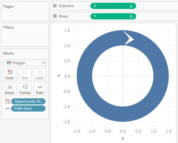
No need to panic, we just need to adjust the Table Calculations, so now let us:
- Right-click on the X object in Columns and select Edit Table Calculations.
- In Nested Calculations select TC_Stage Number:
- In
Compute Using select Specific Dimensions. - Tick Opportunity Stages and Path (bin) and ensure that Opportunity Stages is on top.
In At the level select Deepest.- In Restarting every select Opportunity Stages.
- In
- In Nested Calculations select TC_Total Number:
- In
Compute Using select Specific Dimensions. - Tick Opportunity Stages and Path (bin) and ensure that Opportunity Stages is on top.
In At the level select Deepest.- In Restarting every select None.
- In
- In Nested Calculations select TC_Starting Point:
- In
Compute Using select Specific Dimensions. - Tick Opportunity Stages only.
- In
- In Nested Calculations select TC_Stage Number:
- Right-click on the Y object in Columns and select Edit Table Calculations.
- In Nested Calculations select TC_Stage Number:
- In
Compute Using select Specific Dimensions. - Tick Opportunity Stages and Path (bin) and ensure that Opportunity Stages is on top.
In At the level select Deepest.- In Restarting every select Opportunity Stages.
- In
- In Nested Calculations select TC_Total Number:
- In
Compute Using select Specific Dimensions. - Tick Opportunity Stages and Path (bin) and ensure that Opportunity Stages is on top.
In At the level select Deepest.- In Restarting every select None.
- In
- In Nested Calculations select TC_Starting Point:
- In
Compute Using select Specific Dimensions. - Tick Opportunity Stages only.
- In
- In Nested Calculations select TC_Stage Number:
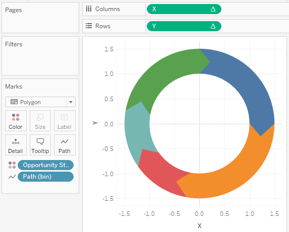
If all has gone well you should now see the following:
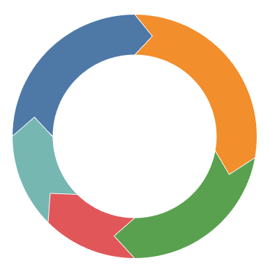
Now we need to adjust the visualisation by:
- Editing tooltips.
- Editing colours and adding a white border.
- Editing fonts.
- Removing gridlines.
- Hiding headers.
- Sort the Opportunity manually to be:
- Initial Contact
- Qualification
- Meeting
- Proposal
- Close
And you should then end up with something like the following:
and boom, that is a wrap, we have gone through and drawn ourselves an Interactive and Dynamic Process Chart, seriously, drag Opportunity Stage onto the filter and have a play.
You can see and interact with my visualisation on Tableau Public
Summary
I hope you all enjoyed this article as much as I enjoyed writing it, if so, please do share this article with fellow Tableau addicts and spread the love. Do let me know if you experienced any issues recreating this Visualisation, and as always, please leave a comment below or reach out to me on Twitter @Tableau_Magic.
If you like our work, do consider supporting us on Patreon, and for supporting us, we will give you early access to tutorials, exclusive videos, as well as access to current and future courses on Udemy:
- Patreon: https://www.patreon.com/tableaumagic
Also, do be sure to check out our various courses:
- Creating Bespoke Data Visualizations (Udemy)
- Introduction to Tableau (Online Instructor-Led)
- Advanced Calculations (Online Instructor-Led)
- Creating Bespoke Data Visualizations (Online Instructor-Led)


This is exactly what I need!!!! Toan you are a helper from heaven! Amazing! Thank you soooooo much!!!!
Your welcome Simone, glad to be of assistance 🙂
Beautifully created!!! looks cool Thank you 🙂
Beautifully created!!! looks cool.. Thank you.
Beautifully created!!! Thank you.
Hi Toan,you can have a try as follows,and you will understand the equation will be better
X Coordinate : IF [Index] = 0 THEN
SIN(([TC_Starting Point]+10)*PI()/180)*1.25
ELSEIF [Index]
Thanks, I will check it out
If I want to add label in the middle of each arrow, how am I going to do that?