


")


One of the most read tutorials on Tableau Magic is my Radial Bar Chart Tutorial. As more Tableau enthusiast check out our website, we are getting more requests for a tutorial on how to draw a Squared Radial Bar Chart, so
Note: As always never choose a data visualisation type and try to fit your data into it, instead, understand your data and choose the best visualization for your data consumers.
Data
Load the following data into Tableau Desktop / Public.
| Country | Path | Value |
| United States | 0 | 400 |
| United States | 201 | 400 |
| United Kingdom | 0 | 300 |
| United Kingdom | 201 | 300 |
| France | 0 | 250 |
| France | 201 | 250 |
| Germany | 0 | 220 |
| Germany | 201 | 220 |
| Canada | 0 | 120 |
| Canada | 201 | 120 |
Note: we need two records for each Country as we are going to be drawing lines and using densification to get more points on our canvas. For more information, check out our article of Data Densification.
Calculated Fields
With our data set loaded into Tableau, we are going to create the following Calculated Fields, Bins and Parameters:
Path (bin)
- Right click on Path, go to Create and select Bins…
- In the Edit Bins dialogue window:
- Set New field name to Path (bin).
- Set Size of bins to 1.
- Click Ok.
Distance from Center
Create the following parameter with:
- Set Name as Distance from Center.
- Set Data type as Integer.
- Set Current value as 3.
- Set Allowable values as Range.
- Set Minimum as 3.
- Set Maximum as 10.
Starting Degree
Create the following parameter with:
- Set Name as Starting Degree.
- Set Data type as Integer.
- Set Current value as 45.
- Set Allowable values as Range.
- Set Minimum as 0.
- Set Maximum as 360.
- Set Step size as 15.
Index
INDEX()-1TC_Value
WINDOW_MAX(MAX([Value]))TC_Max Value
WINDOW_MAX(SUM([Value]))TC_Percentage
[TC_Value]/[TC_Max Value]Rank
RANK_UNIQUE([TC_Value],"asc")X
IF [Index] <= 100 THEN
    SIN(RADIANS([Index]*2.7*[TC_Percentage]+[Starting Degree]))
    *([Rank]+[Distance from Center])
ELSE
    SIN(RADIANS((201-[Index])*2.7*[TC_Percentage]+[Starting Degree]))
    *([Rank]+[Distance from Center]+1)
END
Y
IF [Index] <= 100 THEN
    COS(RADIANS([Index]*2.7*[TC_Percentage]+[Starting Degree]))
    *([Rank]+[Distance from Center])
ELSE
    COS(RADIANS((201-[Index])*2.7*[TC_Percentage]+[Starting Degree]))
    *([Rank]+[Distance from Center]+1)
END
Let us explore X and Y a little.
- The IF Statement allows us to draw the inner line of the shape if Index Table Calculation is less than or equal to 100, otherwise, draw the outer line of the shape.
- The Outer line of the shape has additional distance from the centre, hardcoded to 1.
- 2.7 is required as a multiplier as we want our Radial Bar Chart to be a maximum of 270 degrees.
- The sole difference between X and Y is the use of COS or SIN.
- We multiply by TC_Percentage so that the maximum value goes to 270 degrees, and everything else will be a percentage of that value.
So now that we have created a lot of Calculated fields, we will now put this together into a Worksheet.
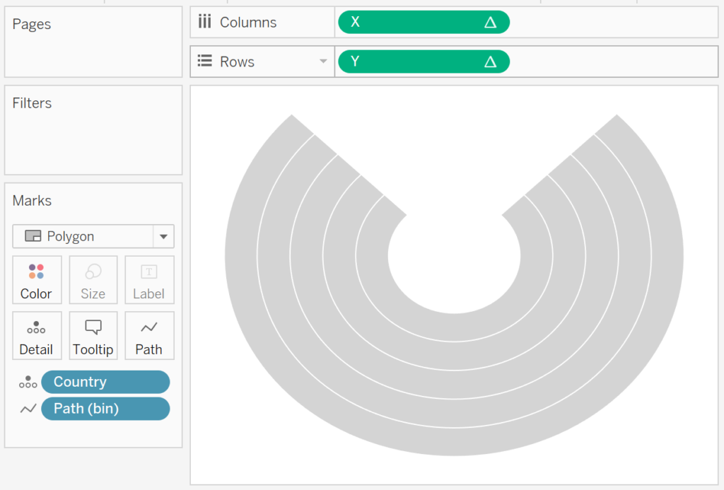
Worksheet
We will now build our worksheet:
- Change the Mark Type to Polygon.
- Drag Path (bin) to Columns.
- Right-click on the object, and ensure that Show Missing Values is checked.
- Drag this object onto the Path Mark.
- Drag Country onto the Detail Mark.
- Drag TC_Value onto the Tooltip Mark.
- Right-click on the object, go to Compute Using and select Path (bin).
- Drag X onto Columns.
- Right-click on the object, go to Compute Using and select Path (bin).
- Drag Y onto Rows.
- Right-click on the object, go to Compute Using and select Path (bin).
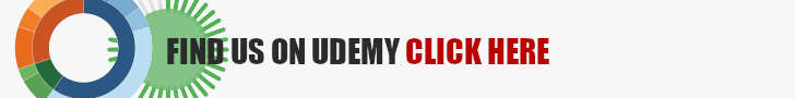
If all goes well, you should see the following:
Note: These are the moments that completely distract me while blogging and make me want to experiment with different and cool shapes.
We will edit the Table Calculations to adjust the visualisation:
- Right-click on X and select Edit Table Calculation.
- In Nested Calculations select TC_Max Value, and
- In Compute Using select Specified Dimensions.
- Ensure that Country and Path (bin) are both selected and Country is on top.
- For At the level select Deepest.
- In Nested Calculations select Rank, and
- In Compute Using select Specified Dimensions.
- Ensure that Country is the only value selected.
- In Nested Calculations select TC_Max Value, and
- Right-click on Y and select Edit Table Calculation.
- In Nested Calculations select TC_Max Value, and
- In Compute Using select Specified Dimensions.
- Ensure that Country and Path (bin) are both selected and Country is on top.
- For At the level select Deepest.
- In Nested Calculations select Rank, and
- In Compute Using select Specified Dimensions.
- Ensure taht Country is the only value selected.
- In Nested Calculations select TC_Max Value, and
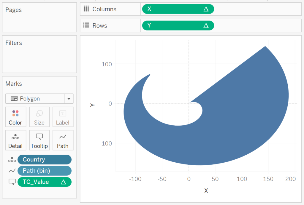
- Lastly, Ctrl-drag TC_Value from Tooltip to Color.
If all goes well you should now see the following:
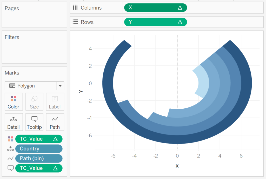
Now, adjust the cosmetics of the visualisation to ensure that we have the look and feel desired.
- Remove Axis Headers.
- Remove Grid and Zero Lines.
- Remove Axis Rulers.
- Add a White Borders.
- Adjust the Tooltip.
You should now see the following:
Normally, this is where the tutorial would be completed, but I want you to:
- Set the background color for this visualisation as None.
- Copy the worksheet and rename to Background.
- In the Background worksheet:
- Remove TC_Value from the Color Mark and the Tooltip Mark.
- Right-click on X and select Edit Table Calculation.
- In Nested Calculation, select TC_Max Value and uncheck Country.
- Right-click on Y and select Edit Table Calculation.
- In Nested Calculation, select TC_Max Value and uncheck Country.
- Click on Color and choose a shade of Grey.
If all goes well your Background worksheet should look like the following:
Hopefully, you can see where we are going with this. Drag both worksheets onto a dashboard and use the Layout Pane to resize and position your worksheets so that they are exactly the same size and perfectly overlap. If all goes well you should see the following:

And boom, we are now done, adjust the parameters for extra fun. I hope you enjoyed this tutorial and if in doubt, you can download the visualisation from Tableau Public here: https://public.tableau.com/profile/toan.hoang#!/vizhome/SquareRadialBarCharts/SquareRadialBarCharts
Summary
I hope you all enjoyed this article as much as I enjoyed writing it and as always do share the love. Do let me know if you experienced any issues recreating this Visualisation, and as always, please leave a comment below or reach out to me on Twitter @Tableau_Magic.
If you like our work, do consider supporting us on Patreon, and for supporting us, we will give you early access to tutorials, exclusive videos, as well as access to current and future courses on Udemy:
- Patreon: https://www.patreon.com/tableaumagic
Also, do be sure to check out our various courses:
- Creating Bespoke Data Visualizations (Udemy)
- Introduction to Tableau (Online Instructor-Led)
- Advanced Calculations (Online Instructor-Led)
- Creating Bespoke Data Visualizations (Online Instructor-Led)


Hi Toan Hoang,
Thanks for all the tutorials. I am following all of this, It is very helpful.
Have question on this. In the Edit Table calculations, you have mentioned Edit Tablea calculations for ‘X’ twice. I think one is for ‘X’ and other is for ‘Y’. Please let know if this is correct?
Right-click on X and select Edit Table Calculation.
Thanks for the catch, I have to stop making these copy and paste errors.
Toan,
I really enjoy your examples. A couple comments…
1) In Starting Degree parm, you’ve got a couple typos… (I notice the differences from what you published to Tableau Public)
Set Current value as 45 (should be 180)
Set Minimum as 3 (should be 0)
Set Maximum as 10 (should be 360)
2) For your Path values, what’s the significance of 201? In the future, could you explain why your data is structured in a particular way. I’d like to understand it better so I can automate the process in Tableau Prep.
Again, great stuff… keep it coming!
Hi Bill,
Thanks for noticing the Typo, I have corrected this in the blog, it was a bad copy and paste job.
Regarding the Path value, change the mark type to Circle, and explore the index value to see why 201 was used; also check out the following article on Data Densification, this will hopefully shed some light on the value. https://tableau.toanhoang.com/data-densification-for-tableau-drawing/
Thank you for reading,
Toan
Dear Tona, This is the best tutorial I’ve got and Thank you for the U-Demy, I’m learning a lot from your class.
About to make this square a Radial bar chart, I would love to ask you advice on how to divide the color section for each different portion of value shown in your “parameter fun design” up there? I need to show the portion of the each value to show for total TV_Value with different colors like you did. Please leave me a comment when you see this!
Hi Gemma, there are many ways you can color your segments, it is really about playing around and seeing what works, but is entirely up to you. Personally, I use the Material Design color palette, you can download it here: https://github.com/tableaumagic/tableau-colors. I am not sur eif that answers your question.
Thank you, Toan, maybe my question was too ambiguous. What I wanted to ask you is how to divide the portion of each radial bars shown up there like 4 bars. I would love to divide them like 8 pieces within 4 bars of Radial chart! with two colors mainly with other percentage portions!
Ah, that will be a little more complicated as each segement will need to be drawn individually. Check out our tutorial on Sunbursts, hopefully that will give you a hint on where to go.