


")


Sometimes you read something and you just want to have fun, so therefore, I decided to write a short blog to introduce the RANDOM() function in Tableau and to use this to create a Jitter Plots.
Note: The RANDOM() function is undocumented, and therefore, should be avoided for production use and only used for fun. The function returns a floating point number between 0 and 1.
Data
Load the Tableau Sample Data Set, Superstore, into Tableau. If you do not have Tabelau Desktop and no access to this sample, you can download it here:
http://www.tableau.com/sites/default/files/training/global_superstore.zip
Calculations
Columns
RANDOM()Rows
RANDOM()*1Note: This is the joys of a function being undocumented. If the Calculated Field has the same RANDOM() formula, it returns the same random number. Therefore, in Rows, I have multiplied by 1 to ensure that Tableau generates a different random number.
Worksheet
To start building our dashboard:
- Change the Mark Type to Circle.
- Drag Category onto Columns.
- Drag the Columns Calculated Field onto Columns.
- Right-click on the object and select Dimension.
- Drag Region to Rows.
- Drag the Rows Calculated Field onto Rows.
- Right-click on the object and select Dimension.
- Drag Category onto Color Mark.
- Drag Product Name onto the Details Mark.
- Drag Sales onto Size.
- You can choose any metric you fancy.
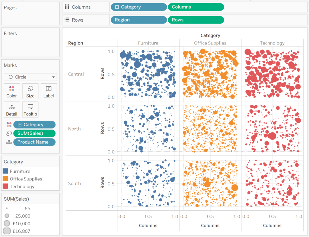
If all goes well, you should see the following:
Now that we have the visualisation, we will adjust the cosmetics:
- Hide theAxis headers.
- Set the Grid Lines to None.
- Set the Zero Lines to None.
- Hide Field Labels for Rows.
- Hide Field Labels for Columns.
- Rotate the Region label text.
- Format the Header fonts.
- Edit sizes.
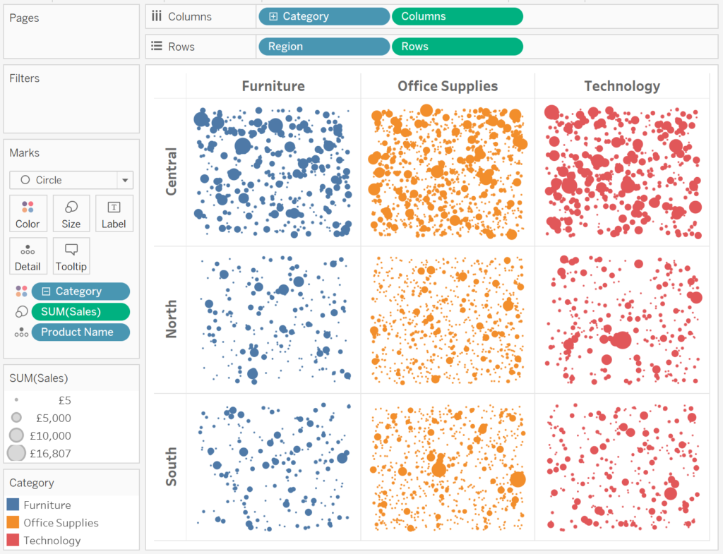
You will hopefully have the following.
and boom, we are done with this short and quick example. You can find my work on Tableau Public at
https://public.tableau.com/profile/toan.hoang#!/vizhome/JitterPlots/JitterPlots
I am going to explore putting Jitter Plots into shapes and other data visualisations like my Sunburst or Radial Bar Charts, just for fun of course.
Summary
I hope you all enjoyed this article as much as I enjoyed writing it. Do let me know if you experienced any issues recreating this Visualisation, and as always, please leave a comment below or reach out to me on Twitter @Tableau_Magic.
If you like our work, do consider supporting us on Patreon, and for supporting us, we will give you early access to tutorials, exclusive videos, as well as access to current and future courses on Udemy:
- Patreon: https://www.patreon.com/tableaumagic
Also, do be sure to check out our various courses:
- Creating Bespoke Data Visualizations (Udemy)
- Introduction to Tableau (Online Instructor-Led)
- Advanced Calculations (Online Instructor-Led)
- Creating Bespoke Data Visualizations (Online Instructor-Led)


 Table Calculation")


Wow, not documented function! Are there other hidden functions in Tableau?