


")


As a Tableau Zen Master, I volunteered time to support non-profit organisations. One of the organisations had an interesting requirement, and as this was static one-off data visualisation, I decided to rapidly put together an Excel Template and a Tableau Packaged Workbook.
The result will be released soon, so no spoilers, however, I thought that I would make the Excel Template and associated Tableau Packaged Workbook available for you to have fun with. I also had some fun with the template and produced the two data visualisations:
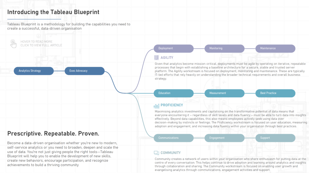
Tableau Blueprint
Interactive Data Visualisation here: https://public.tableau.com/app/profile/toan.hoang/viz/TableauBlueprint/TableauBlueprint
Champions League

Interactive Data Visualisation here: https://public.tableau.com/app/profile/toan.hoang/viz/ChampionsLeague202021Knockout/ChampionsLeague20202021KnockOut
The Excel Source File
The Excel Source File consists of 3 tabs:
- Items – this allows you to define the individual items, the fields include:
- ID – a uniquely allocated number
- Name – the text that will appear within the item
- Start X – the starting x coordinate for the item
- End X – the ending x coordinate for the item
- Start Y – the starting y coordinate for the item
- End Y – the ending y coordinate for the item
- Full Name – as there could be limited space in the item, this is a fuller name for the tooltip
- Description – this is the description for the tooltip
- URL – this is used for the tooltip. Note: the Full Name, Description and URL are all additional fields, you can add as many as you want here
- Links – this consists of several vlookups to allow you to define the connections between various items, fields include:
- ID – again, this is a unique identifier
- Start Item – enter the starting Item ID from the Item tab
- End Item – enter the ending Item ID from the Item tab
- Start X – this leverages a vlookup to get the value from the Items tab, this is formula driven
- End X – this leverages a vlookup to get the value from the Items tab, this is formula driven
- Start Y – this leverages a vlookup to get the value from the Items tab, this is formula driven
- End Y – this leverages a vlookup to get the value from the Items tab, this is formula driven
- Data Densification – is required for data densification and allows us to draw the lines (this does not need to be edited)
You can download the file here, with data from the Tableau Blueprint data visualisation
Tableau Packaged Workbook
The Tableau Workbook has some interesting aspects to it, here are some of the key points:
- We perform a Union between the Items and the Links tabs, this will create a single data source for us to leverage
- We have a Calculated Join between the Union of the two tabs with the Data Densification tab, this allows us to draw our data visualisation
- As we are drawing, we wrap our fields in a Table Calculation to make sure that the data is visible in our data visualisation. This is where we see the TC_ fields
- We have a Dual Axis with two different Rows Calculated Fields. Note: in the Champions League Data Visualisation we turn the type to shapes for the club logos
- We use the Sigmoid function for the curved lines, you can experiment with this to change this if required, be careful as it can be a bit tricky
Creating Bespoke Tableau Templates
I have started putting together a video course on creating this template from inception to completion, so if you are curious about creating your own Bespoke Tableau Templates, this will be available on my eLearning site: https://learn.toanhoang.com/courses/creating-a-bespoke-tableau-template


")

