


")


As of the time of this article, I am a two-time Tableau Zen Master, and, as such, I am afforded several different types of opportunities from Tableau. One such opportunity is to volunteer as a Tableau Doctor at the Tableau Conference, which is where attendees can book a 20-minute session with us to help diagnose an issue and provide an answer; it was at one of these Tableau Doctor sessions that I was asked to help create the Gauge Chart in Tableau. This tutorial is the find output, so I really do hope you enjoy it.
Note: This is an alternative type of data visualisation, and is sometimes pushed for by clients. Please always look at best practices for data visualisations before deploying this into production.
Data
We will start by loading the Sample Superstore data into Tableau Desktop / Tableau Public.
Note: If you have Tableau Desktop, you can use the Sample data source, but if you are using Tableau Public, download and load the following data source.
Calculated Fields
With our data set loaded into Tableau, we are going to create the following Parameter, Bins and Calculated Fields:
Create a @Selected Year Parameter
- Set Name to @Selected Year
- Set Data type to Integer
- Set Allowable values to List with the following values
- Set Value to 2017 and Display As to 2017
- Set Value to 2018 and Display As to 2018
- Set Value to 2019 and Display As to 2019
- Set Value to 2020 and Display As to 2020
- Set Current value to 2020
Create a @Selected Year Parameter
- Set Name to @Comparison Year
- Set Data type to Integer
- Set Allowable values to List with the following values
- Set Value to 2017 and Display As to 2017
- Set Value to 2018 and Display As to 2018
- Set Value to 2019 and Display As to 2019
- Set Value to 2020 and Display As to 2020
- Set Current value to 2019
- Path
IIF ([Ship Mode]="First Class", 0, 1)Path (bin)
- Right-click on Path, go to Create and select Bins…
- In the Edit Bins dialogue window:
- Set New field name to Path (bin)
- Set Size of bins to 1
- Click Ok
Index
INDEX() - 1Sales (Selected Year)
SUM(IF YEAR([Order Date]) = [@Selected Year] THEN
    [Sales]
END)
Sales (Comparison Year)
SUM(IF YEAR([Order Date]) = [@Comparison Year] THEN
    [Sales]
END)
Sales (Growth)
( [Sales (Selected Year)] - [Sales (Comparison Year)] ) / [Sales (Comparison Year)]TC_Sales Growth
WINDOW_MAX([Sales (Growth)])TC_Angle Calculation
90 * // 100 % would be right down the middle

// This is here to make sure that insane growth can still be represented in this visualisation, we will have the label so you can see the actual numbers
IF [TC_Sales Growth] > 2 THEN
    2 // Set the maximum value of the line to 200%
ELSEIF [TC_Sales Growth] < 0 THEN
    0 // Set the minimum value of the line to 0%
ELSE
    [TC_Sales Growth]
END
TC_Sales Growth Label
IF [Index] = 0 THEN
    [TC_Sales Growth]
END
X
[Index] * COS(RADIANS([TC_Angle Calculation]))Y
[Index] * SIN(RADIANS([TC_Angle Calculation]))With this done, let us start creating our data visualisation.
Worksheet
We will now build our worksheet:
- Change the Mark Type to Line
- Drag Region onto the Columns Shelf
- Drag Category onto the Rows Shelf
- Drag Path (bin) onto the Path Mark
- Drag X onto the Columns Shelf
- Right-click on this pill, go to Compute Using and select Path (bin)
- Drag Y onto the Rows Shelf
- Right-click on this pill, go to Compute Using and select Path (bin)
- Drag TC_Sales Growth Label onto the Label Mark
- Right-click on this pill, go to Compute Using and select Path (bin)
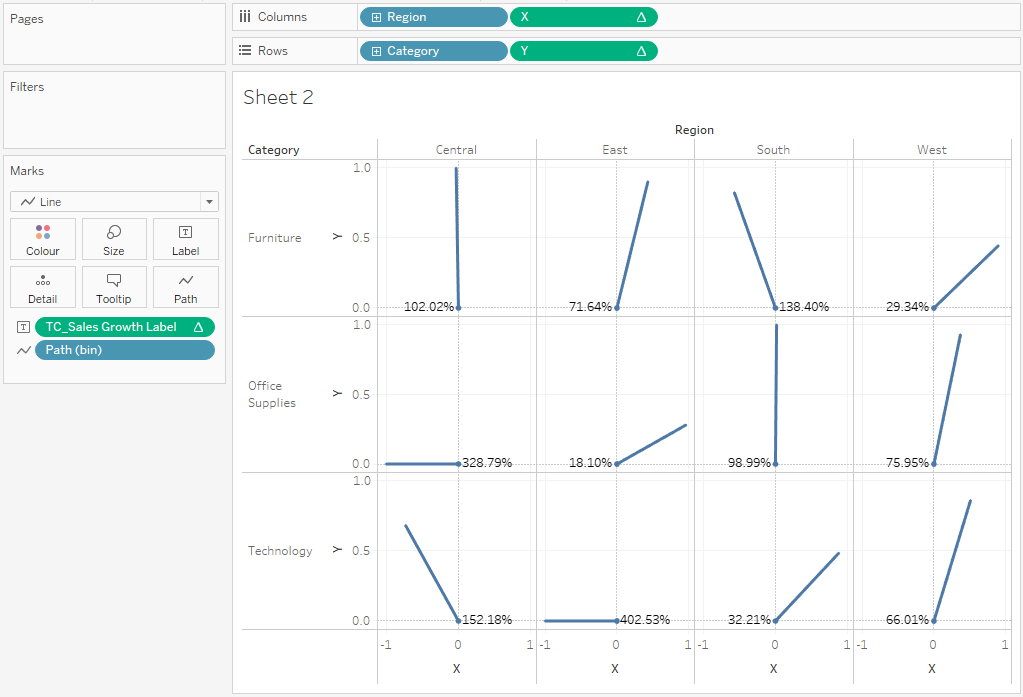
If all goes well, you should see the following:
Now we will adjust the data visualisation:
- Drag Path (bin) onto the Size Mark
- On the Path (bin) Size Card, click on the Down Arrow, and select Edit size…
- Tick the Reversed check box and edit the size as you see fit
- Double-click on the Y Axis Header
- Set Range to Fixed
- Set Fixed start to -0.1
- Set Fixed end to 1.1
- Close this window
- Double-click on the X Axis Header
- Set Range to Fixed
- Set Fixed start to -0.1
- Set Fixed end to 1.1
- Close this window
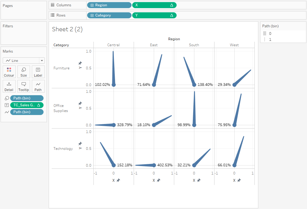
If all goes well, you should now see the following
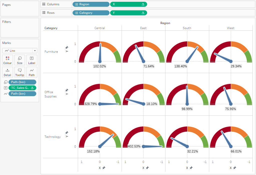
Lastly, we will now apply a background image to complete our data visualisation, so download the following image:
- In the Menu, go to Map and select Background Images and select your data source
- In the Background Images dialog window
- Click on Add Image…
- Click on Browse… and select the downloaded file
- In the X Field, make sure that X is selected
- Set Left to 1.2
- Set Right to -1.2
- In the Y Field, make sure that Y is selected
- Set Bottom to -0.1
- Set Top to 1.2
- Click OK
- Lastly, double click on the X Axis and select Reversed
You should now see the following:
The last thing to do is to apply the final formatting touches i.e. removing gridlines and adjusting your fonts, but you will want to end up with something like this:
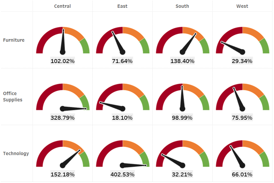
P.s. enable Animations and then change the Parameter values to really see some magic at work, I think you will like it,
and boom, we are done! I hope you enjoyed creating this data visualization and learned some cool techniques as well. As always, you can find this data visualisation on Tableau Public at https://public.tableau.com/app/profile/toan.hoang/viz/GaugeChartArrowIndicator/GaugeChartArrowIndicator
Summary
I hope you all enjoyed this article as much as I enjoyed writing it and as always do share the love. Do let me know if you experienced any issues recreating this Visualization, and as always, please leave a comment below or reach out to me.
 Table Calculation")


Toan, you are really the master of bespoke charts.
I love to recreate them from time to time though I never really used them but I appreciate the beauty in your approaches.
Thank you Steffen
Hi Toan Hoang, Great. This is so awesome.
But, I have a problem at this this step below, I don’t find ‘edit size’ and ‘reversed check box’
Thank you so much
Fajar
——
Drag Path (bin) onto the Size Mark
On the Path (bin) Size Card, click on the Down Arrow, and select Edit size…
Tick the Reversed check box and edit the size as you see fit
Hi Toan, this is a great visualization for the gauge. However, I have a couple Qs: when I recreated it with exact images and numbers as you have the data in SuperStore is actually different if you do it in Table layout. The % shown on gauge are for ‘First Class’ shipping mode only. Is this because our path field calc says ‘IIF shipmode = ‘First Class’ then 0, 1″? What else can I use for ‘Path calc” that won’t skew the actual % values across each region and category? As I need in total not sliced by First class ship mode only values for the sales growth. Also, some sales growth is actually negative, but it shows positive on the gauge (East Office Supplies First Class) and South Technology First Class. If negative it should be showing “zero’ on the gauge based on the calcs preparation for the viz. Why it is showing a positive value? Appreciate your help.
Toan, nice gauge charts. I am trying to put some dashboard views together and I care to use gauges instead of bar or pie charts. You appear to have a knowledgeable understanding for accomplishing such dashboards. Is there some manner to contract you for purpose of building such views? Please respond at your convenience