


")


Now we are in the full swing of things I wanted to create a nice and simple visualisation for comparing two different metrics i.e. through drawing two half-circles and comparing them against each other. In this tutorial, we will go through the process of creating this visualization in a simple step-by-step manner.
Note: As always never choose a data visualisation type and try to fit your data into it, instead, understand your data and choose the best visualization for your data consumers.
Data
Load the following data into Tableau Desktop / Public.
| Product | Path | Sales |
| Office | 0 | 800 |
| Office | 180 | 800 |
| Home | 0 | 500 |
| Home | 180 | 500 |
Note: we need two records for each stage as we are going to be drawing polygons and using densification to get more points on our canvas.
Calculated Fields
With our data set loaded into Tableau, we are going to create the following Calculated Fields and Bins:
Path (bins)
- Right click on Path, go to Create and select Bins…
- In the Edit Bins dialogue window:
- Set New field name to Path (bin).
- Set Size of bins to 1.
- Click Ok.
Index
INDEX()-1Product Flag
WINDOW_MAX( IIF(MAX([Product])="Office",-1,1))TC_Max Sales
WINDOW_MAX(MAX({ FIXED : MAX([Sales]) } ))TC_Product Sales
WINDOW_MAX(MAX([Sales]))TC_Percentage
[TC_Product Sales]/[TC_Max Sales]X
SIN([Index]*PI()/180)*[TC_Percentage]*[Product Flag]Y
COS([Index]*PI()/180)*[TC_Percentage]*[Product Flag]So with our Calculated Fields in place, let us start creating our worksheet.
Worksheet
We will now build our worksheet:
- Change the Mark Type to Polygon.
- Drag Product onto Color Mark.
- Drag Path (Bins) onto Rows.
- Right-click on the object and ensure that Show Missing Values is checked.
- Drag this object onto the Path Mark.
- Drag X onto Columns.
- Right-click on the object, go to
Compute Using and select Path (Bins).
- Right-click on the object, go to
- Drag Y onto Rows.
- Right-click on the object, go to
Compute Using and select Path (Bins).
- Right-click on the object, go to
You should get something like the following:
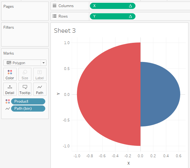
We will now adjust the worksheet by:
- Copying X, setting Dual Axis and turning the copy into a Line Chart.
- Double click the X-axis and fixing the values to be from -1.1 to 1.1.
- Remove the grid and axis lines.
- Edit the polygon transparency
to 60%. - Hide the headers.
- Adjust the tooltip.
You want to end up with the following:
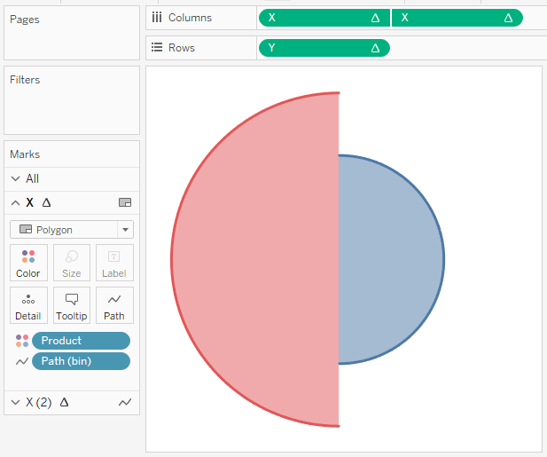
and boom, we are done, we have created an interesting way of comparing two different metrics using half circles.
You can see and interact with my visualisation on Tableau Public at https://public.tableau.com/profile/toan.hoang#!/vizhome/Half-Circles/Half-Circles
Summary
I hope you all enjoyed this article as much as I enjoyed writing it, if so, please do share this article with fellow Tableau addicts and spread the love. Do let me know if you experienced any issues recreating this Visualisation, and as always, please leave a comment below or reach out to me on Twitter @Tableau_Magic.
If you like our work, do consider supporting us on Patreon, and for supporting us, we will give you early access to tutorials, exclusive videos, as well as access to current and future courses on Udemy:
- Patreon: https://www.patreon.com/tableaumagic
Also, do be sure to check out our various courses:
- Creating Bespoke Data Visualizations (Udemy)
- Introduction to Tableau (Online Instructor-Led)
- Advanced Calculations (Online Instructor-Led)
- Creating Bespoke Data Visualizations (Online Instructor-Led)

 Table Calculation")


Dear Toan
Doing your Udemy course and the additional exercises in section 18. In the example above (Half Circles) the outer lines of the polygon remain darker than the interior. I am having difficulty keeping the outer lines (circumference) of the circle darker than the interior. Any advice on what I am doing wrong? Thanks
Hi Pat, please send a sample workbook to admin@tableau.toanhoang.com
Hi Toan, very nice article. Thank you for sharing it! I am trying to recreate it. So far it works good. I have a problem to show up the figuers in the tool tip. How did you figuered it out, that the value “Office: $800” is shown up? Thank you in advance!
Hey Dilyana, please send me an email to toan.hoang@tableau.toanhoang.com and I will forward you the workbook when I get home, you can have a look through as I cannot completely remember 🙂
Hi Toan,
Hope you are well !!
Can you please send me workbook for this chart? asrivastava.info@gmail.com
Please send me an email to toan.hoang@tableau.toanhoang.com