


")


I have always had a thing for Hex Maps, so I decided to finally write a tutorial on how you can generate some very interesting Hex Maps. With the help of an online tool I found, you can generate some fantastic maps, so with that said, let us have some funny good times.
Note: This is an alternative type of data visualisation, and sometimes pushed for by clients. Please always look at best practices for data visualisations before deploying this into production.
amCharts
amCharts is a company based in Vilnius, Lithuania. The beginning of amCharts and amMap was in 2004 when the first version of amMap was created. Antanas Marcelionis worked as a manager in a web development company and, being a fan of maps and traveling, wanted to have a tool to work like a pin-map for him. So he made this tool in his free time.
You can read more about amCharts here: https://www.amcharts.com.
I noticed amCharts have a free tool to generate cool maps, and we are going to use this to get our Hex Map data. So let us get started by going to https://pixelmap.amcharts.com, you should see the following:
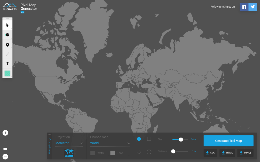
Now we will configure our map:
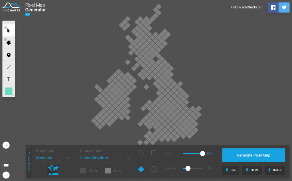
- Under Choose map select UnitedKingdom.
- Select Diamond.
- Set Size to 25px.
- Set Distance to 5px.
- Click on Generate Pixel Map.
We should now see the following:
Now we need to get the data in a form which you can use in Tableau, so we will click on the HTML button that will show us the HTML required to provide the generated map; you will HTML and, more importantly, JavaScript that contains JSON data for the map, and it is this that we are going to take.
Here is the generated HTML copied into my preferred text editor; I like to use Sublime Text 3.
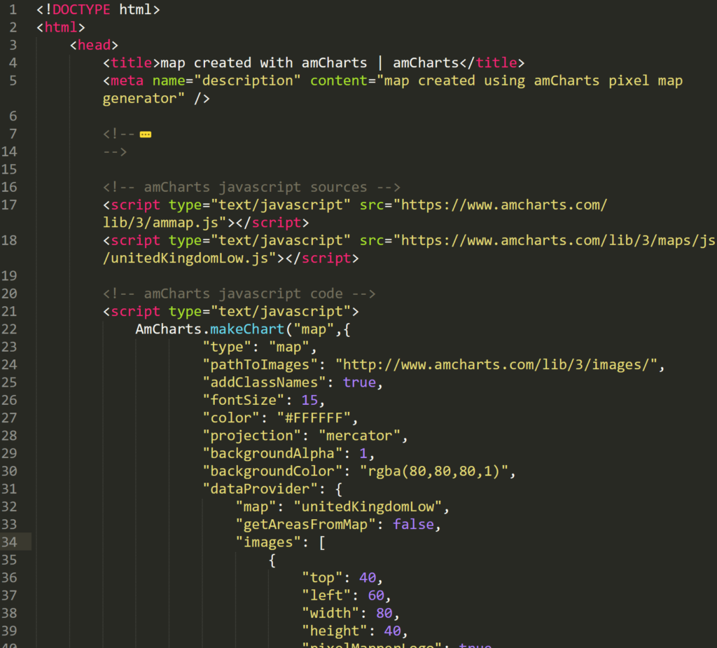
We want to locate and copy the data in the images array and copy this into a file called data.json.
{
   "images": [
      {
         "top": 40,
         "left": 60,
         "width": 80,
         "height": 40,
         "pixelMapperLogo": true,
         "imageURL": "http://pixelmap.amcharts.com/static/img/logo.svg",
         "url": "http://www.amcharts.com"
      },
      {
         "groupId": "GB-UKM",
         "selectable": true,
         "title": "Scotland",
         "longitude": -1.6153,
         "latitude": 60.5076,
         "type": "rectangle",
         "color": "rgba(129,129,129,1)",
         "width": 17.677669529663685,
         "height": 17.677669529663685,
         "scale": 1,
         "fixedSize": false
      }
      ...
      {
         "groupId": "GB-UKM",
         "selectable": true,
         "title": "Scotland",
         "longitude": -1.2734,
         "latitude": 60.3385,
         "type": "rectangle",
         "color": "rgba(129,129,129,1)",
         "width": 17.677669529663685,
         "height": 17.677669529663685,
         "scale": 1,
         "fixedSize": false
      }
   ]
}
Note: I removed the first element in the array which contains the amCharts logo, and also wrapped the image array with { }.
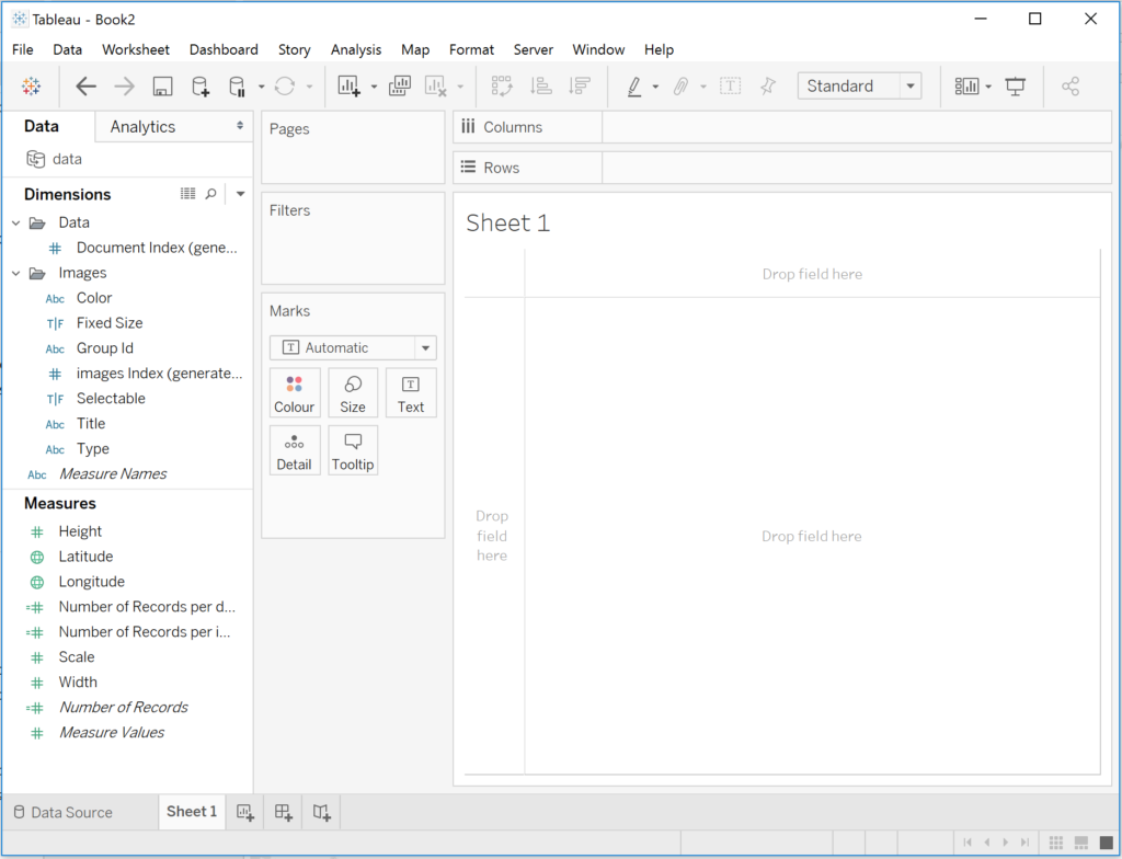
Worksheet
We will now load the data.json file in Tableau:
- Open Tableau.
- In the Connect menu, select JSON file.
- select data.json.
- Ensure that images is checked.
- Click OK.
- Under Connection, choose Extract.
- Click on Sheet 1 to go to your Worksheet.
- You will be prompted for a location to save your Hyper file.
You should now see the following:
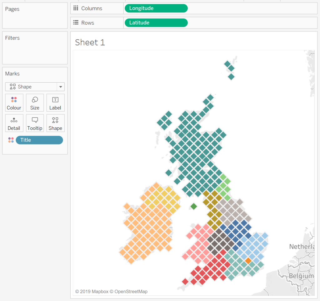
We will now build our Worksheet:
- Change the Mark Type to Shape.
- Drag Longitude onto Columns.
- Right-click on this object and select Dimensions.
- Drag Latitude onto Rows.
- Right-click on this object and select Dimensions.
- Drag Title onto Colour.
- Change the Shape to a filled Diamond.
- Modify the Size.
You should now see the following:
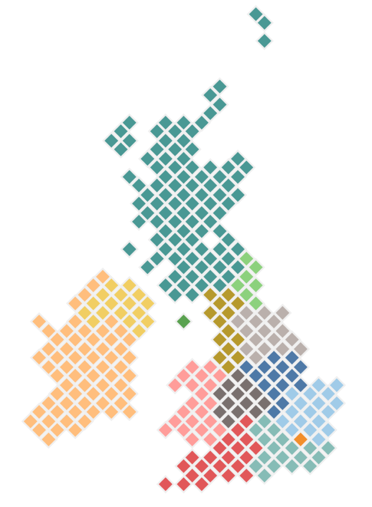
Our final step will be to adjust the cosmetics:
- In the Application Menu, go to Map and Map Layers…
- Change Washout to 100%.
You should now see our final product:
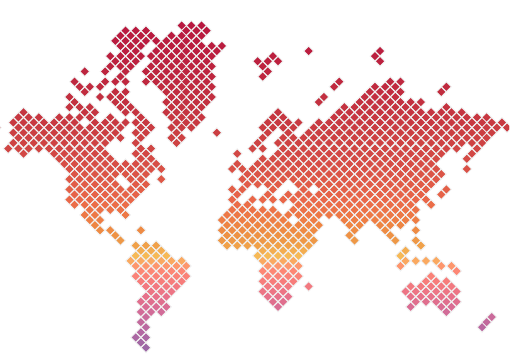
World Map
As you can see, we can have loads of fun with this, check out our World Hex Map, colored by the Latitude:
and boom, we are done with this tutorial, you can find our Data Visualisation on Tableau Public here: https://public.tableau.com/profile/toan.hoang#!/vizhome/HexMaps_15614156910750/HexMap
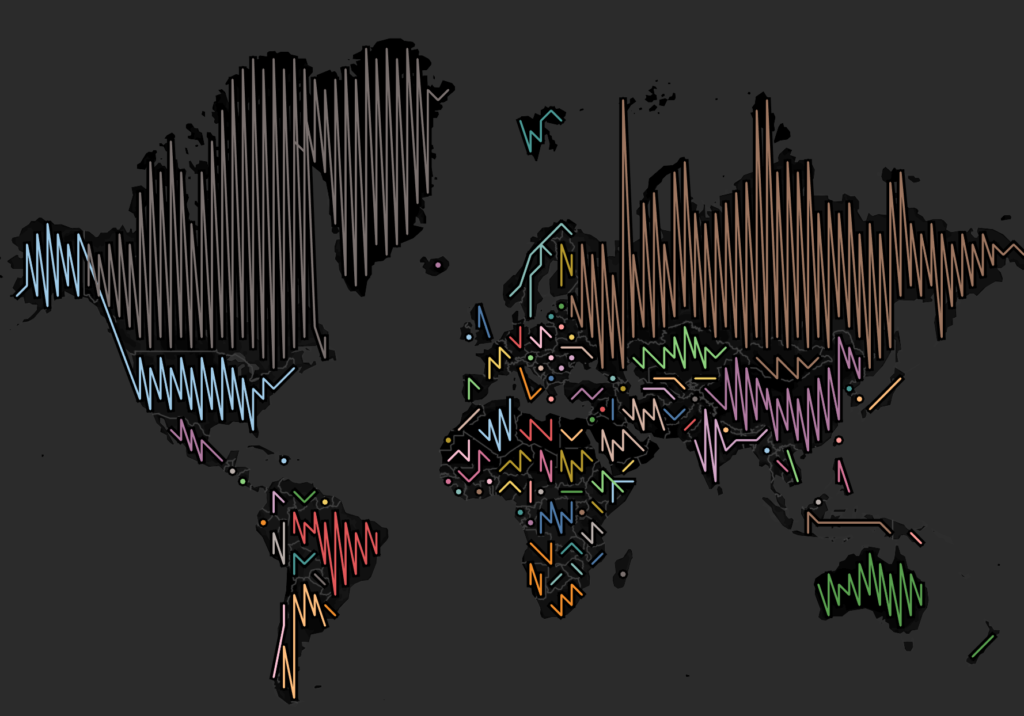
Special Request
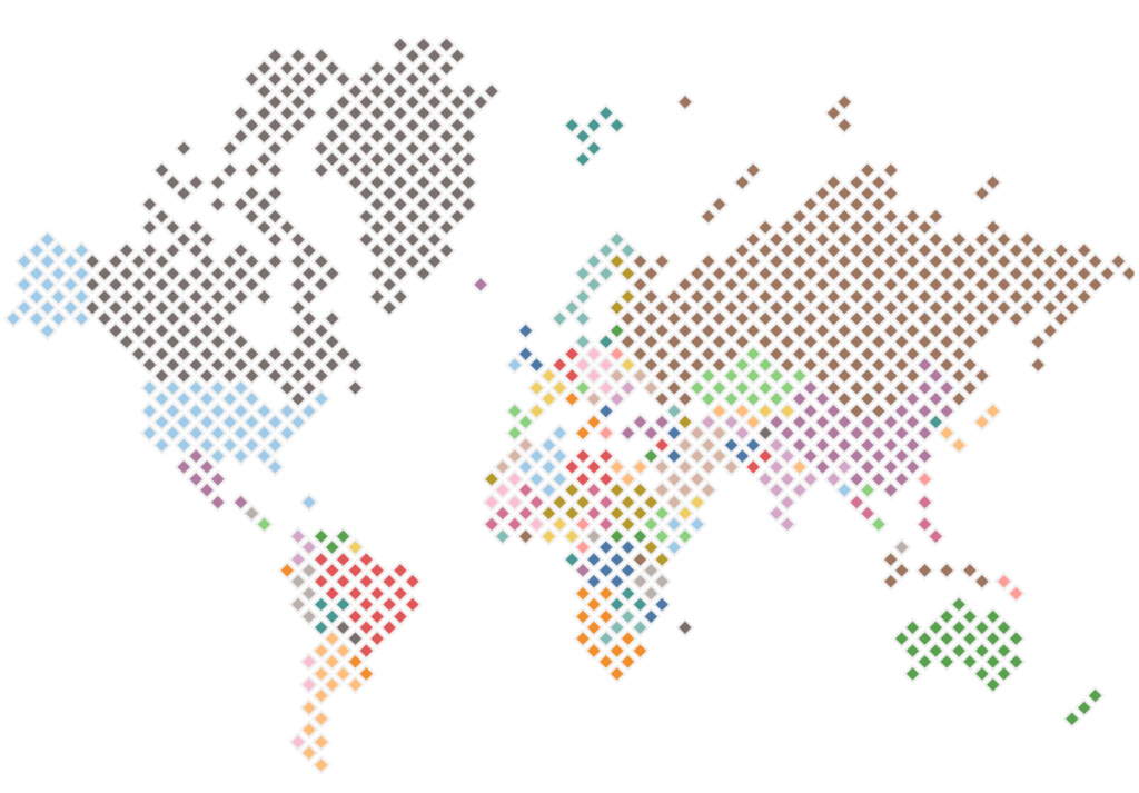
When writing this tutorial, I posted up an accidental image and alot of people requested that I post how this was created.
- Create a World Map Hex Map.
- In the visualisation above, drag Title onto the Colour Mark.
You should get the following:
We are going to have a little more fun:
- Change the Mark Type to Line.
- In the Application Menu, go to Map and select Map Layers…
- Set Style to Dark.
- Set Washout to 0%.
You should now have the following:
Summary
I hope you all enjoyed this article as much as I enjoyed writing it and as always do share the love. Do let me know if you experienced any issues recreating this Visualisation, and as always, please leave a comment below or reach out to me on Twitter @Tableau_Magic.
If you like our work, do consider supporting us on Patreon, and for supporting us, we will give you early access to tutorials, exclusive videos, as well as access to current and future courses on Udemy:
- Patreon: https://www.patreon.com/tableaumagic
Also, do be sure to check out our various courses:
- Creating Bespoke Data Visualizations (Udemy)
- Introduction to Tableau (Online Instructor-Led)
- Advanced Calculations (Online Instructor-Led)
- Creating Bespoke Data Visualizations (Online Instructor-Led)
 Table Calculation")


Amazing Maps, Thx a Lot Toan
Amazing tutorial, as always. Thanks so much. I was able to recreate the UK and world map following your steps. I also tried doing one of the U.S., but was not able to get that to work…I think it’s because amcharts positions Hawaii and Alaska in the bottom left corner when you select “usa”, but Tableau has those two states positioned where they actually are on a map.
Great Tutorial as always. Easy to follow. I was able to recreate the world map following your tutorial. Thanks a lot.
Your welcome