


")


As well as written tutorials, interviews and opinion pieces, we will now be releasing end-to-end guides on building dashboards, and we will start with my How Love Works Tableau Dashboard; this dashboard is based on a data visualisation created by TotalJobs, and I was totally inspired. If you are interested in knowing how this dashboard works, please follow the step by step instructions.
You can find this data visualisation on Tableau Public at https://public.tableau.com/profile/toan.hoang#!/vizhome/HowLoveWorks/HowLoveWorks
Data
Download and load the following data into Tableau Desktop / Tableau Public.
Place,Percentage
Work,0.22
Friends,0.18
Online dating,0.13
Night out,0.1
Social event,0.08
School or University,0.07
Family,0.06
Shared hobby,0.03
Holiday,0.02
Other,0.11
This is all the data that we will require for our data visualisation.
Calculated Fields
With our data set loaded into Tableau, we are going to create the following Calculated Fields.
Index
INDEX()Zero
0One
IF [Index]%2 = 0 THEN
    -1
ELSE
    1
END
Note: this object takes the index, or position of the item, and returns an alternating 1 and -1.
Worksheet
Before we build our first worksheet, please download the following Shape and copy this to your My Tableau Repository:
Download and copy this file to (on Windows):
C:\Users\<Your User Name>\Documents\My Tableau Repository\Shapes\<Your Directory Name>With the Custom Shape loaded, we will now create our Worksheet:
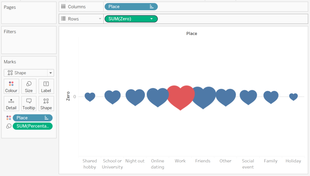
- Change the Mark Type to Shape.
- Drag Place onto the Columns Shelf.
- Right-click on the object and select Sort.
- Set Sort By to Manuel and ensure the following order:
- Shared hobby
- School or University
- Night out
- Online Dating
- Work
- Friends
- Other
- Social event
- Family
- Holiday
- Drag Zero onto the Rows Shelf.
- Drag Percentage onto the Size Mark.
- Click on the Shape Mark.
- Click on More Shapes.
- Set the Select Data Item to your Custom Heart Shape.
- Click OK.
- Note: If you cannot see your Custom Shape, click on Reload Shapes.
- Click on the Color Mark.
- Set Work to Red and all other Items to Blue.
If all goes well you should now have the following:
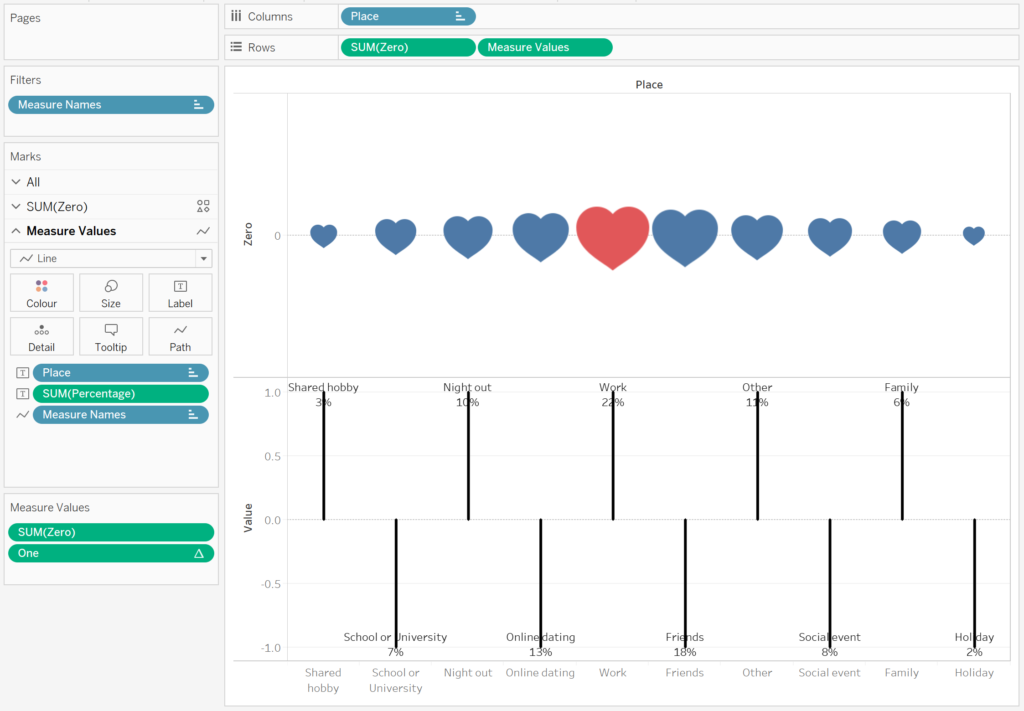
Now we are going to create our labels:
- Drag Measure Values onto Rows.
- Ensure that Measure Values only contains One and Zero, and with SUM(Zero) on top.
- Right-click on One, Go to Compute Using and select Table (across).
- In the Measure Values Mark Pane.
- Change the Mark Type to Line.
- Drag Measure Names to Path.
- Remove objects from the Size Mark, and reduce size to one quarter.
- Remove objects from the Color Mark, and change the colour to Black.
- Drag Place to Label.
- Drag Percentage to Label.
- Click on the Label Mark.
- Set Vertical Alignment to Center.
- Set Mark to Label as Line Ends.
- Untick Label start of line.
Hopefully, you should now see the following:
Now we will adjust the cosmetics of the worksheet:
- Right-click on Measure Values in the Rows Shelf, and select Dual Axis.
- Right-click on the Axis Header and select Synchronize Axis.
- Right-click on Place on the Canvas, and select Hide Field Label for Columns.
- Right-click on Place in the Columns Shelf and uncheck Show Header.
- Double-click on the Zero Header.
- Set Range to Fixed and to be from -2 to 2.
- Hide the Zero and Values Headers.
- Set the Row Dividers to None.
- Set the Column Dividers to None.
- On the Measure Values Mark Panel.
- Reduce the Size to get a very thin line.
- Click on the Colour Mark and set Marker to All.
- Lastly, I want us to edit format the Label
We should now have the following:
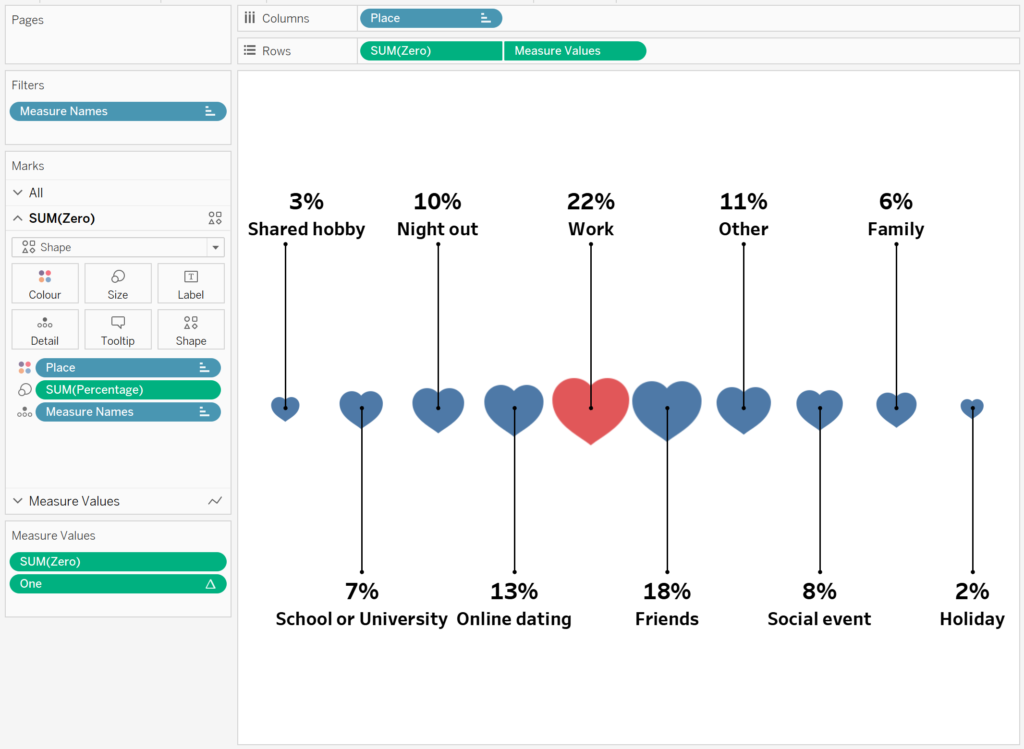
And boom, we are done with the worksheet.
Dashboard
We will now assemble our dashboard.
- Create a new Dashboard.
- Set the size to Custom with Width as 1000px and Height as 700px.
- Set the Name to How Love Works.
- With Tiled selected, download any image with the 1000×700 dimension and drag this onto the Dashboard. This will act as your background image.
Now, click on Floating and drag the following objects onto your Canvas:
A Text Object with:
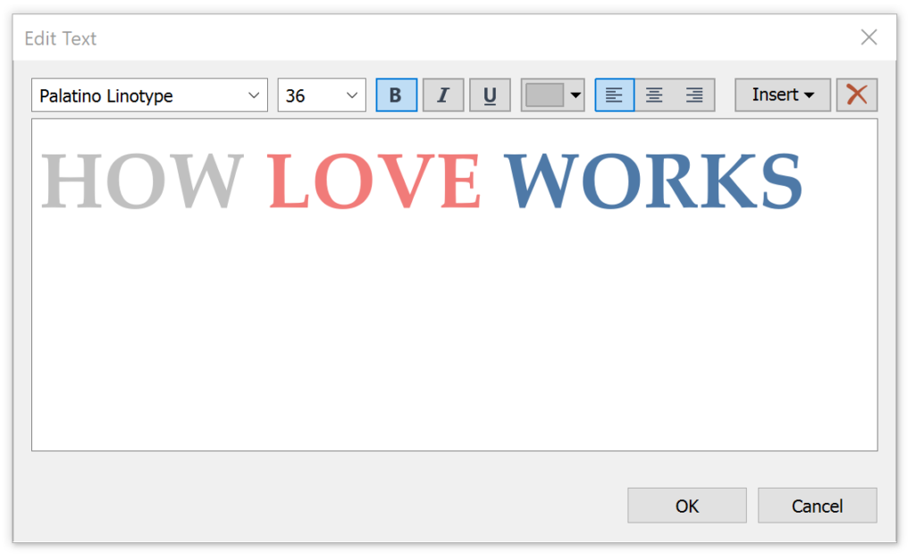
- Set the following positional attributes:
- Position X as 60.
- Position Y as 40.
- Size W as 500.
- Size H as 80.
A Text Object with:
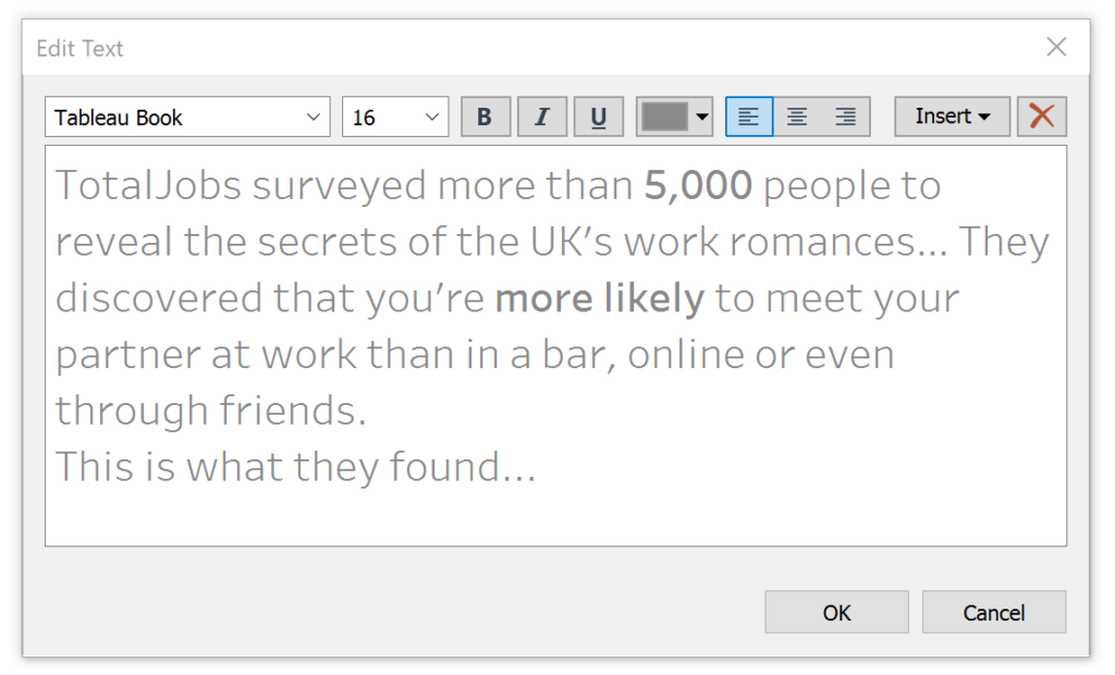
- Set the following positional attributes:
- Position X as 60.
- Position Y as 460.
- Size W as 580.
- Size H as 150.
A Text Object with:
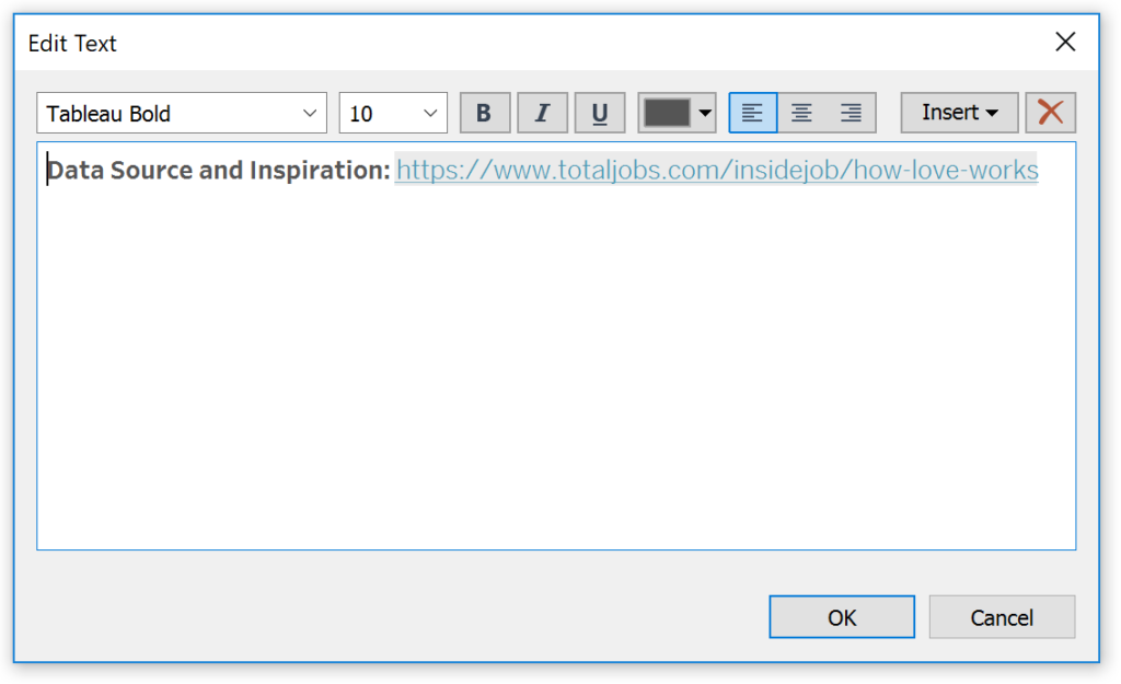
- Set the following positional attributes:
- Position X as 60.
- Position Y as 460.
- Size W as 580.
- Size H as 150.
Finally, drag the created worksheet onto the Dashboard and set the following parameters:
- Position X as 30.
- Position Y as 120.
- Size W as 950.
- Size H as 350.
If all goes well, we should now have the following completed dashboard.
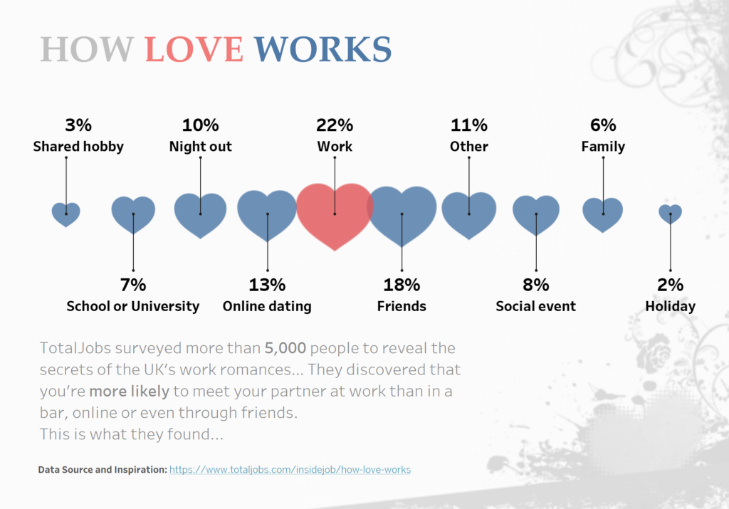
and boom, we are done, once again you can find my dashboard on Tableau Public at https://public.tableau.com/profile/toan.hoang#!/vizhome/HowLoveWorks/HowLoveWorks
Summary
I hope you all enjoyed this article as much as I enjoyed writing it and as always do share the love. Do let me know if you experienced any issues recreating this Visualisation, and as always, please leave a comment below or reach out to me on Twitter @Tableau_Magic.
If you like our work, do consider supporting us on Patreon, and for supporting us, we will give you early access to tutorials, exclusive videos, as well as access to current and future courses on Udemy:
- Patreon: https://www.patreon.com/tableaumagic
Also, do be sure to check out our various courses:
- Creating Bespoke Data Visualizations (Udemy)
- Introduction to Tableau (Online Instructor-Led)
- Advanced Calculations (Online Instructor-Led)
- Creating Bespoke Data Visualizations (Online Instructor-Led)

 Table Calculation")


