
I am a big advocate of having fun in Tableau and seeing where my imagination takes me. While browsing Pinterests I saw several neon (glowing) line charts and was wondering if this was possible in Tableau? and then wondered if we could use the Density Mark Type to achieve this effect? In this tutorial, we will go through and draw 5 different curves and try to have a little bit of fun.
Note: As always never choose a data visualisation type and try to fit your data into it, instead, understand your data and choose the best visualization for your data consumers. However, this tutorial is meant to be, well FUN…!!!
Data
Load the following data into Tableau Desktop / Public.
| Path |
| 1 |
| 360 |
I kid you not, this is all the data that we will need in our quick and fun tutorial. So let us get started.
Line
Once the data is loaded we will start by drawing a simple line.
- Right click on Path, go to Create and select Bins…
- In the Edit Bins dialogue window:
- Set New field name to Path (bin).
- Set Size of bins to 0.1.
- Click Ok.
- In the Edit Bins dialogue window:
- Change the Mark Type to Density.
- Drag Path (bin) onto Columns.
- Right-click on the object and ensure that Show Missing Values is checked.
- Drag the object onto Details.
- Create a new Calculated Field called Index with the following formula: INDEX()-1.
- Drag Index onto Columns.
- Right-click on the object, go to ompute Using and Select Path (bin).
- Click on the Color Mark.
- Set Color to Density Blue Dark.
- Set Intensity to 60%.
- Set Opacity to 100%.
- Set Border to None.
- Now we add the final cosmetic touches.
- Set the Background Color to Black.
- Set the Sheet Zero Lines to None.
- Set the Sheet Grid Lines to None.
- Set the Sheet Axis Rulers to None.
- Set the Size to 40%.
- Hide the Headers.
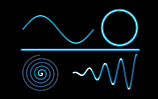
If all goes well, you should see the following:


Sin Curve
We will now add a new worksheet and create a Sin Curve using the same technique.
- reate a Calculated Field called X (Sin Curve) with the following formula: [Index]/10.
- Create a Calculated Field called Y (Sin Curve) with the following formula: SIN(RADIANS([Index]/10)).
Note: We want a more dense line to ensure that we have smoothness. This is why we set our Path (bin) to 0.1 to create more points. Because of this we also divided our index by 10 to ensure we get a single Sin Curve.
Now to build our Worksheet:
- Create a new Worksheet and name this Sin Curve.
- Change the Mark Type to Density.
- Drag Path (bin) onto Columns.
- Right-click on the object and ensure that Show Missing Values is checked.
- Drag the object onto Details.
- Drag X (Sin Curve) onto Columns.
- Right-click on the object, go to Compute Using and Select Path (bin).
- Drag Y (Sin Curve) onto Rows.
- Right-click on the object, go to Compute Using and Select Path (bin).
Adjust the cosmetics and if all goes well, you should see the following:

Circle
We will now add a new worksheet and create a nice Circle using the same technique.
- Create a Calculated Field called X (Circle) with the following formula: SIN(RADIANS([Index])).
- Create a Calculated Field called Y (Circle) with the following formula: COS(RADIANS([Index])).
Now to build our Worksheet:
- Create a new Worksheet and name this Circle.
- Change the Mark Type to Density.
- Drag Path (bin) onto Columns.
- Right-click on the object and ensure that Show Missing Values is checked.
- Drag the object onto Details.
- Drag X (Circle) onto Columns.
- Right-click on the object, go to Compute Using and Select Path (bin).
- Drag Y (Circle) onto Rows.
- Right-click on the object, go to Compute Using and Select Path (bin).
Adjust the cosmetics and if all goes well, you should see the following:

Spiral
We will now add a new worksheet and create a nice Spiral using the same technique.
- Right click on Path, go to Create and select Bins…
- In the Edit Bins dialogue window:
- Set New field name to Path (Spiral).
- Set Size of bins to 0.2.
- Click Ok.
Note: We want less points in the spiral than in the previous visualisations.
- Create a Calculated Field called X (Spiral) with the following formula: SIN(RADIANS([Index]))*[Index].
- Create a Calculated Field called Y (Spiral) with the following formula: COS(RADIANS([Index]))*[Index].
Now to build our Worksheet:
- Create a new Worksheet and name this Spiral.
- Change the Mark Type to Density.
- Drag Path (Spiral) onto Columns.
- Right-click on the object and ensure that Show Missing Values is checked.
- Drag the object onto Details.
- Drag X (Spiral) onto Columns.
- Right-click on the object, go to Compute Using and Select Path (Spiral).
- Drag Y (Spiral) onto Rows.
- Right-click on the object, go to Compute Using and Select Path (Spiral).
Adjust the cosmetics and if all goes well, you should see the following:

For giggles, change the Path (Spiral) value to 0.01 and you get this cool spotlight effect.

Incremental Wave
We will now add a new worksheet and create a nice Incremental Wave using the same technique. This is our last bit of fun.
- Right click on Path, go to Create and select Bins…
- In the Edit Bins dialogue window:
- Set New field name to Path (Wave).
- Set Size of bins to 0.25.
- Click Ok.
- Create a Calculated Field called Y (Wave) with the following formula: COS(RADIANS([Index]))*[Index].
Now to build our Worksheet:
- Create a new Worksheet and name this Incremental Wave.
- Change the Mark Type to Density.
- Drag Path (Wave) onto Columns.
- Right-click on the object and ensure that Show Missing Values is checked.
- Drag the object onto Details.
- Drag Index onto Columns.
- Right-click on the object, go to Using and Select Path (Wave).
- Drag Y (Wave) onto Rows.
- Right-click on the object, go to Using and Select Path (Wave).
Adjust the cosmetics and if all goes well, you should see the following:

For giggles, change the Path (Wave) value to 0.001 and you get this cool effect.

Summary
Now does this technique have real work application in terms of building Tableau Visualisations, I am not sure yet, but this is the Dashboard that inspired me to research and experiment with this technique.


I hope you all enjoyed this article as much as I enjoyed writing it, and as always, if you like this article, do share the love on, and also remember to follow us on Facebook, LinkedIn as well as Pinterest. Do let me know if you experienced any issues recreating this Visualisation, and as always, please leave a comment below or reach out to me on Twitter @Tableau_Magic.
If you like our work, do consider supporting us on Patreon, and for supporting us, we will give you early access to tutorials, exclusive videos, as well as access to current and future courses on Udemy:
- Patreon: https://www.patreon.com/tableaumagic
Also, do be sure to check out our various courses:
- Creating Bespoke Data Visualizations (Udemy)
- Introduction to Tableau (Online Instructor-Led)
- Advanced Calculations (Online Instructor-Led)
- Creating Bespoke Data Visualizations (Online Instructor-Led)