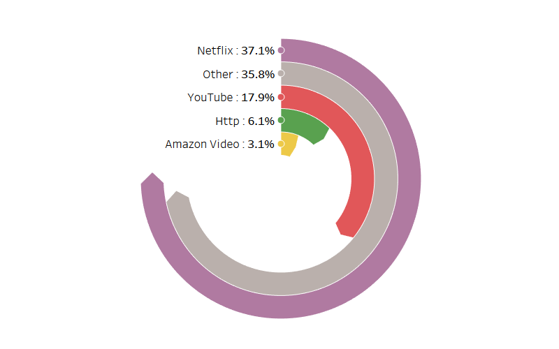
In September 2016, I wrote a tutorial titled Tableau Rings which was a step-by-step guide to create a Radial Bar Chart. To my surprise, this tutorial went on to be my top Tableau blog and was my third most read blog, yes, I have a blog on Salsa Dancing which is read by thousands and right now is far ahead, although, hopefully, that may change one day. During my search for website designs I saw a similar chart and thought to myself that I had to build this in Tableau, so here you have it, my Pointed Rings tutorial. Enjoy.
The Data
We are going to use a very simple DataSet, so let’s get started. Download the text file and open it within Tableau: HERE
Calculated Fields
We will create a Path (bin) object by:
- Right click on Path
- Go to Create, Bins…
- In Edit [Path] set the Size of bins to 1
- Click Ok
The Path (bin) will allow us to use a table calculation to create additional data points between 1 and 271.
Note: we are using the Path (bin) to densificate data and give us more points to work with. One thing to make sure of is that you check the Show Missing Values.
We will now create the following Calculated fields.
Index: This Table Calculation will be used to represent the individual points.
WC_PI: A Table Calculation that represents PI.
WC_Start: A Table Calculation that represents the individual line.
Note: I could have used a rank function to get this value, that way it would be more dynamic and would allow me to perform functions like sort. But oh well.
WC_Percentage: A Table Calculation that represents the percentage of the bar vs the maximum.
X: This is to plot the X point.
Before you hate me for this calculation, I am going to briefly go through it. In our Index Calculated Field we had ([Index]-1) * 2, this is to give us more points to play with. If Index is less than 270 then we are drawing the inner line, if Index is above 270then we draw the outer line. If Index is 270 then we draw the point at the tip of the arrow.
Y: This is the same as X but uses COS instead of SIN
Y 2: This is used to create the little circle and allow us a good place to put our label.
That is all the Calculated fields we will need for this visualisation. We will now use these to create our worksheet.
The Worksheet
Lets start by dragging our Calculated fields onto the worksheet:
- Grad Path (Bin) onto the Details Mark.
- Drag X onto Columns
- Right click on X, select Compute Using and choose Path (Bin)
- Drag Y onto Columns
- Right click on Y, select Compute Using and choose Path (Bin)
- Change the Mark Type to Polygon
- Drag Index onto Path
- Right click on Index, select Compute Using and choose Path (Bin)
- Drag Name onto the Color Mark
You should not see something like the following:
Oh now, this is getting excited.
- Drag Y 2 Onto Rows
- Right click on Index, select Compute Using and choose Table (across)
- Right click on Y 2 and select Dual Axis
- Right click on the Y 2 Axis and click Synchronise Axis
- Do not panic because everything disappeared
- Now remove Measure Names from the Color Mark
- Go to the Y 2 Marks Panel and change the type from Polygon to Circle.
We should now have something that looks like this.
That now for the finishing touches
- Remove all borders and zero lines
- Right click on the canvas.
- Add Max(Value) to the Y 2 Label Mark
- Make the label alignment Middle Left
- Change the colour to suit your taste.
Keep working on this until you get something like my finished product.

And that is a wrap. I hope you enjoyed this blog. Do let me know how you get along via Twitter @Tableau_Magic.
If you like our work, do consider supporting us on Patreon, and for supporting us, we will give you early access to tutorials, exclusive videos, as well as access to current and future courses on Udemy:
- Patreon: https://www.patreon.com/tableaumagic
Also, do be sure to check out our various courses:
- Creating Bespoke Data Visualizations (Udemy)
- Introduction to Tableau (Online Instructor-Led)
- Advanced Calculations (Online Instructor-Led)
- Creating Bespoke Data Visualizations (Online Instructor-Led)


