

As the Premier League season comes to a close, I always look for ways to experiment with data visualisations, and this season, I came up with the two following data visualisations
Premier League 2020/2021 Poster

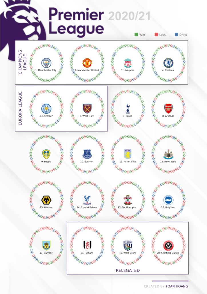
Last season, I built a data visualisation highlighting all the games in a horizontal line, and for this season, I decided to have the matches going around in a circle. This combines my tutorials on create a Circle Dot Chart, Waffle Chart and leverages some interesting techniques and images.
You can explore the data visualisation here: https://public.tableau.com/app/profile/toan.hoang/viz/PremierLeague2020-2021Poster/PremierLeague20202021Poster
Premier League 2020/2021 Report Card

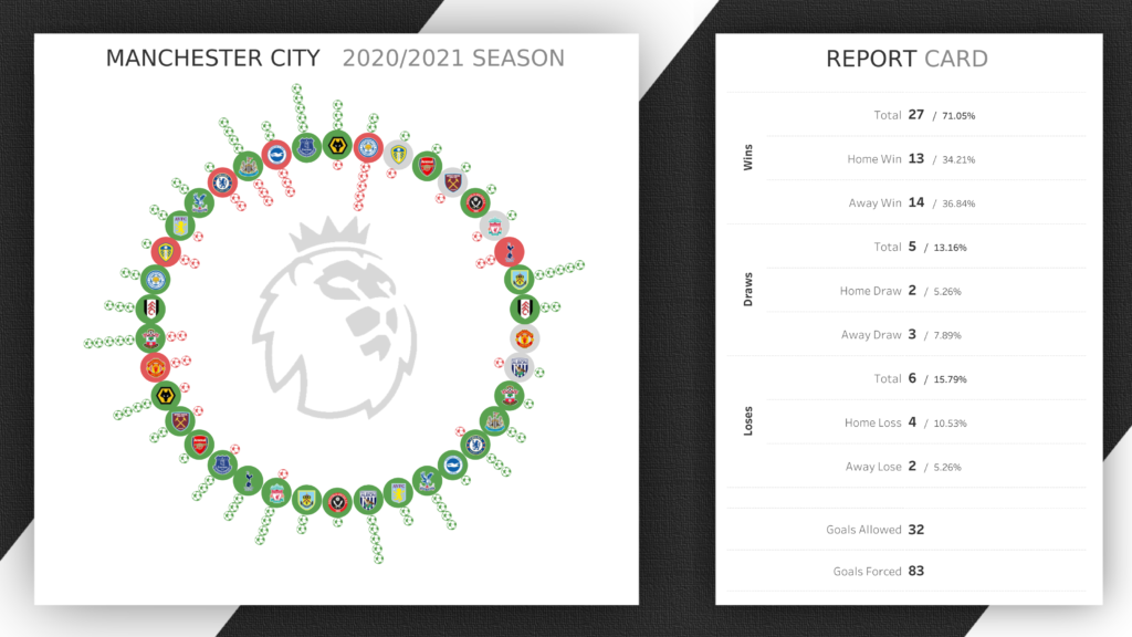
As well as creating a Circle Dot Chart, I wanted to see if I could highlight the numbers of goals scored for each match. Therefore, I decided to leverage data densification and create the middle circle to highlights the results, and then the number of goals scored on the outside (highlighted in green), and the numbers of goals allowed on the inside (highlighted in red). I think this works out pretty well, is definitely interesting to look at, and if anything, this will probably form the basis of a new tutorial.
You can explore the data visualisation here: https://public.tableau.com/app/profile/toan.hoang/viz/PremierLeague2020-2021ReportCard/20202021PremierLeagueSeason
Match Day Data Set
I spent several hours to manually compile the match day data source,
- Match ID – Unique machine-generated ID
- Team – One of the 20 Premier League teams
- Match – The match number for the particular team (ranges from 1 to 38)
- Date – The date of the match
- Home Team – The home team
- Home Score – The number of home goals scored
- Away Team – The away team
- Away Score – The number of away goals scored
- Grounds – The location of the game
I have made the file downloadable, so do enjoy, and please do tag me if you use this data in your data visualisations, as I would love to see it.