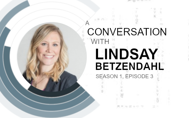
Consultant | #ProjectHealthViz founder, #TeamTableauHealthcare | 5 Time #VOTD | A licensed marriage and family therapist turned into a Tableau junkie.
Twitter: @ZenDollData
Website: https://vizzendata.com
Lindsay is a data visualization consultant at HealthDataViz and describes herself as a highly energetic, passionate, extroverted individual whom, at the same time, is usually very relaxed and steadfast. Lindsay is also highly detail-oriented and therefore particular about order and consistency.
Lindsay lives with her husband and two young boys (ages 6 and 1.5) in Connecticut
I had the pleasure of having a conversation with Lindsay Betzendahl regarding her journey in Data Visualisation and Tableau.
Toan: Tell us a little about your background, how did you get into Data Visualisation and find your way to Tableau?
Lindsay: It’s an interesting story, I think. Prior to data viz work, I was (and technically still am) a licensed Marriage and Family Therapist. For six years I delivered direct clinical
It was in my role as a Regional Network Manager, that I came into daily contact with data. Much of that data I was required to analyze and then to communicate key points or stories to others in order to prompt change. I found that the platform, or visual method, of the
I sought out alternative methods
As the local leader of the innovation, I was appropriately thrust into the role to help others learn and perfect their Tableau skills, as well as support the operational strategy for implementing Tableau at my company. Luckily, I have some natural skills that helped me learn fast, be efficient, take risks, be creative, and challenge the status quo. That, along with some amazing leaders who were willing to listen and believe that there was power in data visualization, propelled me into the data viz space. Literally, from clinician to data visualization specialist within a few years. It’s been a fabulous journey
Toan: I have talked to many people about their journey in Tableau, was there a specific moment or feature of Tableau which got you hooked? Or was it something more general? I know that mapping caught the eye of many people, what was it for you?
Lindsay: For me, it was the simple ability to give people a tool to visualize data that didn’t require a formal degree or educational training in a data analytics field. What I mean, is that the initial learning curve is pretty low. Since I came from a world of just using Excel, the advancement to Tableau was huge. With little training, I could make better graphs than I could previously, and I could understand calculations with ease. Excel felt so cumbersome and I couldn’t “see” what I was doing with calculations. Having the ability to simply drag and
Toan: Which tools (or processes, or ideas) did you initially use to help others learn and perfect their Tableau skills, and why? Was this a process of trial and error? Or did you leverage your past experiences?
Lindsay: At my prior job, much of the support I provided to others to learn Tableau came in the way of simple knowledge transfer, or sharing of information, and feedback loops. This may have come from my past as a clinician to a degree. In therapy, you are taught to use questions to evoke ideas and emotions from the client as well as to challenge their point of view and help them to a “better” place by giving them new skills.
In regard to teaching Tableau, if I came across a new concept, trick, method, chart, or calculation, I would share that with the team. I started collecting resources that would likely be helpful for the work that we did. I began a “Friday Viz of the Day” email in which I would email around two community visualizations: one “practical” and one “design-based”. In that email, I shared tips and tricks that the people used to either create a visual that would be applicable to our work or something wildly creative, that while perhaps not directly useful, showed the capabilities of Tableau. This simple email kept people engaged and learning.
The second was
I believe when you are presented with new ideas you have the opportunity to weave them into your framework, into your toolbox. People learned faster when they engaged in this feedback loop and iterative process.
Toan: Tableau projects come in various shapes and sizes, personally speaking, what has been the most rewarding work (or project) you have done in the Tableau space and why?
Lindsay: This is a tough question, mostly because I sort of separate the visualizations I do for work and those I do personally into two different buckets of what I would define as rewarding. What I deem rewarding (pleasurable, fulfilling, productive) for work is different than it is for play
Let’s start with the ‘on the job most rewarding viz’. At work, I find the most rewarding visualizations I’ve completed are ones that achieve tremendous insight and bring people together around data. I love seeing people’s faces when they suddenly move from “I hate data” to “I can’t get enough of this data!”. At my prior job, I developed a dashboard that was used by many people and was presented to hospital providers. Prior to creating the dashboard, we almost cut the entire program that analyzed the data for the hospitals because we thought “it was boring” and “nothing was really changing”. We were so wrong, but we didn’t know what was really going on until we visualized and explored it in more detail. The dashboard ended up saving the program and, upon my departure, was the most used dashboard at our company.
Personally, on Tableau Public, my most rewarding visualization was the one I just completed as a collaborative project with Kevin Flerlage. While I have a number of other visuals that I truly love, this collaboration provided me with a few experiences and lessons I wouldn’t have achieved on my own. You can see the visualization here:
https://public.tableau.com/views/ACheetahsRaceforSurvivalCollaboration/Cheetah
First of all, this was a month-long project. I spent a lot of time into researching data on cheetahs, reviewing research articles, infographics, conservation websites, etc. Secondly, the topic was very close to my heart as the cheetah is my
Ultimately, through this collaboration, I think both Kevin and I learned a lot about how to work on a visualization together. How do you share your own personal style with someone else? How do you navigate when you like or don’t like something? How do you collectively decide the story the data is telling you? How do you determine layout, flow, chart types, etc.? All these questions were exciting to solve with someone.
In the end, we were both proud
Toan: Collaborating on data visualisations sounds super interesting, I do not think it is done too often as most of the time “someone builds” and “someone uses”. How did this collaboration come about? How do you go about brain storming ideas? How did you work together, by phone, by skype, did you use a whiteboarding tool? Did you fight, laugh, cry, argue, debate?
Lindsay: So in mid-February, I got to thinking about collaboration. I hadn’t seen it much, maybe twice on Tableau Public, and while I’ve experienced handing off work dashboards midway through development for someone else to complete, those weren’t true collaborations where people work together to create.
I started asking around if anyone knew about how someone would collaborate on a Tableau Public viz – any best practices so-to-speak. It got me thinking about all the details: how would you share the workbook; how would you both decide on the data, the charts, the various design elements; what would it feel like to disagree; what would make it a good visual; and how would you incorporate each other’s unique talents? My goal was to “experiment” with
What happened was I reached out to Kevin, since he’s a friend of mine, and asked if he knew of anyone that had done a true collaboration. He mentioned he had done a viz with his brother and one with his boss, but they were quick and didn’t involve the complex thought that a longer, larger, collaboration may need. In our discussion when I was throwing around ideas he said, “maybe we can do one together!” I immediately said “Yes, I’d love to!”
Within an hour of my initial question, we had agreed to do the c
While we didn’t actually argue or cry about any aspect of developing the viz, we did have some longer conversations (debates) about design choices. For example, Kevin really had an idea of having a close-up photo of a cheetah near the title. He and I went back and forth for a long time reviewing images on Shutterstock, which I have an account with. At one point he said, “You are going to hate me by the end of this.” We laughed at the determination we both had to make it perfect. I did finally find an image that we both liked and accomplished the emotional draw we also were looking for. I will say that we laughed a lot and got super excited quite often when we saw each step of the visualization take form. I believe
we both may have had dreams about the cheetah viz!
Toan: To add to the above, what was the most challenging project you have experienced in Tableau and why? How did you overcome this challenge, and what advice would you give to people who experience the same challenge? What would you say to yourself if you had a time machine
Lindsay: It’s hard to recall an exact challenging project. Every project comes with its own challenges. In general, the biggest challenges can be the ones in which the client doesn’t know what they want. While I do find those enjoyable because it can be a blank slate, it also can mean lots of iterations as the client learns what they want by seeing what you build. In cases like these, I try to ask a ton of questions and then provide some examples to gauge what types of dashboards they may be interested in. Then I communicate, communicate, communicate. This means I share every step of the way and shoot emails with images to show progress on ideas. This helps them remain engaged and make decisions along the way.
For me, the worst is when a client doesn’t know what they want, and they don’t have data to share with you. I find these so difficult. Basically, it means I need to be extremely creative in envisioning their data (both the structure and the use of it) and given some data visualization best practices, put together a prototype that gives them a sense of how a dashboard would help them answer their key questions. I actually created a PowerPoint deck that has a ton of images made of shapes to look like various chart types. Then I can use these to arrange an example. Or, if I can really get a sense of their data, then I may mock up data and build something in Tableau. In retrospect for any of these, I’d tell myself that I can do it. It’s always challenging at first looking at a blank page without data and miraculously creating something out of nothing, but with a little creativity and time to think, I usually can pull through.
Toan: I am designing a mockup tool that acts exactly like your PowerPoint, I would love to collaborate on this. Have you worked with a client that knows exactly what they want, and it is either not best practice, or at worse a replication of Excel? If so, how do you have a conversation about visual analytics? How do you approach the subject of changing mind-sets?
Lindsay: Sounds amazing! I’d love to collaborate and hear more about what you are working on!
Yes, I’ve definitely worked with clients who know what they want. Some have mocked up ideas in Excel or pointed me to other dashboards they have seen. I believe that people often think they know what they want because they don’t really know anything different or better. In cases in which their idea is a poor practice or a terrible Excel mock-up, then I try to educate them in the moment on best practices. The why it’s not a good chart or the how I can make it better so they can answer their questions. As with therapy, you can’t just tell someone, “Well, your relationship is suffering because you are horrible at communicating your feelings,” and then expect them to nod and agree and change.
The key is helping people towards change on their own terms, sometimes slowly, and guiding them to situations which will lead them to the “right” visual analytic decisions. By aligning with the client (“Ah, I see you have thought this through and have an idea about what you want. That is great insight into your needs.”), I can then build rapport before sharing best practice concepts. If they are not in immediate agreement, that is fine. I will usually build most of what they want or even show them a “better” option up-front so they can actually see the differences before any decision is made. Usually, people come around on their own. Patience is a virtue, as they say, and it can take time to change the course of a ship.
Toan: Tableau is amazing, where do you see Tableau going in the next few years? What features would you love to see, or functionality improved upon? If you were the CEO of Tableau, what would you see as
Lindsay: I always find this is a hard question to answer because it usually depends on the moment and what recent challenge I’ve faced. Plus, I worry that what I think is a limitation with Tableau is really just a limitation with me! Okay, paranoia aside… I dislike when I adjust a dashboard size and everything in my dashboard “grows” – this is especially true with anything floating. It would be nice to have things remain
As far as the CEO goes, I think there are two things I would focus on – ability to manage larger and larger data sets and complexities without losing speed or function and cost. Organizations are only accumulating more and more data and they want to use tools that are cost effective. For speed, it’s a matter of ensuring that all the elements people can use in Tableau can perform at optimum speed for users. I think the various changes to Tableau’s payment structure and the overall cost is challenging for many organizations. I hope Tableau doesn’t grow too fast to where they have to increase cost. It would be a shame if that led to business loss due to the overall expense of the product and the maintenance of it.
Toan: What are your thoughts about the change from preputial licenses vs the newer subscription model? Has this changed the way your clients view Tableau? Tableau did release AskData for free but now have a data management SKU for Tableau prep scheduling and other features, do you think that Tableau will give us free functionality and premium functionality as add-ons?
Lindsay: To be honest, the subscription model gets my neurons in knots. I find it confusing and every time I’m a part of a conversation questioning all of the separate licenses, subscriptions, add-ons, etc., I lose track. I have a feeling some companies, maybe smaller ones, may feel the same way. I have enough challenges getting people to understand the difference between Tableau Desktop and Server let alone Creator, Builder, Prep, and Ask Data, and how to pay for each. Originally, Tableau released Prep as a part of Desktop, but now it’s a separate fee. I can only wonder if AskData will go that route as well. It’s hard to predict what Tableau will do, but I think with all the wonderful additional tools and functions, we could risk intimidating some organizations as it becomes too a la cart. I believe it would be simpler to just have tiers that get you more tools. Like you said, a desktop, a pro, and premium, or something like that. I can wrap my head around that logic!
Toan: Tableau has an amazing community for learning and there are loads of places to go. What is your top tip for really excelling within Tableau, what is your secret?
Lindsay: Agreed. The community is certainly stellar. It’s like nothing I’ve encountered in my life thus far in regards to software or a work-related subject. I think the community can really help one another grow and excel in their skills. One benefit is being able to find people you can relate
- Practice. I did not engage in much formal training, but
instead I used Tableau every day at work and at home. Most of my learning was by trial and error and then improving on my failures. The skills most people have that use Tableau didn’t develop overnight. Yes, there are some with some natural abilities one way or another, but ultimately, it takes some degree of dedication and practice to solidify your style and your knowledge bank. - Inspiration. Be sure you have a place for inspiration. That means, I think it’s important to have data that gets you energized when you are initially learning. Luckily, I loved what I did at my job so using my daily work data was perfect. But if you don’t like the data you work with, then I’d find something you truly are interested in.
Second to that, is find places where you can find visual inspiration. That can be on Tableau Public, on internet searches, in art, in magazines, infographics, photography, news articles, etc. I can’t work without finding new things that spark ideas regularly. - Discussion. You can’t learn in a vacuum. It’s important to communicate and discuss with others what you are doing, what you are struggling with, and what you think you are doing well. Feedback is so important to excelling. We cannot always be our own mirror. We don’t always see our own mistakes or areas that aren’t all that great. This is why having a network of people for feedback is very helpful. This can be at your workplace, your family, or in the Tableau
Community. As long as you have people to bounce ideas off of or get help, and people who can give you honest feedback, then you are better poised for success.
Toan: Who are your biggest inspirations in the Tableau Space, past and present? Who are the people you would highly recommend following or keeping an eye out for?
Lindsay: This is a super tough question! There are so many inspirational people in the Tableau Community who are pushing boundaries and being creative. I’m often inspired by Simon Beaumont and Chantilly Jaggernauth for their designs. They both tend to make more artist or infographic-type visuals and that is something I’m drawn to. Justin Davis has been producing some amazing dashboards, as has Sam Parsons. Three individuals that I think are worth keeping an eye out for are Katie Bridges, Penola Edwards, and Anna Dzikowska. They all have made some exceptional visuals that have clean lines and crisp stories. Anna has been a powerhouse in the healthcare space and I’m so impressed with her dedication to succeed at Tableau and perfect her skills in that area. I try to keep an eye out for women who are advancing in the data visualization space. It’s important for me to support these individuals.
Toan: Finally, tell us something about yourself, what do you do in your free time?
Lindsay: Beyond Tableau, I enjoy activities such as snowboarding in Vermont, hiking, visiting family, boating and fishing in New Jersey, and checking out local breweries with friends. I have an intense taste palette so you can usually find me trying various spicy foods and exploring craft b
I love being involved with groups of people with whom I can share similar loves and make laugh by being myself. Above all, I try to be a genuine person that people can relate to. It’s my goal to be open, honest, and transparent.
Consultant | #ProjectHealthViz founder, #TeamTableauHealthcare | 5 Time #VOTD | A licensed marriage and family therapist turned into a Tableau junkie.
Twitter: @ZenDollData
Website: https://vizzendata.com
A Conversation with Season 1:
- Episode 1 / Mark Bradbourne
- Episode 2 / Josh Tapley
- Episode 3 / Lindsay Betzendahl
- Episode 4 / David Pires
- Episode 5 / Dilyana Bossenz
- Episode 6 / Yukari Nagata
- Episode 7 / Emily Kund
- Episode 8 / Ken Flerlage
- Episode 9 / Sarah Burnett
- Episode 10 / Merlijn Buit
