


")


I was working on an update to our Curved Line Charts and thought about turning this onto a Curved Area Chart, or Sigmoid Area Chart. I am going to be exploring this a lot more, but I hope you enjoy this tutorial that leverages a secondary data source and data densification to draw this bespoke data visualisation in Tableau.
Note: This is an alternative type of data visualisation, and sometimes pushed for by clients. Please always look at best practices for data visualisations before deploying this into production.
Data
Load the following data into Tableau Desktop / Public.
Country,Date,Value,Link
United States,01/01/2019,90,1
United States,01/02/2019,40,1
United States,01/03/2019,-60,1
United States,01/04/2019,100,1
United States,01/05/2019,-20,1
United States,01/06/2019,-20,1
United Kingdom,01/01/2019,80,1
United Kingdom,01/02/2019,10,1
United Kingdom,01/03/2019,10,1
United Kingdom,01/04/2019,10,1
United Kingdom,01/05/2019,10,1
United Kingdom,01/06/2019,-20,1
France,01/01/2019,200,1
France,01/02/2019,-120,1
France,01/03/2019,-10,1
France,01/04/2019,-20,1
France,01/05/2019,50,1
France,01/06/2019,80,1
Once your data is copied into Tableau, right-click on the data source and click on Edit Data Source… with the Data Source Editor open, paste the following:
Link,Path
1,0
1,100
Note: If you are using Tableau 2020.2 or great i.e. have access to new Relationship Model, you will need to double-click on the originally pasted data source to open up before pasting in the Path Data.
Make sure that you are using an inner join and the Link column is used to link the two data sources.
Note: we need two records for each Metric as we are going to be drawing lines and using densification to get more points on our canvas. For more information, check out our article on Data Densification.
Calculated Fields
With our data set loaded into Tableau, we are going to create the following Calculated Fields and Bins:
Create Path (bin)
- Right click on Path, go to Create and select Bins…
- In the Edit Bins dialogue window:
- Set New field name to Path (bin).
- Set Size of bins to 1.
- Click Ok.
Index
-6+((INDEX()-1)*0.12) // Index values from -6 to 6 in 0.12 incrementsDate (Month)
DATEPART("month",[Date])TC_Date
WINDOW_MAX(MAX([Date]))TC_Value
WINDOW_MAX(MAX([Value]))TC_Previous Value
RUNNING_SUM([TC_Value])-[TC_Value]TC_Running Sum
RUNNING_SUM([TC_Value])Y
ROUND((1/(1+EXP(-[Index]))),2)// Sigmoid Curve, correction by Klaus Schulte
* [TC_Value] // Size of the Value
+ [TC_Previous Value] // Add the Previous Values i.e. Starting Point
So now that we have created a lot of Calculated fields, we will now put this together into a Worksheet.
Worksheet
We will now build our first worksheet:
- Change the Mark Type to Area.
- Drag Country to Colour Mark.
- Drag Date (Month) to Columns.
- Drag Path (bin) to Columns.
- Right-click on this object and ensure that Show Missing Values is selected.
- Drag this object onto the Detail Mark.
- Drag Index onto Columns.
- Right-click on this object, go to Compute Using and select Path (bin).
- Drag Y onto Rows.
- Right-click on this object, go to Compute Using and select Path (bin).
If all goes well, you should see the following:
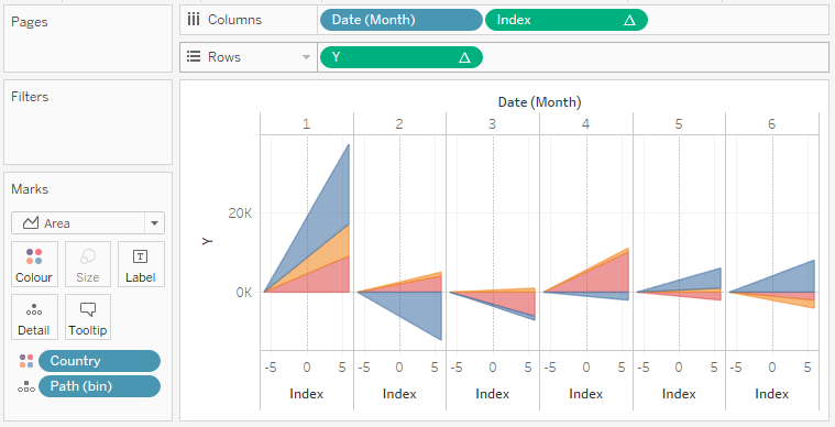
We are getting close and now just need to update the Y Table Calculation settings.
- Right-click on the Y object and click Edit Table Calculation…
- In Nested Calculations, select TC_Previous Value.
- In Compute Using select Table (across).
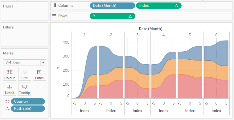
You should now use the following:
The final steps is to update the cosmetics.
- Edit the Index Axis to be a fixed range from -6 to 6.
- Hide the Headers
- Hide the Zero Lines
- Hide the Grid Lines
- Hide Rows and Column Dividers
- Add the Tooltips
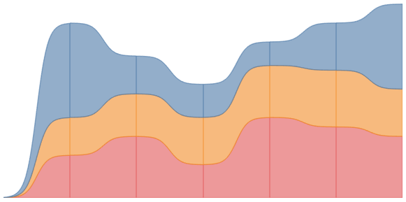
You will want to end with the following:
and boom we are done, this was a fun blog and you can see my version of this visualisation on Tableau Public at https://public.tableau.com/profile/toan.hoang#!/vizhome/SigmoidAreaCharts/SigmoidAreaCharts
Summary
I hope you all enjoyed this article as much as I enjoyed writing it and as always do share the love. Do let me know if you experienced any issues recreating this Visualisation, and as always, please leave a comment below or reach out to me on Twitter @Tableau_Magic.
If you like our work, do consider supporting us on Patreon, and for supporting us, we will give you early access to tutorials, exclusive videos, as well as access to current and future courses on Udemy:
- Patreon: https://www.patreon.com/tableaumagic
Also, do be sure to check out our various courses:
- Creating Bespoke Data Visualizations (Udemy)
- Introduction to Tableau (Online Instructor-Led)
- Advanced Calculations (Online Instructor-Led)
- Creating Bespoke Data Visualizations (Online Instructor-Led)


Hi Toan, thx for another awesome viz, I have got the viz perfectly but the values are not matching, pls find my public link below
https://public.tableau.com/views/SigmoidAreaCharts_15613840871970/SigmoidAreaCharts?:embed=y&:display_count=yes&publish=yes&:origin=viz_share_link
Toan could you please let me know what are the fields you are using in Tool-tip. I would also like to know whether you are using dual axis
In the tooltips, I have TC_Value and TC_Running Sum. I will have to have a look at your values over the weekend as I am on a weeklong project.
Thx Toan, will wait
I have made this downloadable.
Thank you Toan, I didn’t modify table calculation for Running Sum, now its perfect.
[…] can now use [Path] and [Profit LOD] and follow for example this blog by Toan Hoang to create curvy line […]
Thank you so much for sharing your work….you are Picasso of tableau..!