


")


In the fifth part of our introduction to Tableau Series, we are going to look at the Mark Shelf, Mark Types and how to customize the appearance of your Marks within your worksheet View.
Mark Types
Tableau provides several mark types for you to choose from, let us go into these now.
- Automatic – The automatic Mark Type tells Tableau to choose the most appropriate Mark Type for the data within your Columns and Rows. This is the default value.
- Bar – The Bar mark type is useful when you want to compare measures across categories, or when you want to break data down into stacked bars
- Line – The line mark type is useful when you want to see trends in data over time, your data are ordered, or interpolation makes sense.
- Area – The Area mark type is useful when you have a view where the marks are stacked and do not overlap.
- Square – The square mark type is useful when you want to clearly see individual data points. When you select Square from the Marks card drop-down menu, Tableau displays your data using squares.
- Circle – When you select Circle from the Marks card drop-down menu, Tableau displays your data using filled circles. This is good for Scatter Plots and the alike.
- Shape – The shape mark type is useful when you want to clearly see individual data points while also viewing categories associated with those points.
- Text – The Text mark type is useful when you want to display the numbers associated with one or more dimension members.
- Map – The Map mark type uses geocoding to fill a polygon or line with a color based on data. The primary use of the map mark type is for creating polygon or line maps. The area to be filled is defined by the geographic fields used in the view.
- Pie – You can use the Pie mark to show proportions. Although generally this type of information can be better shown using stacked bar charts, there are cases where pie marks can be very effective
- Gantt Bar – The distinguishing characteristic of Gantt Bars is that the length of every mark is proportional to the measure placed on Size on the Marks card.
- Polygon – Polygons are points connected by lines enclosing an area. The polygon mark type is useful when you want to connect points to create data areas. On the Tableau Magic website we make use of Polygons for drawing shapes.
- Density – You can use the density mark to visualize patterns or trends in dense data with many overlapping marks. Although generally this type of information can be shown using a circle mark, there are cases where density marks can be very effective
There is a lot of information here, so we will load into some sample data and then explore the different map types.
Exploring Mark Types
We will start by downloading the following data from the official Tableau Website at http://www.tableau.com/sites/default/files/training/global_superstore.zip
Once the file is downloaded, unzip the file to retrieve the Excel document; open this Excel file within Tableau Desktop / Public and ensure you load the Orders Tab.
With this, we are going to build a visualisation using the different mark types mentioned above; this will hopefully give you hands on experience with Mark Types.
Bar Mark Type
In a new worksheet:
- Change the Mark Type to Bar.
- Drag Order Date onto Columns.
- Drag Sales onto Rows.
You should see the following:
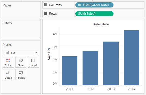
With the Bar Mark Type you have the ability to customize the following: Color, Size, Label, Detail and Tooltip. Experiment by dragging additional objects onto the different customization and observe the results.
Line Mark Type
Create a new Worksheet and:
- Change the Mark Type to Line.
- Drag Order Date onto Columns.
- Drag Sales onto Rows.
You should see the following:
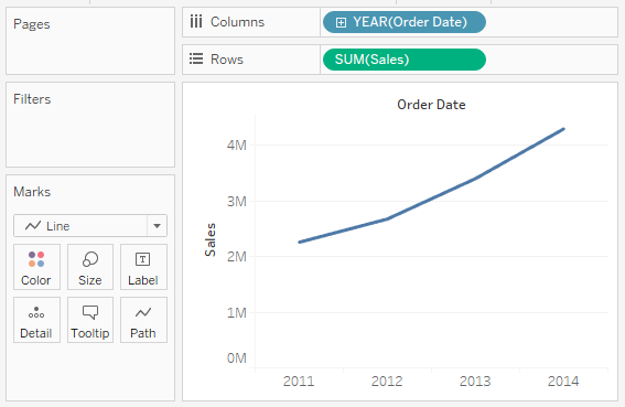
With the Line Mark Type you have the ability to customize the following: Color, Size, Label, Detail, Tooltip and an the addition of Path. Click on Path and explore the Linear, Step and Jump options.
Area Mark Type
Create a new Worksheet and:
- Change the Mark Type to Area.
- Drag Order Date onto Columns.
- Drag Sales onto Rows.
You should see the following:
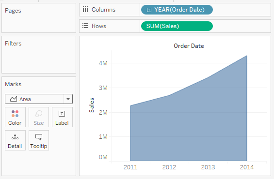
With the Area Mark Type you have the ability to customize the following: Color, Label, Detail and Tooltip.
Square Mark Type
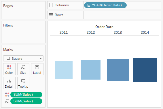
Create a new Worksheet and:
- Drag Order Date onto Columns.
- Drag Sales onto Color.
- Drag Sales onto Size.
You should see something like the following:
We can have a little more fun with the Square Mark Type by creating a new Worksheet and:
- Change the Mark Type to Square.
- Drag Order Date onto the Filters Shelf.
- Select Year.
- Filter on 2014.
- Drag Segment onto Columns.
- Drag Order Date onto Rows.
- Right-click on the object and select Month.
- Note: Make sure you select the discrete month as opposed to the continuous month. The Discrete month appears towards to the top of the menu bar.
- Drag Sales onto Label.
- Drag Sales onto Color.
In the Fit setting choose Entire View.
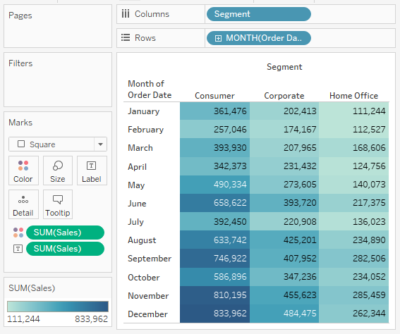
Highlight tables and the alike are a fantastic way to visualize tables within Tableau.
Note: Tableau does not work too well with very large tables so be cautious.
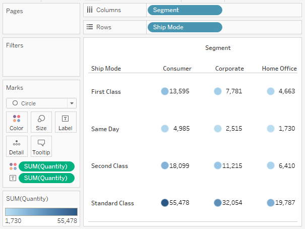
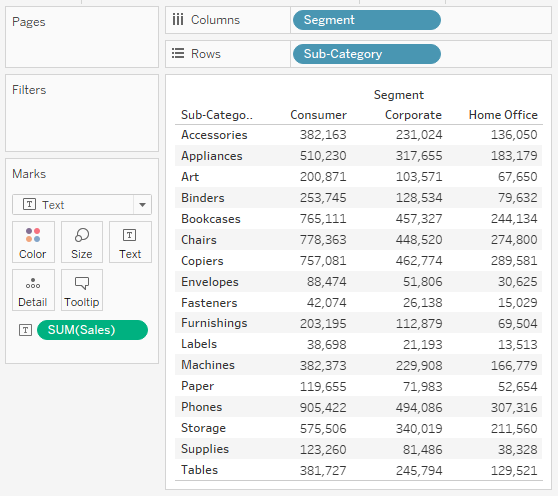
Circle Mark Type
Create a new Worksheet and:
- Change the Mark Type to Circle.
- Drag Segment onto Columns.
- Drag Ship Mode onto Rows.
- Drag Quantity onto Color.
- Drag Quantity onto Label.
- Right-click on the Segment header in the view and right align the text.
You should hopefully see the following:
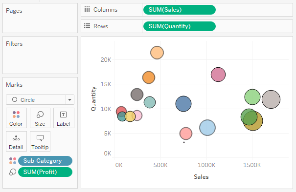
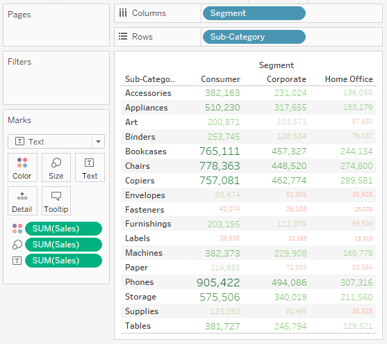
Create a new Worksheet and:
- Change the Mark Type to Circle.
- Drag Sales onto Columns.
- Drag Quantity onto Rows.
- Drag Sub-Category onto Color.
- Click on Color and Set the Opacity to 80%, and also set the Border to black.
- Drag Profit onto Size.
- Click on size and increase the value.
You should see the following:
Shape Mark Type
Create a new Worksheet and:
- Change the Mark Type to Shape.
- Drag Sales onto Columns.
- Drag Quantity onto Rows.
- Drag Category onto Shape.
- Click on shape and assign the a shape to different Categories.
- Drag Category onto Color.
- Click on Color and Set the Opacity to 80%.
- Drag Profit onto Size.
- Click on size and increase the value.
- Drag Sub-category onto Details.
- This will include the Sub-categories into your View.
You should see the following:
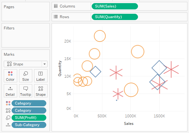
You can include your own custom Shapes in Tableau.
Text Mark Type
Create a new Worksheet and:
- Change the Mark Type to Text.
- Drag Sales onto Text.
- Drag Segment onto Columns.
- Drag Sub-Category onto Rows.
Nice and simple, and you should see the following:
Let us have some fun and:
- Drag Sales onto Size and adjust.
- Drag Sales onto Color.
- Click on the Color Mark and select Edit Colors.
- In the Edit Colors window:
- In Palette select Red-Green Diverging.
- Click Advanced, check Center and enter 100,000.
- Click OK.
Adjust both, and you should see the following:
Are you can see the values are customized to jump out at you.
Map Mark Type
Create a new Worksheet and:
- Drag State onto Detail.
- Because State is a Geographic data type, we Tableau automatically generates a Longitude and Latitude objects for us and places them in our visualization.
- In the application Menu, to go Map and select Edit Locations…
- In Country/Region select the United States.
- Click OK.
- Drag Sales onto Color.
You should see the following:
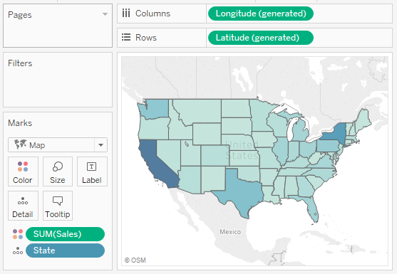
Do explore the possible options with Maps as you can have loads of fun here.
Pie Mark Type
Create a new Worksheet and:
- Change the Mark Type to Pie.
- Drag Segment onto Color.
- Drag Sales onto Angle.
- Note: Angle is only available to Pie Mark Types.
- Drag Segment onto Label.
- Drag Sales onto Label.
- Click on Label and edit as required.
You should see the following:
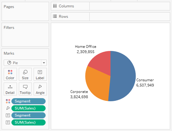
Note: As you can see we did not need to add any objects to the Columns or the Rows.
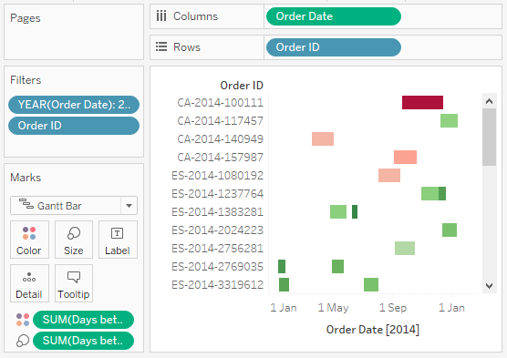
Gantt Mark Type
Create a new worksheet and:
- Create a Calculated Field called Days between Order and Ship with the following formula DATEDIFF(‘day’, [Order Date], [Ship Date]). We are going to explore Calculated Fields in more depth in the next tutorial.
- Drag Order Date onto the Filters Shelf and filter for only 2014.
- Drag Order Date onto Columns.
- Right-click on the object and select Exact Date.
- Drag Order ID onto Rows, you will see a prompt and I want you to choose Filter and then add.
- Go to Top, check By field, and choose top 100.
- Click OK.
- Drag Days between Order and Ship onto Size.
- Drag Days between Order and Ship onto Color.
- Click on Color, and select Edit Colors.
- In Palette, select Red-Green Diverging.
- Check Reversed.
- Click OK.
You should now see the following where you can trace the time between the Order Date and the Ship Date. The Darker the red, the long the time between the two dates.
Polygons and Density Mark Types
We have several tutorials on how to use the polygon mark type and we will release an introduction to Drawing Polygons in Tableau in due course. This as well as how to use Density Maps. Suffice to say, you are going to see a lot of data visualizations from beginner to advanced using these two mark types. So basically, we will tackle these two in the future.
Summary
In this part of our introductory series, we explored the Mark Panel, Mark Types and how you can alter how marks are shown in your view. We tried to build at least one visualization with each type to give you a flavor of what can be done. I would suggest connecting to your data source and having a play around with the different options as in our next Chapter we are going to go through Calculated Fields.
I hope you enjoyed this tutorial, and look forward to the next one. I am always looking for ways to help share knowledge around the community, so if you want to know more about something, and wish there was a tutorial out there, do get in touch on Twitter at @Tableau_Magic.
- Introduction to Tableau (TAB101).
- Installation of Tableau Desktop (TAB102).
- Data Sources and Connectivity (TAB103).
- Building Worksheets (TAB104).
- Exploring Marks (TAB105).
- Exploring Calculated Fields (TAB106).
- Exploring Filters (TAB107)
- Exploring Parameters (TAB108).
- Exploring Sets (TAB109).
- Building Dashboards (TAB110).
- Exploring Layouts (TAB111).
- Exploring Actions (TAB112).
- Advanced Calculations:
- Table Calculations (TAB113)
- Level of Details (LOD) (TAB114)
 Table Calculation")


")


