
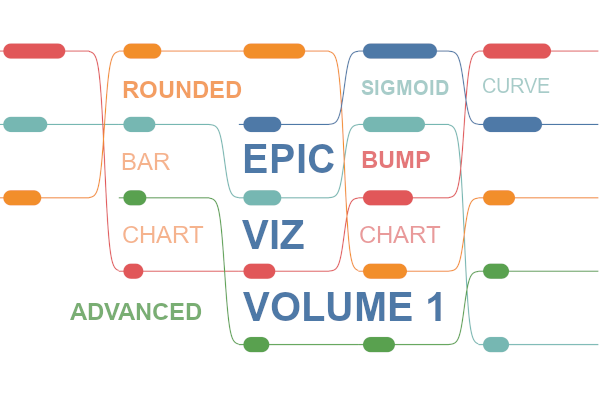
This is going to be a longer post than most as I want to give you the full idea behind this visualisation as well as show you how to combine several techniques to build this most EpicViz. The idea for this visualisation hit me when I was writing a tutorial on how to build a Bump Chart and, while I this visualisation very useful, there was something missing.
This bugged me, as I not only want to see the ranking by month but to visually show the differences between the different dimensions. So naturally, I combined a Bump Chart, with a Bar Chart, and for additional appeal, I leveraged the Sigmoid curve to add connectivity between dates, and thus, my first EpicViz was born.
Note: This is an alternative type of data visualisation, and sometimes pushed for by clients. Please always look at best practices for data visualisations before deploying into production.
Data
Load the following data into Tableau Desktop / Public.
Country,Date,Path,Value
United Kingdom,01/01/2018,1,500
United Kingdom,01/01/2018,201,500
United Kingdom,01/02/2018,1,300
United Kingdom,01/02/2018,201,300
United Kingdom,01/03/2018,1,400
United Kingdom,01/03/2018,201,400
United Kingdom,01/04/2018,1,800
United Kingdom,01/04/2018,201,800
United Kingdom,01/05/2018,1,200
United Kingdom,01/05/2018,201,200
France,01/01/2018,1,400
France,01/01/2018,201,400
France,01/02/2018,1,400
France,01/02/2018,201,400
France,01/03/2018,1,800
France,01/03/2018,201,800
France,01/04/2018,1,500
France,01/04/2018,201,500
France,01/05/2018,1,300
France,01/05/2018,201,300
Germany,01/01/2018,1,800
Germany,01/01/2018,201,800
Germany,01/02/2018,1,100
Germany,01/02/2018,201,100
Germany,01/03/2018,1,300
Germany,01/03/2018,201,300
Germany,01/04/2018,1,600
Germany,01/04/2018,201,600
Germany,01/05/2018,1,900
Germany,01/05/2018,201,900
Belgium,01/03/2018,1,400
Belgium,01/03/2018,201,400
Belgium,01/04/2018,1,1000
Belgium,01/04/2018,201,1000
Belgium,01/05/2018,1,750
Belgium,01/05/2018,201,750
Brazil,01/02/2018,1,150
Brazil,01/02/2018,201,150
Brazil,01/03/2018,1,200
Brazil,01/03/2018,201,200
Brazil,01/04/2018,1,300
Brazil,01/04/2018,201,300
Brazil,01/05/2018,1,200
Brazil,01/05/2018,201,200
Note: we need four records for each Country as we are going to be drawing lines and using densification to get more points on our view. For more information, check out our article on Data Densification.
Calculated Fields
With our data set loaded into Tableau, we are going to create the following Calculated Fields, Bins and Parameters:
Create a Bin calledPath (bin)
- Right click on Path, go to Create and select Bins…
- In the Edit Bins dialogue window:
- Set New field name to Path (bin).
- Set Size of bins to 1.
- Click Ok.
Create a Parameter called Distance
- Set Data type as Integer.
- Set Current value as 19.
- Click Ok.
Index
INDEX()-1TC_Last
LAST()Details: we are going to use to ensure that we do not have a curve for the last column.
TC_Value
WINDOW_MAX(MAX([Value]))TC_Max Value
WINDOW_MAX(MAX([Value]))TC_Percentage
[TC_Value]/[TC_Max Value]*100TC_Current Position
RANK_UNIQUE([TC_Value],"desc")TC_Next Position
LOOKUP([TC_Current Position], 1)Details: Using to find the next position so we can the height of the curve. This is used in TC_Multiplier.
TC_Size
IF [Index] < [TC_Percentage]+[Distance] AND [Index]> [Distance] THEN
    1
ELSE
    0
END
Details: The Distance parameter is used to control the distance from the left. and we return 1 for all points to draw the Rounded Bar Chart.
TC_Sigmoid
1/(1+EXP(-(-6+([Index]-151)*6/25)))Details: Yep, this is the hard math part and is the formula to draw the Sigmoid Curve at the end of the Rounded Bar Chart.
TC_Multiplier
IF [TC_Last] = 0 THEN
    0
ELSE
    ZN([TC_Next Position])-ZN([TC_Current Position])
END
Y
IF [Index] < 151 THEN
    RANK_UNIQUE ([TC_Value])
ELSE
    RANK_UNIQUE([TC_Value])+([TC_Sigmoid]*[TC_Multiplier])
END
Details: We have 200 points to play with, for the first 150 points we are drawing the Rounded Bar Chart, after which we are drawing th Sigmoid Curve.
So now that we have created a lot of Calculated fields, we will now put this together into a Worksheet.
Worksheet
We will now build our worksheet:
- Change the Mark Type to Line.
- Drag Country onto Color.
- Drag Date onto Columns.
- Right-click on this object and select Exact Date.
- Right-click on this object and select Discrete.
- Drag Path (bin) onto Columns.
- Right-click on this object and ensure that Show Missing Values is checked.
- Drag this object onto the Path Mark.
- Drag Index onto Columns.
- Right-click on this object, go to Using and select Path (bin).
- Drag Y onto Rows.
- Right-click on this object, go to Compute Using and select Path (bin).
If all goes well, you should now see the following:

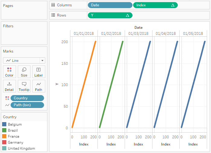
We are now going to adjust the Y Table Calculation settings, and in phases, we will get to our final visualisation:
- Right-click on Y and go to Edit Table Calculations…
- In Nested Calculations, choose Y.
- Set Using to Specific Dimensions.
- Ensure that only Date and Country are checked and move Date to the top.
- Set Restarting every to Date.
- In Nested Calculations, choose TC_Last.
- Set Using to Specific Dimensions.
- Untick all items.
- In Nested Calculations, choose Y.
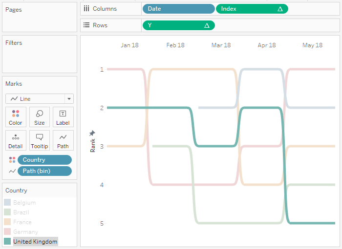
You should now see the following:

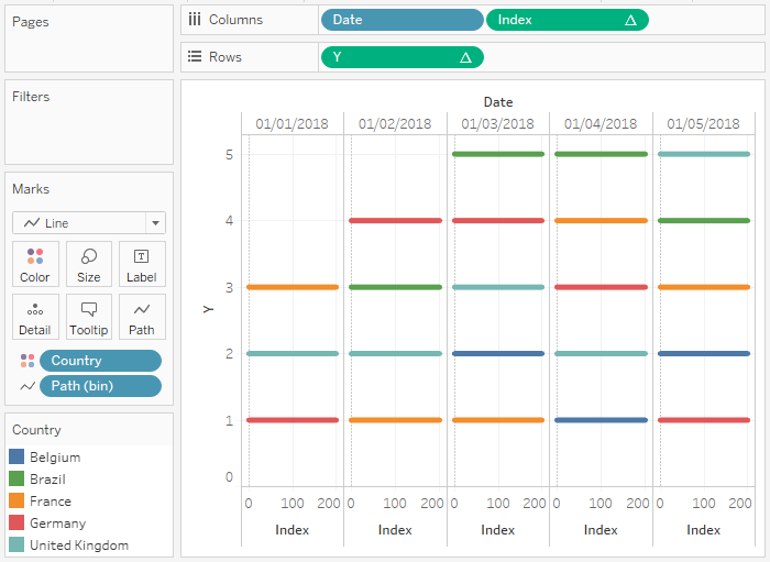
At this point want us to adjust the cosmetics so that we can have our first visualisation.
- Double-click on the Y-Axis, and set the Range to Fixed and to be between 0.5 and 5.5.
- Under Scale, tick Reversed.
- Hide the X-Axis.
- Rename the Y-Axis label to Rank.
- Right-click on Date and apply a date format.
- Set Gridlines to None.
- Set Row Divider Pane to None.
- Set Column Divider Pane to None.
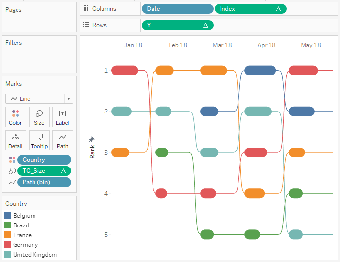
You should now have the following:

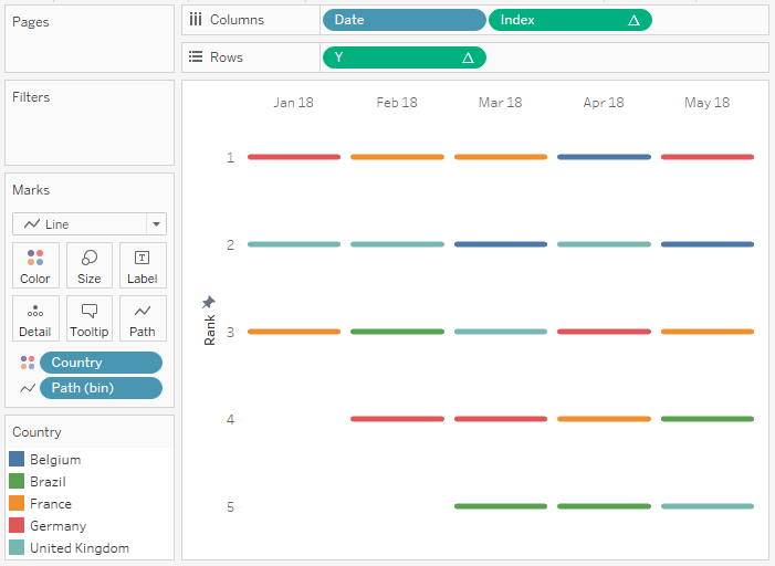
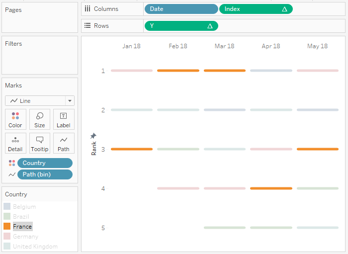
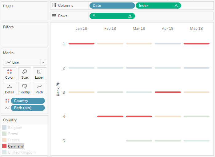
Even if you stop the tutorial here, you have a prett cool visualisation, you can click on the Country on the left and see the following:

But we do not want to stop here, let us adjust our Y Table Calcualtion once again:
- Right-click on Y and go to Edit Table Calculations…
- In Nested Calculations, choose TC_Next Position.
- Set Compute Using to Specific Dimensions.
- Ensure that only Date and Country are checked and move Country to the top.
- In Nested Calculations, choose TC_Current Position.
- Set Compute Using to Specific Dimensions.
- Ensure that only Date and Country are checked and move Date to the top.
- Set Restarting every to Date.
- In Nested Calculation, choose TC_Last.
- In Using select Table (across).
- In Nested Calculations, choose TC_Next Position.
I also want you edit the cosmetics:
- Right-click on Index and select Show Header.
- Double-click the Index Axis.
- Set the Range to Fixed, and to be between 0 and 200.
- Hide the Index H.
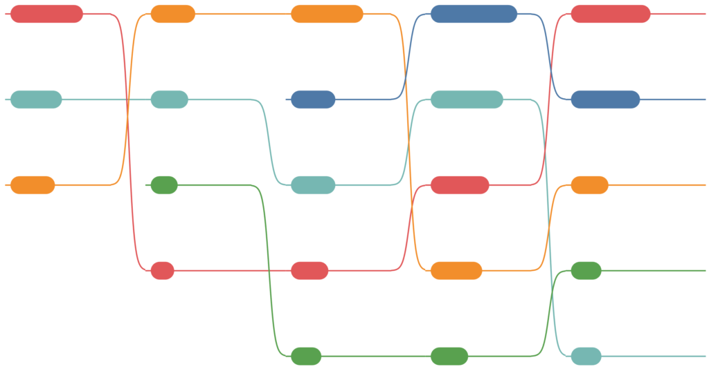
You should now see the following:
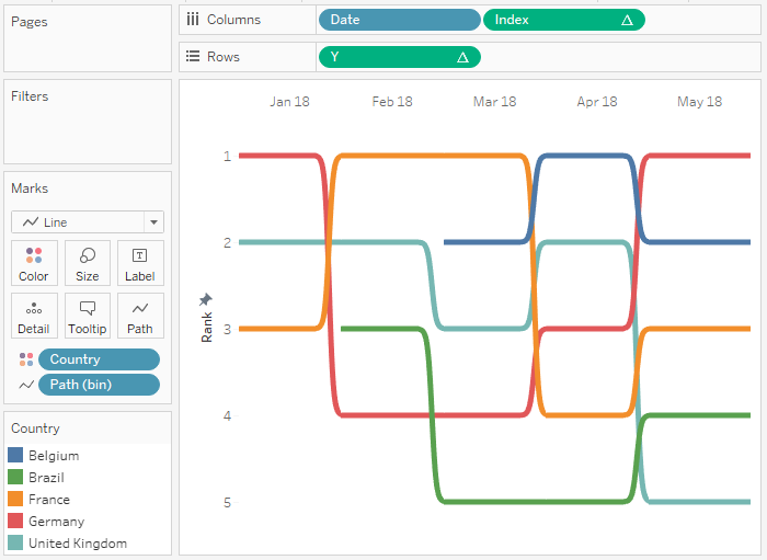
Yes, we have now created a continuous line per country using the Sigmoid Curve formula.

Now we are going to finish off our data visualisation by adding the Rounded Bar Chart.
- Drag TC_Size onto the Size Mark.
- Right-click on this object, go to Compute Using and select Path (bin).
- Right-click on TC_Size and go to Edit Table Calculations…
- In Nested Calculations, choose TC_Max Value.
- Set Using to Specific Dimensions.
- Ensure that only Date, Country and Path (bin) are checked and ensure that Date is at the top and Path (bin) is at the bottom.
- In Nested Calculations, choose TC_Max Value.
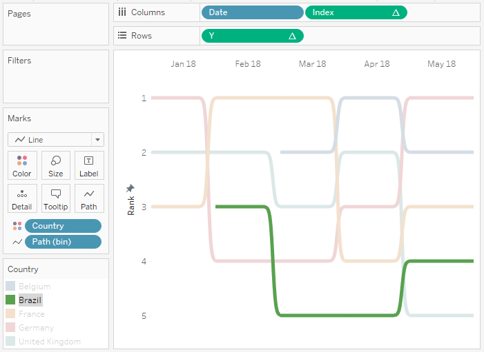
If all goes well, you should now have the following:

now add some tooltips and boom, we are done with my first EpicViz tutorial. You can find this data visualisation on my Tableau public profile at:
https://public.tableau.com/profile/toan.hoang#!/vizhome/EpicVizFebruary2019/EpicVizVol_1

Summary
I hope you all enjoyed this article as much as I enjoyed writing it and as always do share the love. Do let me know if you experienced any issues recreating this Visualisation, and as always, please leave a comment below or reach out to me on Twitter @Tableau_Magic.
If you like our work, do consider supporting us on Patreon, and for supporting us, we will give you early access to tutorials, exclusive videos, as well as access to current and future courses on Udemy:
- Patreon: https://www.patreon.com/tableaumagic
Also, do be sure to check out our various courses:
- Creating Bespoke Data Visualizations (Udemy)
- Introduction to Tableau (Online Instructor-Led)
- Advanced Calculations (Online Instructor-Led)
- Creating Bespoke Data Visualizations (Online Instructor-Led)