


")


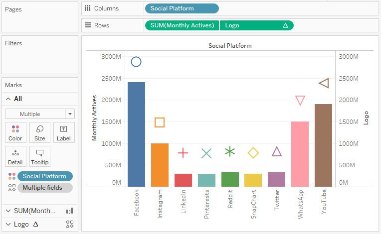
Requested from a student, here is a Tableau Quick Tip (QT) on creating a Bar Chart with a floating icons. So in 5 minutes or less, we are going to build this cool data visualisation.
Data
Let us start by loading the following data in Tableau Desktop / Public.
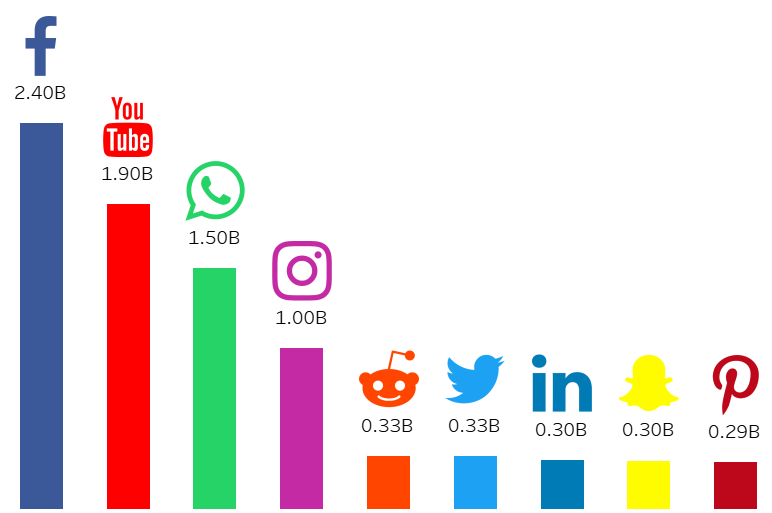
Social Platform,Monthly Actives
Facebook,2400000000
YouTube,1900000000
WhatsApp,1500000000
Instagram,1000000000
Twitter,330000000
Reddit,330000000
LinkedIn,303000000
SnapChart,301000000
Pinterests,291000000
Shapes
Download the following file and unzip this to you My Tableau Repository.
Note: You can read more about using custom shapes in Tableau in the following article: https://tableau.toanhoang.com/tableau-qt-custom-shapes
Calculated Fields
Create the following Calculated Fields:
Logo
SUM([Monthly Actives])+(WINDOW_MAX(SUM([Monthly Actives]))/5)Note: this calculation appends an extract amount of distance to the monthly sales value, this is because we want the logo to sit above the bars, but by a constant amount, so we take the maximum value in the data visualisation.
and that is it, let us now build our worksheet.
Worksheet
We will now create our worksheet:
- Drag Social Platform onto Columns.
- Drag Monthly Actives onto Rows.
- Drag Logo onto Rows.
- Right-click on this object and select Dual Axis.
- Right-click on the Logo Axis Header and select Synchronize Axis.
- In the SUM(Monthly Actives) Mark Panel.
- Change the Mark Type to Bar.
- In the Logo Marks Panel.
- Change the Mark Type to Shape.
- Drag Social Platforms onto the Shape Mark.
- in the All Marks Panel.
- Drag Social Platform onto the Color Mark.
If all goes well, you should see something like the following:
Now we will adjust the cosmetics:
- Hide the Axis Headers
- Hide the Grid Lines
- Adjust the Sizes
- Apply the Shapes
- Add a Label
- Add a Tooltip
- Add a sort order
I also want you to apply the following Colors to the social platform.
- Facebook: #3b5998
- YouTube: #ff0000
- WhatsApp: #25d366
- Instagram: #c32aa3
- Reddit: #ff4500
- Twitter: #1da1f2
- LinkedIn: #007bb5
- SnapChat: #fffc00
- Pinterests: #bd081c
Note: Click on the Color mark, then double-click on the Social Platform to allow you to enter in the custom Color.
You should hopefully have the following:
and boom, we are done. We have created our Bar Chart with Floating Icons in Tableau. You can find my data visualisation Tableau Public at https://public.tableau.com/profile/toan.hoang#!/vizhome/BarChartwithFloatingIcons/BarChartwithFlotingIcons
Summary
I hope you all enjoyed this article as much as I enjoyed writing it. Do let me know if you experienced any issues recreating this Visualisation, and as always, please leave a comment below or reach out to me on Twitter @Tableau_Magic.
If you like our work, do consider supporting us on Patreon, and for supporting us, we will give you early access to tutorials, exclusive videos, as well as access to current and future courses on Udemy:
- Patreon: https://www.patreon.com/tableaumagic
Also, do be sure to check out our various courses:
- Creating Bespoke Data Visualizations (Udemy)
- Introduction to Tableau (Online Instructor-Led)
- Advanced Calculations (Online Instructor-Led)
- Creating Bespoke Data Visualizations (Online Instructor-Led)


 Table Calculation")


Can we add the images to tree map with respective to the counts.
For e.g. Nike Brand has highest Sale so that brand should be at the big square with the Nike logo image.
Is this possible in tableau
That is a cool idea, but I don’t think that is currently possible with Tableau.