


")


In this Tableau quick tip, we are going to walk through the creation of a Completion Gantt Chart in Tableau in 10 minutes or less.
Data
We will start by loading the follow data into Tableau Desktop / Tableau public.
| Task | Date | Duration (Days) | Completion (%) |
| Write Blogs of Feb 2020 | 01-Jan-2020 | 10 | 0.5 |
| Record Patreon Videos | 04-Jan-2020 | 3 | 0.2 |
| Record YouTube Videos for Feb 2020 | 18-Jan-2020 | 12 | 0.4 |
| Record YouTube Videos for Mar 2020 | 26-Jan-2020 | 7 | 0.1 |
| Write Blogs of Mar 2020 | 01-Feb-2020 | 10 | 0 |
| Finalize Annual Accounts | 04-Jan-2020 | 2 | 0.8 |
Note: these are tasks that were taken from my Tableau Magic working calendar.
Calculated Fields
With our data set loaded into Tableau, we are going to create the following Calculated Field:
Completed
[Duration (Days)]*[Completion (%)]Yep, that is all we require.
Worksheet
We will now build our first worksheet:
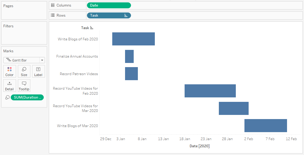
- Change the Mark Type to Gantt Bar
- Drag Date onto the Columns Shelf
- Right-click on this pill and select Exact Date
- Drag Task onto the Rows Shelf
- Right-click on this pill and select Sort…
- Set Sort by to Field
- Set Sort Order to Ascending
- Set Field Name to Date
- Set Aggregation to Minimum
- Right-click on this pill and select Sort…
- Drag Duration (Days) onto the Size Mark
If all goes well, you should see the following:
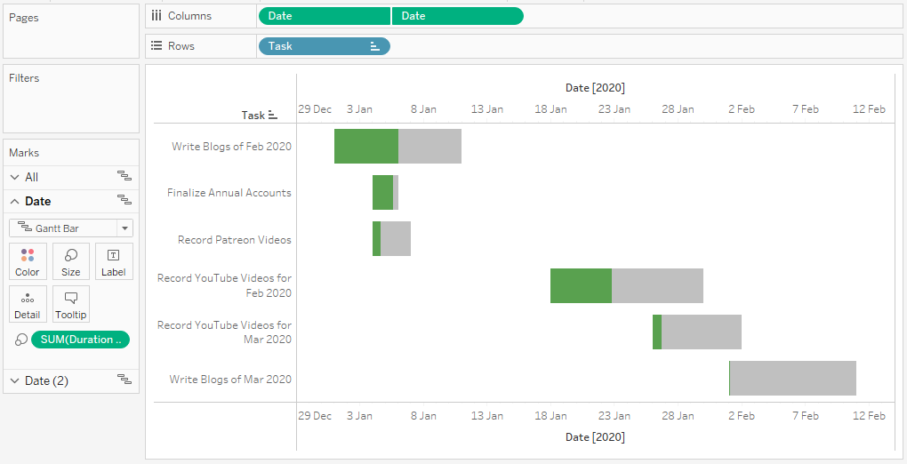
Now we will add in our percentage completed to the mix.
- Ctrl (or Command) Drag and Drop the Date pill in the Columns Shelf to the right; this will duplicate the object with all settings applied.
- Right-click on this pill and select Dual Axis.
- Right-click on the Axis Header and select Synchronize Axis
- In the Date 2 Marks Panel
- Drag Completed onto the Size Mark
- Click on the Color Mark and set the Color to Green
- In the Date Marks Panel
- Click on the Color Mark and set the Color to Grey
If all goes well, you should now see the following:
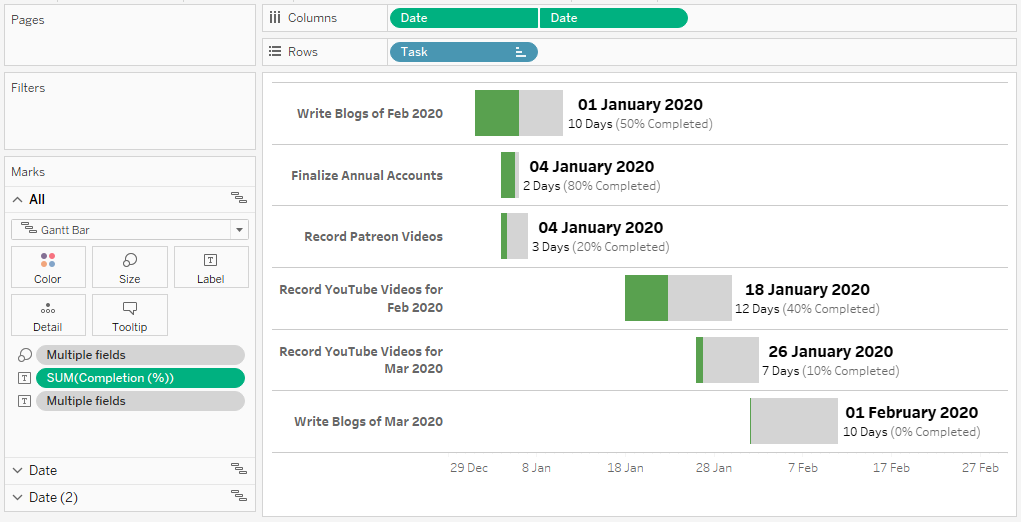
As you can see we have made some good progress. Lastly, we will adjust the cosmetics:
- Add a Row Divider
- Hide the Top Date Header (we only need one)
- Add a Label to the Date Marks Panel (the one with the completed Gantt Bars)
Keep adjusting until you see fit, or in my case, I ended up with the following:
and boom, we are done! I hope you enjoyed this tutorial, and as always, you can find this data visualization on Tableau Public at https://public.tableau.com/profile/toan.hoang#!/vizhome/CompletionGanttChart/CompletionGanttChart
Summary
I hope you all enjoyed this article as much as I enjoyed writing it and as always do share the love. Do let me know if you experienced any issues recreating this Visualization, and as always, please leave a comment below or reach out to me on Twitter @Tableau_Magic. Do also remember to tag me in your work if you use this tutorial.
If you like our work, do consider supporting us on Patreon, and for supporting us, we will give you early access to tutorials, exclusive videos, as well as access to current and future courses on Udemy:
- Patreon: https://www.patreon.com/tableaumagic
Also, do be sure to check out our various courses:
- Creating Bespoke Data Visualizations (Udemy)
- Introduction to Tableau (Online Instructor-Led)
- Advanced Calculations (Online Instructor-Led)
- Creating Bespoke Data Visualizations (Online Instructor-Led)


 Table Calculation")


