


")


This is a Quick Tip on how to build Control Charts in Tableau, so less reading and more jumping in. We are going to spend 5 minutes or less building our Control Chart in Tableau.
Data
Load the following data into Tableau Desktop / Public.
Date,Sales
01/12/2018,83829
01/11/2018,118448
01/10/2018,77777
01/09/2018,87867
01/08/2018,63121
01/07/2018,45264
01/06/2018,52982
01/05/2018,44261
01/04/2018,36522
01/03/2018,58872
01/02/2018,20301
01/01/2018,43971
01/12/2017,96999
01/11/2017,79412
01/10/2017,59688
01/09/2017,73410
01/08/2017,31115
01/07/2017,39262
01/06/2017,40345
01/05/2017,56988
01/04/2017,38750
01/03/2017,51716
01/02/2017,22979
01/01/2017,18542
01/12/2016,74920
01/11/2016,75973
01/10/2016,31405
01/09/2016,64596
01/08/2016,36898
01/07/2016,28765
01/06/2016,24797
01/05/2016,30132
01/04/2016,34195
01/03/2016,38726
01/02/2016,11951
01/01/2016,18174
01/12/2015,69546
01/11/2015,78629
01/10/2015,31453
01/09/2015,81777
01/08/2015,27909
01/07/2015,33946
01/06/2015,34595
01/05/2015,23648
01/04/2015,28295
01/03/2015,55691
01/02/2015,4520
01/01/2015,14237
Parameters
We will start by creating two Parameters and a Calculated Field.
Max Threshold
- Set Data Type as Float.
- Set Current Value as 55,000.
- Set Allowable values as Range:
- Set Minimum as 0.
- Set Maximum as 150,000.
- Set Step size as 5,000.
Min Threshold
- Set Data Type as Float.
- Set Current Value as 25,000.
- Set Allowable values as Range:
- Set Minimum as 0.
- Set Maximum as 100,000.
- Set Step size as 5,000.
Color
IF SUM([Sales]) < [Max Threshold] AND SUM([Sales])>[Min Threshold] THEN
    "Green"
ELSE
    "Red"
END
Worksheet
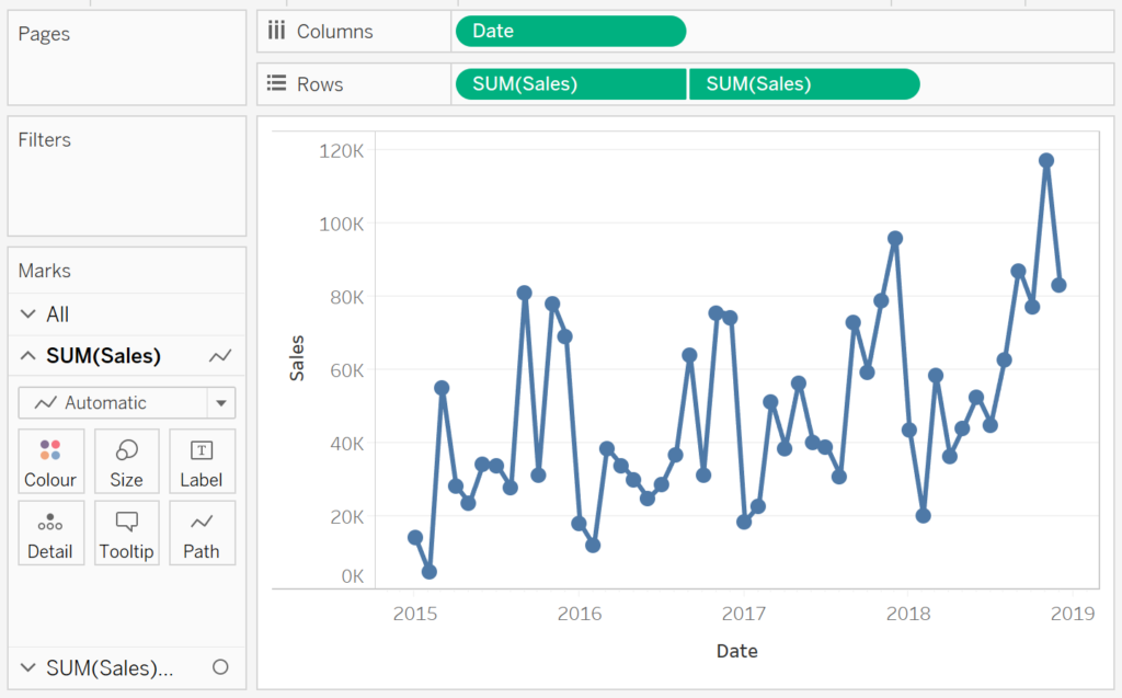
We will create our Control Chart:
- Change the Mark Type to Line.
- Drag Date onto Columns.
- Right-click and select Continuous.
- Drag Sales onto Rows.
- Make sure that the aggregation is set to SUM.
- Drag Sales onto Rows again.
- Change the Mark Type for the second Sales object to Circle.
- Right-click on the second Sales object and select Dual Axis.
If all goes well, you should see the following:
We will now add our reference line and colour:
- Right-click on the Sales Axis Header and select Add Reference Line.
- Select Band.
- In the Band From set:
- Value to Min Threshold.
- Label to None.
- Tooltip to None.
- In the Band To set:
- Value to Max Threshold.
- Label to None.
- Tooltip to None.
- In the Formatting adjust the Line and the Fill options.
- Click Ok.
- In the Band From set:
- In the Second SUM(Sales) Mark Panel drag Color onto Color.
- Adjust the colour.
If all goes well, you should now see the following:
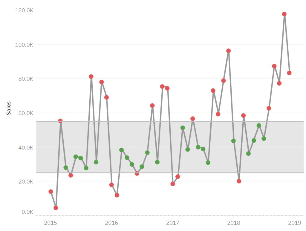
and boom, we are done. We have created a Control Chart in Tableau and used two parameters to control the reference band, the colour, and highlight when monthly Sales exceed or drop below our parameter values. You can find my data visualisation Tableau Public at https://public.tableau.com/profile/toan.hoang#!/vizhome/ControlCharts_15627952222840/ControlChart
Summary
I hope you all enjoyed this article as much as I enjoyed writing it. Do let me know if you experienced any issues recreating this Visualisation, and as always, please leave a comment below or reach out to me on Twitter @Tableau_Magic.
If you like our work, do consider supporting us on Patreon, and for supporting us, we will give you early access to tutorials, exclusive videos, as well as access to current and future courses on Udemy:
- Patreon: https://www.patreon.com/tableaumagic
Also, do be sure to check out our various courses:
- Creating Bespoke Data Visualizations (Udemy)
- Introduction to Tableau (Online Instructor-Led)
- Advanced Calculations (Online Instructor-Led)
- Creating Bespoke Data Visualizations (Online Instructor-Led)


Toan thanks for another excellent chart, looking forward for more from the magician
Thank you 🙂
This is a great tip. I modified it a bit for my growing tennis dataviz at https://tabsoft.co/2LDHz3N.