


")


This is a Quick Tip on how to build a Curved Line Chart in Tableau based on the Sigmoid Function, so less reading and more jumping in. We are going to spend 10 minutes or less building our Curved Line Chart in Tableau.
Note: As always never choose a data visualisation type and try to fit your data into it, instead, understand your data and choose the best visualization for your data consumers.
Data
Load the following data into Tableau Desktop / Public.
| Segment | Value | Path |
| A | 100 | 0 |
| A | 100 | 101 |
| B | 150 | 0 |
| B | 150 | 101 |
| C | -80 | 0 |
| C | -80 | 101 |
| D | -50 | 0 |
| D | -50 | 101 |
| E | 100 | 0 |
| E | 100 | 101 |
Note: we require path and duplicate lines for densification.
Calculated Fields
We will start by creating the following calculated fields.
Path (bin)
- Right-click on Path.
- Go to Create, and select Bins…
- In the Edit Bins window:
- Set New field name to Path (bin).
- Set Size of bins to 1.
- Click OK.
Index
((INDEX()-1)*0.12)-6Note: we want the index, used as the X-axis to have 100 points from -6 to 6.
TC_Value
WINDOW_MAX(MAX([Value]))TC_Start Point
RUNNING_SUM([TC_Value])-[TC_Value]TC_Running Sum
RUNNING_SUM([TC_Value])Y
[TC_Start Point]
+((1/(1+EXP(-[Index])))*[TC_Value])
Note: 1/(1+EXP(i)) is the Sigmoid Curve function. We
Now that we have created our Calculated Fields, we will build our Worksheet.
Worksheet
Now that we have our Calculated Fields and Bin object, let us create our Curve Line Chart:
- Change the Mark Type to Line.
- Drag Path (bin) onto Columns.
- Right-click on the object and ensure that Show Missing Values is checked.
- Drag this object onto the Path Mark.
- Drag Segment onto Columns.
- Drag Index onto Columns.
- Right-click on the object, go to
Compute Using and select Path (Bin).
- Right-click on the object, go to
- Drag Y onto Rows.
- Right-click on the object, go to
Compute Using and select Path (Bin).
- Right-click on the object, go to
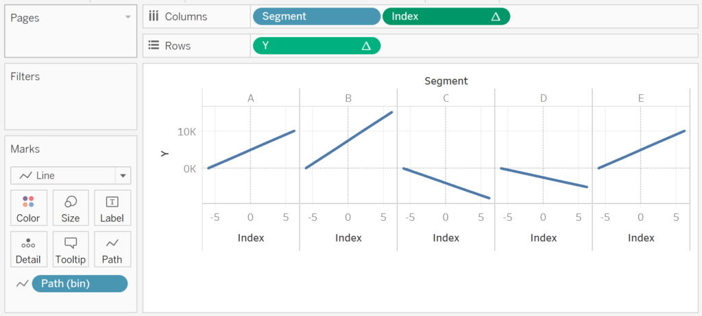
If all goes well, you should see the following:
We will now add a little bit of magic by editing our Table Calculation for Y.
- Right-click on Y and select Edit Table Calculations.
- In Nested Calculations select TC_Start Point.
- In
Compute Using, select Specific Dimensions and ensure that only Segment is checked.
- In
- In Nested Calculations select TC_Start Point.
- Drag TC_Value onto the Tooltip Mark.
- Right-click on the Object, go to
Compute Using and select Path (Bin).
- Right-click on the Object, go to
- Drag TC_Running Sum onto the Tooltip Mark.
- Right-click on the Object and go to Edit Table Calculations.
- In Nested Calculations select TC_Running Sum.
- In
Compute Using, select Specific Dimensions and ensure that only Segment is checked.
- In
- In Nested Calculations select TC_Value.
- In
Compute Using, select Specific Dimensions and ensure that only Path (bin) is checked.
- In
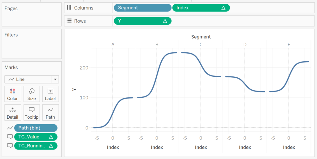
If all goes well, you should see the following:
Can you feel it? We are getting there and now need to adjust the cosmetics:
- Set the Zero Lines to None.
- Set the Grid Lines to None.
- Set the Axis Ruler to None.
- Set the Row Divider Pane to None.
- Set the Column Divider Pane to None.
- Double click on the X-Axis and Fix the range to be from -6 to 6.
- Hide all Column Headers.
- Update the Tooltip.
- Adjust the Size.
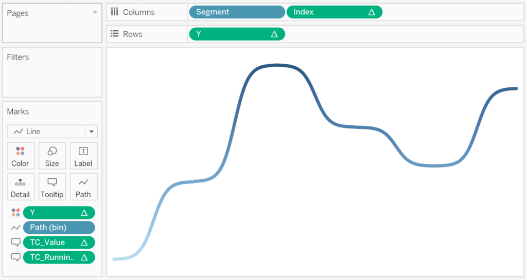
- Control-Drag Y from the Rows and onto Color. Control-Drag copies the object with all settings.
You should now have the following.
and boom, yes, this has been trickier than normal Quick Tip, but hey, it is all good. You can find my Curved Line Chart on Tableau Public at https://public.tableau.com/profile/toan.hoang#!/vizhome/CurvedLinesinTableau/CurvedLines
Summary
I hope you all enjoyed this article as much as I enjoyed writing it. Do let me know if you experienced any issues recreating this Visualisation, and as always, please leave a comment below or reach out to me on Twitter @Tableau_Magic.
If you like our work, do consider supporting us on Patreon, and for supporting us, we will give you early access to tutorials, exclusive videos, as well as access to current and future courses on Udemy:
- Patreon: https://www.patreon.com/tableaumagic
Also, do be sure to check out our various courses:
- Creating Bespoke Data Visualizations (Udemy)
- Introduction to Tableau (Online Instructor-Led)
- Advanced Calculations (Online Instructor-Led)
- Creating Bespoke Data Visualizations (Online Instructor-Led)
 Table Calculation")


")
 Table Calculation")
This is really great. I’m going to give this a shot…but I’m curious to know, have you ever done a Lassonade Curve and then incorporated a way to place markers at fixed points on the Lassonade Curve? I’m going to try and follow your instructions and see if I can make that happen. If I am successful I will share it.
I have not tried that curve type, but I am writting an article about different curves, so will give that a try. In theory it is the same type of technique using a different equation.
Hi Toan,
That would be awesome. There are a lot of different curves that can be useful in visualizing a data set with marks placed along such a curve. Here is an example of what the Lassonade Curve is used for. Would it also be possible to have the categories shown along the bottom? I guess we might just leave it the segmentation on purpose to do that? https://s3.us-west-2.amazonaws.com/cdn.ceo.ca/1ehknsj-Lassonde_Curve.png
Another one to include would be the Hype Cycle Curve (if you are looking for more ideas).
Cheers!
Great blogpost! Thanks so much!
One question still remains. What do I have to do if I want to display multiple curves (one curve for each entity in my dataset) in one sheet?
Best,
Mark
Hi Mark, it is possible, you will need to add your additional dimension (representing the additional curves) and then adjust the Table Calculation to take this into account. Kind Regards, Toan
If I just want to display the “Value” directly in the chart instead of “Running Sum of the value”, which part of the calculation should I change?