


")


This is a Quick Tip on how to build doughnut charts in Tableau, so less reading and more jumping in. We are going to spend 5 minutes or less building our doughnuts charts.
Data
Load the following data into Tableau Desktop / Public.
| Slice | Value |
| A | 100 |
| B | 70 |
| C | 50 |
Worksheet
- Create a Calculated Field called Inner with the following value:
0 - Create a Calculated Field called Outer with the following value:
0 - Drag Outer onto Columns
- Drag Inner onto Columns
- Right-click on the second Inner pill and select Dual Axis.
- In Marks activate SUM(Outer)
- Change the Mark Type to Pie
- Drag Slice onto the Color
- Drag Value onto Size
- Click on Size and move the needle to the middle
- Drag Value onto Label
- Right-click on the Sum(Value), select Quick Table Calculation, select Percent of Total
- In Marks activate the SUM(Inner)
- Remove the Measure Names from Color
- Click on Color and set the Color to White
- Drag Value onto Label
- Click on Label and set Alignment to Center
Now we need to adjust the basic cosmetics:
- Remove Gridlines and Zero lines
- Hide Headers
- Give the Outer Pie Chart white borders
- Edit the Tooltips
- Edit Labels
and boom, you should get the following:
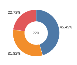
You can experiment with different cosmetics, labels and tooltips.
Summary
I hope you all enjoyed this article as much as I enjoyed writing it. Do let me know if you experienced any issues recreating this Visualisation, and as always, please leave a comment below or reach out to me on Twitter @Tableau_Magic.
If you like our work, do consider supporting us on Patreon, and for supporting us, we will give you early access to tutorials, exclusive videos, as well as access to current and future courses on Udemy:
- Patreon: https://www.patreon.com/tableaumagic
Also, do be sure to check out our various courses:
- Creating Bespoke Data Visualizations (Udemy)
- Introduction to Tableau (Online Instructor-Led)
- Advanced Calculations (Online Instructor-Led)
- Creating Bespoke Data Visualizations (Online Instructor-Led)

 Table Calculation")


")

