


")


In this Tableau quick tip, we are going to walk through the creation of a Filled Square Chart in Tableau in 5 minutes or less. Something very simple and fun.
Data
We will start by loading the following data into Tableau Desktop / Tableau public.
Note: If you have Tableau Desktop, you can use the Sample data source, but if you are using Tableau Public, download and load the following data source.
Worksheet
We will now build our worksheet:
- Change the Mark Type to Bar
- Drag Sales onto the Columns Shelf
- Drag Sales onto the Rows Shelf
- Drag Sales onto the Size Mark
- Drag Region onto the Color Mark
You should see the following:

We will now make some adjustments:
- Click on the Size Mark
- Select Fixed
- In Alignment select Right
- Right-click on Region and select Sort
- Set Sort by to Field
- Set Field name to Sales
- Set Aggregation to Sum
You should now have the following:

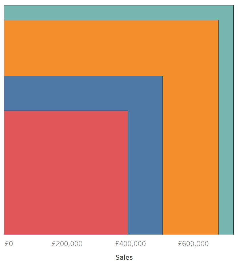
We will make the final adjustments:
- Hide the Y-Axis header
- Add a Color Border
- Edit the Tool Tips
and we should have the following:
and boom, we are done! I hope you enjoyed this tutorial, and as always, you can find this data visualization on Tableau Public at https://public.tableau.com/profile/toan.hoang#!/vizhome/FilledSquareCharts/FilledSquareCharts
Summary
I hope you all enjoyed this article as much as I enjoyed writing it and as always do share the love. Do let me know if you experienced any issues recreating this Visualization, and as always, please leave a comment below or reach out to me on Twitter @Tableau_Magic. Do also remember to tag me in your work if you use this tutorial.
If you like our work, do consider supporting us on Patreon, and for supporting us, we will give you early access to tutorials, exclusive videos, as well as access to current and future courses on Udemy:
- Patreon: https://www.patreon.com/tableaumagic
Also, do be sure to check out our various courses:
- Creating Bespoke Data Visualizations (Udemy)
- Introduction to Tableau (Online Instructor-Led)
- Advanced Calculations (Online Instructor-Led)
- Creating Bespoke Data Visualizations (Online Instructor-Led)


 Table Calculation")

")


