


")


This is a tutorial that has been requested a few times, so as a quick tip, we are going to walk through the creation of a Half-Circle Timeline in Tableau in 10 minutes or less.
Note: This is an alternative type of data visualisation, and sometimes pushed for by clients. Please always look at best practices for data visualisations before deploying this into production.
Data
We will start by loading the following data into Tableau Desktop / Tableau public.
Note: If you have Tableau Desktop, you can use the Sample data source, but if you are using Tableau Public, download and load the following data source.
Once your data is loaded into Tableau, right-click on the data source and click on Edit Data Source… with the Data Source Editor open, paste the following:
Path
0
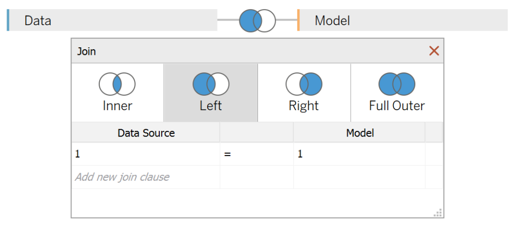
180You should get an error as there is no joining column, however, click on Add new join clause, go to Create Join Calculation, type 1 and click OK. Do this for the right-hand side as well. Ensure that you have Inner join selected and you should see the following:
Note: we need additional records as we are going to be drawing lines and using densification to get more points on our canvas. For more information, check out our article on Data Densification.
Calculated Fields
With our data set loaded into Tableau, we are going to create the following Bin, Calculated Fields:
Path (bin)
- Right-click on Path, go to Create and select Bins…
- In the Edit Bins dialogue window:
- Set New field name to Path (bin).
- Set Size of bins to 1.
- Click Ok.
Index
INDEX()-1TC_Sales
WINDOW_SUM(SUM([Sales]))/2TC_Year
WINDOW_MAX(MAX(YEAR([Order Date])))X
COS(RADIANS([Index]))+[TC_Year]Y
SIN(RADIANS([Index]))*[TC_Sales]With this done, let us start creating our data visualisation.
Worksheet
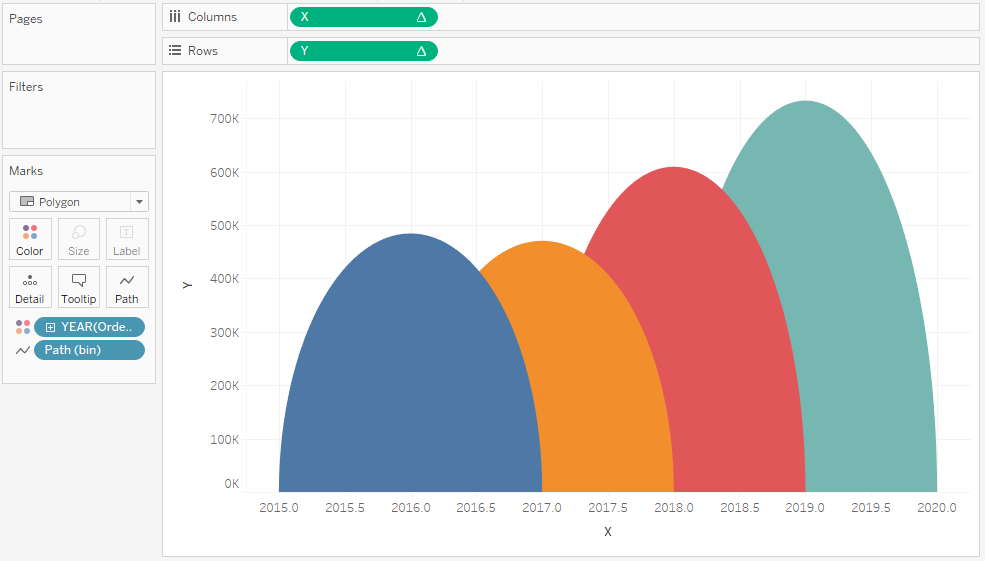
We will now build our first worksheet:
- Change the Mark Type to Polygon
- Drag Order Date onto the Color Mark, make sure this is set to Year
- Drag Path (bin) onto Columns
- Right-click on this pill and ensure that Show Missing Values is selected.
- Drag this pill onto the Path Mark.
- Drag X onto the Columns Shelf
- Right-click on this pill, go to Compute Using and select Path (bin)
- Drag Y onto the Rows Shelf
- Right-click on this pill, go to Compute Using and select Path (bin)
If all goes well you should now see the following:
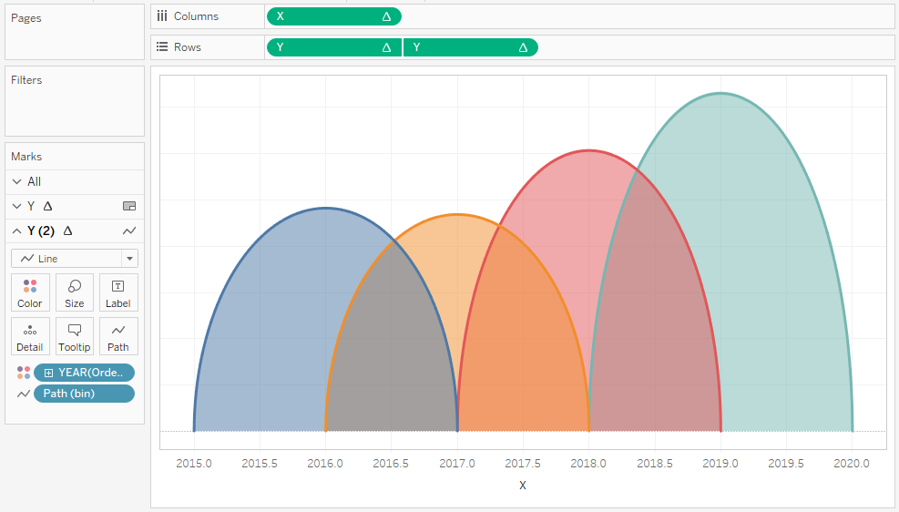
Now we are going to add a line so that we can show the values:
- Ctrl (or command) drag-and-drop Y on the Rows Shelf to the right; this will make a copy of the pill with all settings applied.
- In the Y (2) Marks Panel
- Change the Mark Type to Line
- Right-click on the second Y pill and select Dual Axis
- Right-click on the Axis header and select Synchronized Axis
- In the Y Marks Panel, reduce the Opacity to 50%
You should now see the following:
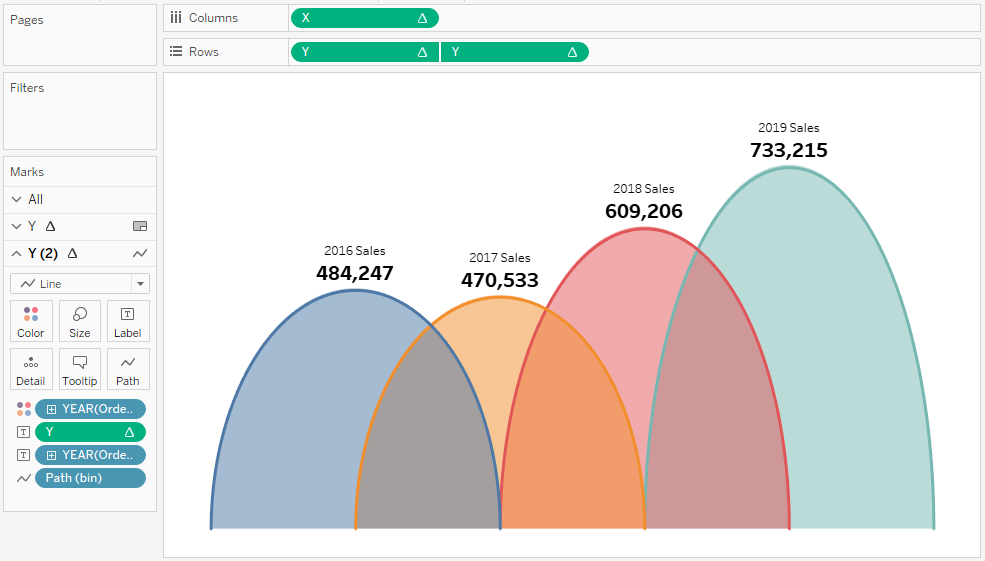
Now we will add our final touches to complete our visualization:
- In the Y (2) Marks Panel
- Ctrl (or command) drag Y from the Rows Shelf onto the Label Mark
- Ctrl (or command) drag YEAR(Order Date) from the Color Mark to the Label Mark
- Click on the Label Mark
- Set Marks to label as Min/Max
- In Options uncheck Label minimum value
- Edit the text description
- Edit your Tooltips
- Hide the Grid Lines and Zero Lines
- Hide the Axis Headers
- Hide the Row and Column Dividers
if all goes well, you should now see the following:
and boom, we are done! I hope you enjoyed this tutorial, and as always, you can find this data visualization on Tableau Public at https://public.tableau.com/profile/toan.hoang#!/vizhome/Half-CircleTimeline/Half-CircleTimelines
Summary
I hope you all enjoyed this article as much as I enjoyed writing it and as always do share the love. Do let me know if you experienced any issues recreating this Visualization, and as always, please leave a comment below or reach out to me on Twitter @Tableau_Magic. Do also remember to tag me in your work if you use this tutorial.
If you like our work, do consider supporting us on Patreon, and for supporting us, we will give you early access to tutorials, exclusive videos, as well as access to current and future courses on Udemy:
- Patreon: https://www.patreon.com/tableaumagic
Also, do be sure to check out our various courses:
- Creating Bespoke Data Visualizations (Udemy)
- Introduction to Tableau (Online Instructor-Led)
- Advanced Calculations (Online Instructor-Led)
- Creating Bespoke Data Visualizations (Online Instructor-Led)

 Table Calculation")


Hi Toan,
I seem to be having trouble following this tutorial and have tried multiple ways to get the half circles to meet but they always seem to have a gap in them, which isnt a true reflection of the timeline. All of the formulas seem like they are working fine, the only part i seem to be having difficulty with is the first point. When I right click on the connection I have no option to edit the data source and paste the Path. I have tried to overcome this by creating a union and using the IIF function to create the path but I think this may be the part causing the issue. I am using the latest version of Tableau Public.
Thanks
Hi Darren, please ase send me a link to your tableau public link, or send me the workbook to toan.hoang@tableau.toanhoang.com, and I will try to have a quick look.
Hi Toan,
I am also having trouble following this tutorial. I have checked all my calculations multiple time, and everything is exactly like yours. But for some odd reason values on the x-axis are pushed to a corner, and the chart looks like a very thin vertical line. Removing ‘+TC year’ from x-axis calculation displays unstacked half circles. My x-axis range is set to automatic.
Hi Rai, please send a copy of you packaged workbook to toan.hoang@tableau.toanhoang.com.
Hi Toan!
Thank you for the information. I have a question about the calculation of TC_Year. How can I create the format month and year for the timeline?
Hello Toan,
thank you for sharing this and asking you something: How can I create the TC_year calculation in a month and year format?