


")


Last week we released a tutorial about the new Distance function in Tableau 2019.3; I really love this function and can see so many interesting applications. This week we are going to look at the HEXBINX and HEXBINY functions to see if we can have more fun with maps in Tableau.
Data
Firstly, we will grab some geographic data from Airbnb and load this into Tableau. Click on the following link and download and load into Tableau the file for your desired city: http://insideairbnb.com/get-the-data.html
Note: I am from London, so I will base the tutorial on London. But it does not matter which city you choose.
Calculated Fields
We will start by creating the following Calculated Fields and Parameters.
Parameter called Size
- Name: Size
- Data type: Integer
- Current Value: 20
- Display format: Automatic
- Allowable values: All
We will now create the following Calculated Fields.
HexbinX
HEXBINX([Latitude]*[Size], [Longitude]*[Size])HexbinY
HEXBINY([Latitude]*[Size], [Longitude]*[Size])HEXBINX(number, number)
Maps an x, y coordinate to the x-coordinate of the nearest hexagonal bin. The bins have side length 1, so the inputs may need to be scaled appropriately.
HEXBINX and HEXBINY are binning and plotting functions for hexagonal bins. Hexagonal bins are an efficient and elegant option for visualising data in an x/y plane, such as a map. Because the bins are hexagonal, each bin closely approximates a circle and minimises variation in the distance from the data point to the centre of the bin. This makes the clustering both more accurate and informative.
Color
STR([HexbinX])+"-"+STR([HexbinY])and that is it, we are ready to build out data visualisation.
Worksheet
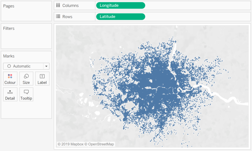
Our workshop is pretty simple.
- Double click on Latitude and Longitude to add them to your view.
- Right-click on these objects and convert them to Dimensions.
- Now click on the Size Mark and reduce the Size to the minimum.
You should now see the following:
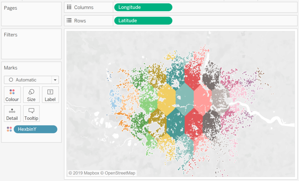
Now, let us have some fun with Colors, drag HexbinY onto the Color Mark, you should see something like the following:
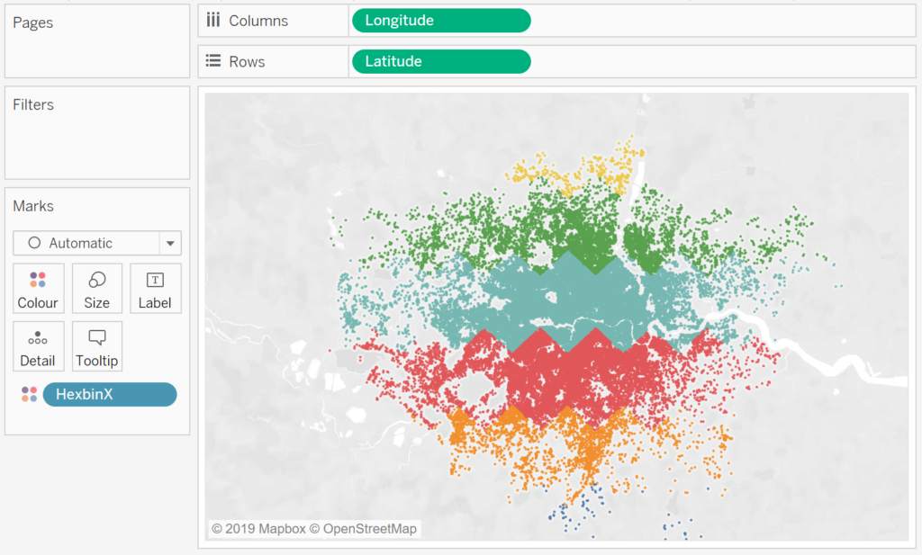
Let us now drag HexbinX onto the Color Mark:
Finally, drag Color onto the Color Mark.
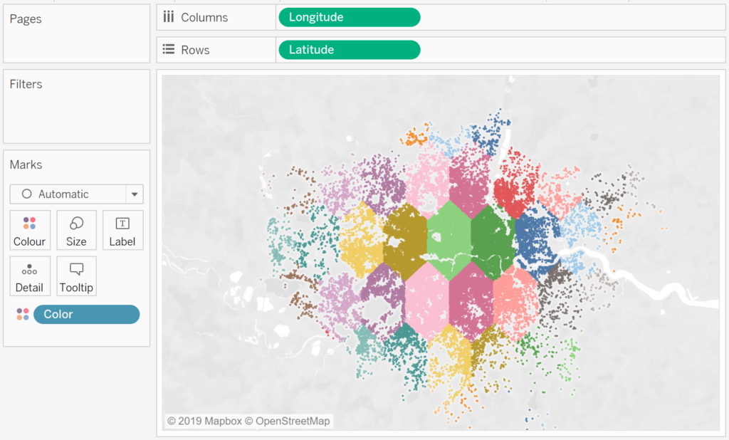
and boom, we are done. Don’t forget to change the Size Parameter to see the effects of our scaling. I hope that you have found this interesting and fun, and as always, you can find my data visualisation on Tableau Public here https://public.tableau.com/profile/toan.hoang#!/vizhome/HexbinMaps/HexbinMaps
Summary
I hope you all enjoyed this article as much as I enjoyed writing it and as always do share the love. Do let me know if you experienced any issues recreating this Visualization, and as always, please leave a comment below or reach out to me on Twitter @Tableau_Magic. Do also remember to tag me in your work if you use this tutorial.
If you like our work, do consider supporting us on Patreon, and for supporting us, we will give you early access to tutorials, exclusive videos, as well as access to current and future courses on Udemy:
- Patreon: https://www.patreon.com/tableaumagic
Also, do be sure to check out our various courses:
- Creating Bespoke Data Visualizations (Udemy)
- Introduction to Tableau (Online Instructor-Led)
- Advanced Calculations (Online Instructor-Led)
- Creating Bespoke Data Visualizations (Online Instructor-Led)

 Table Calculation")


