


")


In this Tableau quick tip, we are going to walk through the creation of a Line (Polygon) Square Chart in Tableau in 10 minutes or less. Something very simple and fun.
Data
We will start by loading the following data into Tableau Desktop / Tableau public.
Note: If you have Tableau Desktop, you can use the Sample data source, but if you are using Tableau Public, download and load the following data source.
Once your data is loaded into Tableau, right-click on the data source and click on Edit Data Source… with the Data Source Editor open, paste the following:
Path
1
5
Note: If you are using Tableau 2020.2 or great i.e. have access to new Relationship Model, you will need to double-click on the originally pasted data source to open up before pasting in the Path Data.
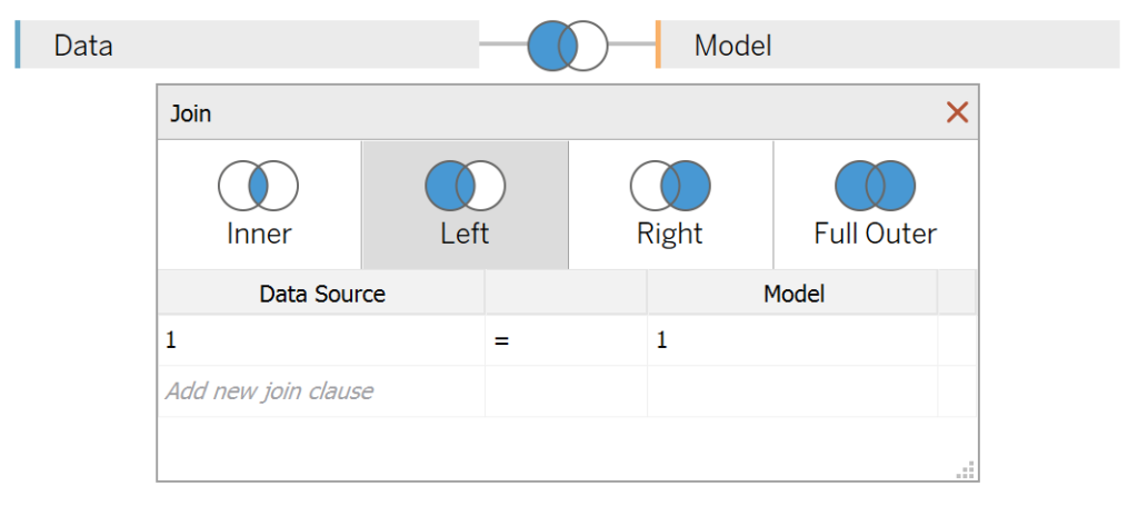
You should get an error as there is no joining column, however, click on Add new join clause, go to Create Join Calculation, type 1 and click OK. Do this for the right-hand side as well. Ensure that you have Inner join selected and you should see the following:
Note: we need additional records as we are going to be drawing lines and using densification to get more points on our canvas. For more information, check out our article on Data Densification.
Calculated Fields
With our data set loaded into Tableau, we are going to create the following Parameter and Calculated Fields:
Path (bin)
- Right-click on Path, go to Create and select Bins…
- In the Edit Bins dialogue window:
- Set New field name to Path (bin)
- Set Size of bins to 1
- Click Ok
Index
INDEX()X
IF [Index] = 2 OR [Index] = 3 THEN
    WINDOW_SUM(SUM([Sales]))/2
ELSE
    0
END
Y
IF [Index] = 3 OR [Index] = 4 THEN
    WINDOW_SUM(SUM([Sales]))/2
ELSE
    0
END
With this done, let us start creating our data visualisation.
Worksheet
We will now build our first worksheet:
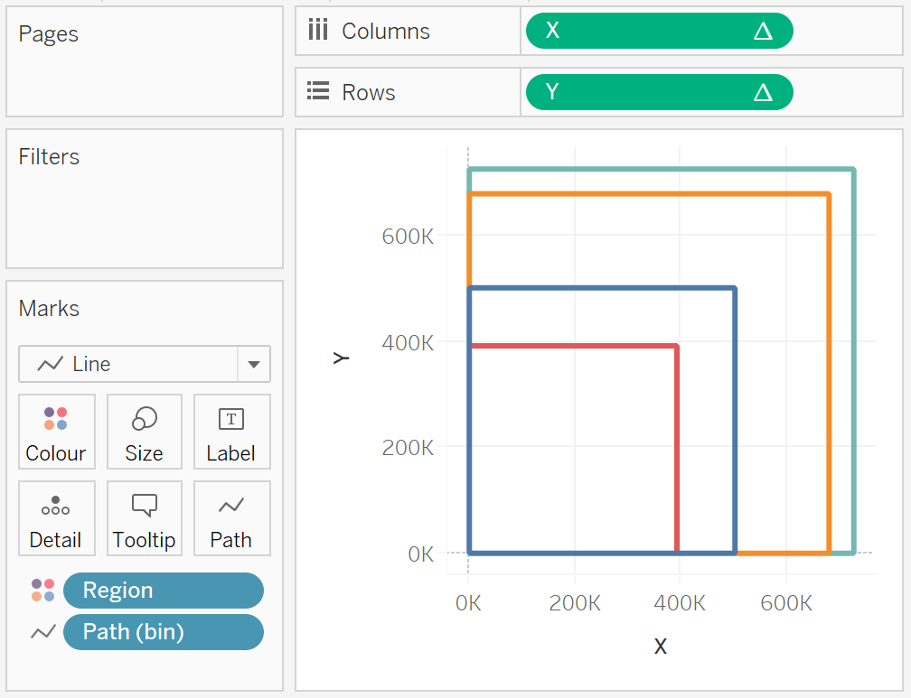
- Change the Mark Type to Line
- Drag Region onto the Color Mark
- Drag Path (bin) onto the Column Shelf
- Right-click on this pill and ensure that Show Missing Values is selected
- Drag this pill onto the Path Mark
- Drag X onto the Columns Shelf
- Right-click on this pill, go to Compute Using and select Path (bin)
- Drag Y onto the Rows Shelf
- Right-click on this pill, go to Compute Using and select Path (bin)
You should now see the following:
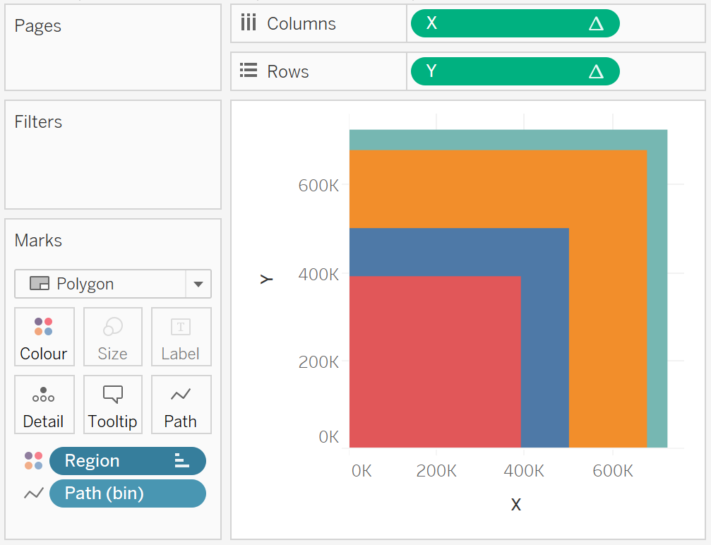
You can also change try polygons:
- Change the Mark Type to Polygon
- Right-click on Sort…
- Select Sort by to Field
- Select Field Name as Sales
- Select Aggregation as Sum
You should see the following:
You can also combine this by Duplicating the Y pill on the Rows Axis and editing as required, you should see the following:

Now, if we adjust the cosmetics, we want to end up with the following:

and boom, we are done! I hope you enjoyed this tutorial, and as always, you can find this data visualization on Tableau Public at https://public.tableau.com/profile/toan.hoang#!/vizhome/LinePolygonSquareCharts/LinePolygonSquareCharts
Summary
I hope you all enjoyed this article as much as I enjoyed writing it and as always do share the love. Do let me know if you experienced any issues recreating this Visualization, and as always, please leave a comment below or reach out to me on Twitter @Tableau_Magic. Do also remember to tag me in your work if you use this tutorial.
If you like our work, do consider supporting us on Patreon, and for supporting us, we will give you early access to tutorials, exclusive videos, as well as access to current and future courses on Udemy:
- Patreon: https://www.patreon.com/tableaumagic
Also, do be sure to check out our various courses:
- Creating Bespoke Data Visualizations (Udemy)
- Introduction to Tableau (Online Instructor-Led)
- Advanced Calculations (Online Instructor-Led)
- Creating Bespoke Data Visualizations (Online Instructor-Led)


 Table Calculation")


Hi How to do this transparent colors with borders setup, Can you please share the workbook
Hi Manoj, if you click on the Color Mark, you should be able to set the Opacity as well as the Border Color.