
This is a Quick Tip on how to build lollipop charts in Tableau, so less reading and more jumping in. We are going to spend 5 minutes or less building our lollipop chart.
Data
Load the following data into Tableau Desktop / Public.
| Flavour | Total Sales ($m) | Total Quantity Sold (m) |
| Cotton Candy | 5.5 | 5 |
| Watermelon | 4 | 5.5 |
| Blue Raspberry | 4.4 | 4 |
| Pink Lemonade | 3 | 3 |
| Strawberry | 2 | 5 |
Worksheet
- Drag Flavour onto Columns.
- Drag Total Quantity Sold (m) onto Rows twice.
- Right-click on the second Total Quantity Sold (m) and select Dual Axis.
- Right-click on the header in and select Synchronize Axis.
- Under Marks, you should have
- All
- SUM(Total Quantity Sold (m))
- SUM(Total Quantity Sold (m)) (2)
- In All
- Drag Flavour onto Color.
- In SUM(Total Quantity Sold (m))
- Change the Mark Type to Bar.
- Click on Size and reduce to a quarter.
- In SUM(Total Quantity Sold (m)) (2)
- Change the Mark Type to Circle.
- Drag Total Sales ($m) onto Size.
Now adjust the visuals and now you should see the following:
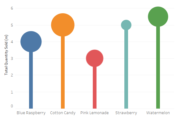
Now you can see that the height of the lollipop stick gives you a visual way to see the total quantity of lollipops sold, and the size of the lollipop gives you the total sales. Let us compare Cotton Candy and Strawberry flavours and you can see that the quantity is the same, however, the total sales are vastly different.
Summary
I hope you all enjoyed this article as much as I enjoyed writing it. Do let me know if you experienced any issues recreating this Visualisation, and as always, please leave a comment below or reach out to me on Twitter @Tableau_Magic.
If you like our work, do consider supporting us on Patreon, and for supporting us, we will give you early access to tutorials, exclusive videos, as well as access to current and future courses on Udemy:
- Patreon: https://www.patreon.com/tableaumagic
Also, do be sure to check out our various courses:
- Creating Bespoke Data Visualizations (Udemy)
- Introduction to Tableau (Online Instructor-Led)
- Advanced Calculations (Online Instructor-Led)
- Creating Bespoke Data Visualizations (Online Instructor-Led)