


")


This is a Quick Tip on how to build a Ratings Chart in Tableau, so less reading and more jumping in. We are going to spend 5 minutes or less building our Ratings chart in Tableau.
Note: As always never choose a data visualisation type and try to fit your data into it, instead, understand your data and choose the best visualization for your data consumers.
Data
Load the following data into Tableau Desktop / Public.
| Product | Path | Rating |
| ACER XC-885 Intel® Core™ i5 Desktop PC | 1 | 4.5 |
| ACER XC-885 Intel® Core™ i5 Desktop PC | 5 | 4.5 |
| ACER C20-720 19.5″ Intel® Celeron® | 1 | 4 |
| ACER C20-720 19.5″ Intel® Celeron® | 5 | 4 |
| ACER Aspire C24-865 23.8″ Intel® Core™ i5 | 1 | 4 |
| ACER Aspire C24-865 23.8″ Intel® Core™ i5 | 5 | 4 |
| ACER Nitro N50-600 Intel® Core™ i5+ GTX 1050 | 1 | 3.5 |
| ACER Nitro N50-600 Intel® Core™ i5+ GTX 1050 | 5 | 3.5 |
| ACER TC-885 Intel® Core™ i5+ Desktop PC | 1 | 3.5 |
| ACER TC-885 Intel® Core™ i5+ Desktop PC | 5 | 3.5 |
This data is from the PC World website, as I am looking for a new desktop, the rating system inspired me.
Calculations
With our data set loaded into Tableau, we are going to create the following Calculated Fields:
Path (bin)
- Right-click on Path, go to Create and select Bin…
- Set New field name to Path (bin).
- Set Size of bins to 1.
- Click Ok.
Index
INDEX()TC_Rating
WINDOW_MAX(MAX([Rating]))TC_Shape
IF [Index] <= [TC_Rating] THEN
    1
ELSE
    IF [Index]-0.5 >= [TC_Rating] AND [Index] < [TC_Rating]+1 THEN
        0.5
    ELSE
        NULL
    END
END
TC_Size
IIF(ISNULL([TC_Shape]),0,1)Now that we have the Calculated Fields created, let us start building our dashboard.
Worksheet
To start building our dashboard:
- Drag Path (bin) onto Columns.
- Drag Product onto Rows.
- Change Mark Type to Shape.
- Drag TC_Shape onto the Shape Mark.
- Click on the Shape Mark.
- In Select Shape Palette select Ratings.
- For 1, assign the Full Red Circle.
- For 0.5, assign the Half-Filled Red Circle.
- Drag TC_Size onto the Size Mark.
- Drag TC_Size onto the Color Mark.
- Right-click on the object and change to Discrete.
- Click on the Color Mark.
- Set 0 to White.
- Set 1 to Red.
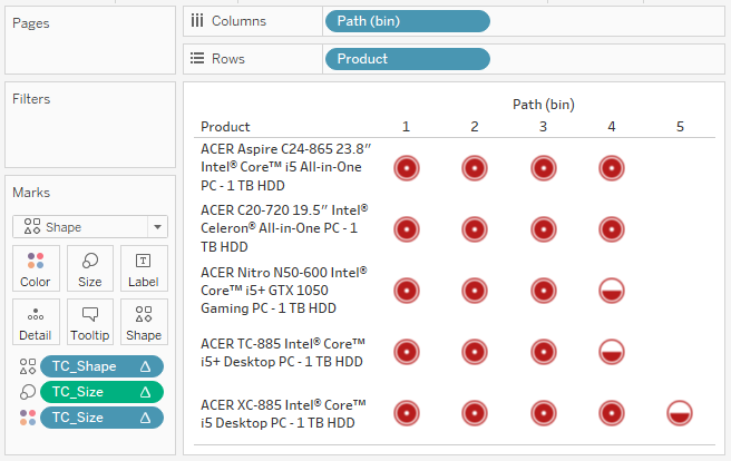
If all has gone well, you should see the following:
Now we can adjust the visualisation by:
- Dragging TC_Rating onto the Rows, and changing this to a Discrete.
- Format all Text.
- Hide all Headers.
- Adjust the Size.
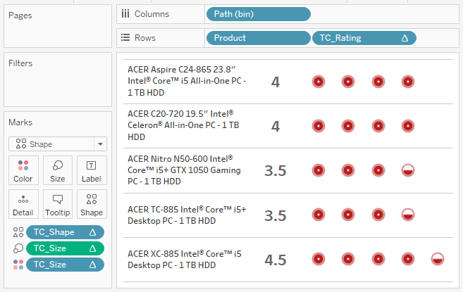
And you should hopefully end up with the following:
and boom, you can experiment with a variety of shapes and include quarters as well as half values. However, we are done and you can find my QT Ratings Dashboard on Tableau Public at https://public.tableau.com/profile/toan.hoang#!/vizhome/RatingsChart_0/RatingsChart
Summary
I hope you all enjoyed this article as much as I enjoyed writing it. Do let me know if you experienced any issues recreating this Visualisation, and as always, please leave a comment below or reach out to me on Twitter @Tableau_Magic.
If you like our work, do consider supporting us on Patreon, and for supporting us, we will give you early access to tutorials, exclusive videos, as well as access to current and future courses on Udemy:
- Patreon: https://www.patreon.com/tableaumagic
Also, do be sure to check out our various courses:
- Creating Bespoke Data Visualizations (Udemy)
- Introduction to Tableau (Online Instructor-Led)
- Advanced Calculations (Online Instructor-Led)
- Creating Bespoke Data Visualizations (Online Instructor-Led)


Hi Toan,
The daisy chart,shape bar chart and ratings chart , you have defined the path . Wanted to understand how you are defining the path.
Thanks,
Nimisha Philip
HI Nimisha, please check out my article on data densification 🙂