


")


This is a Quick Tip on how to build a Rounded Bar Charts in Tableau, so less reading and more jumping in. We are going to spend 5 minutes or less building our Rounded Bar Charts in Tableau.
Note: As always never choose a data visualisation type and try to fit your data into it, instead, understand your data and choose the best visualization for your data consumers.
Data
Load the following data into Tableau Desktop / Public.
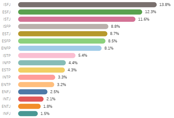
| Type | Percentage of Population |
| ISTJ | 0.116 |
| ISFJ | 0138 |
| INFJ | 0.015 |
| INTJ | 0.021 |
| ISTP | 0.054 |
| ISFP | 0.088 |
| INFP | 0.044 |
| INTP | 0.033 |
| ESTP | 0.043 |
| ESFP | 0.085 |
| ENFP | 0.081 |
| ENTP | 0.032 |
| ESTJ | 0.087 |
| ESFJ | 0.123 |
| ENFJ | 0.025 |
| ENTJ | 0.018 |
Calculations
With our data set loaded into Tableau, we are going to create the following Calculated Field:
Zero
0Now that we have the Calculated Fields created, let us start building our dashboard.
Worksheet
To start building our dashboard:
- Drag Measure Name onto the Filters Shelf.
- Untick Number of Records.
- Drag Measure Values onto Columns.
- Drag Myers Briggs onto Rows.
- Drag Myers Briggs onto Color.
- Change the Mark Type to Line.
- Drag Measure Name onto Path.
If all goes well, you should see the following:
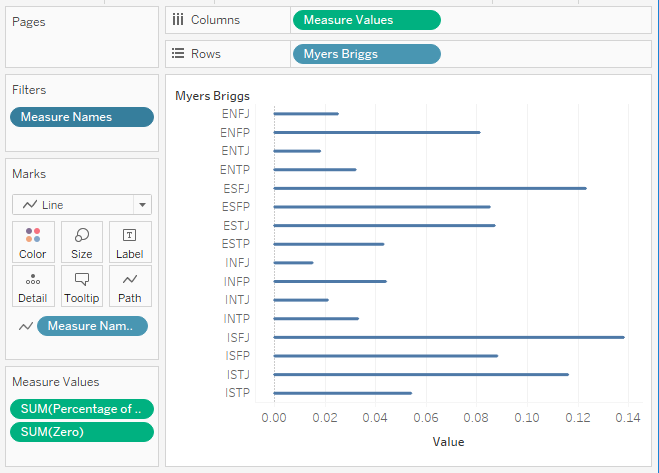
Now adjust the cosmetics of the visualisation:
- Drag Myers Briggs onto Color.
- Remove Grid and Zero Lines.
- Add Percentage of Population to Label and format.
- Format the Percentage of Population to a one decimal percentage.
- Add Sort Order.
- Add Highlighter.
You should now see the following:
and boom, you can experiment with a variety of shapes and include quarters as well as half values. However, we are done and you can find my Visualisation on Tableau Public at https://public.tableau.com/profile/toan.hoang#!/vizhome/RoundedBarCharts_5/RoundedBarCharts
Summary
I hope you all enjoyed this article as much as I enjoyed writing it. Do let me know if you experienced any issues recreating this Visualisation, and as always, please leave a comment below or reach out to me on Twitter @Tableau_Magic.
If you like our work, do consider supporting us on Patreon, and for supporting us, we will give you early access to tutorials, exclusive videos, as well as access to current and future courses on Udemy:
- Patreon: https://www.patreon.com/tableaumagic
Also, do be sure to check out our various courses:
- Creating Bespoke Data Visualizations (Udemy)
- Introduction to Tableau (Online Instructor-Led)
- Advanced Calculations (Online Instructor-Led)
- Creating Bespoke Data Visualizations (Online Instructor-Led)
 Table Calculation")


Hello Mr.Toan, thanks for the tutorial, i have a question, what for we use the calculation ZERO?, i have done the steps but at the end i have get a chat with an axis start from negative values and not from 0.
Because we want to draw a line between 0 and the actual value.
thanks for the explanation
Your welcome 🙂
Hi Toan, is there a way we can have this style in a stacked way?
Hi Lisa, I have seen quite a few requestsnfor this and will write a tutorial for the end of September. Kind Regards, Toan
Thanks, Toan 🙂
Great help, thanks!
Your welcome 🙂
Hi Toan, thank you for the tip.
I have a problem, because I also need to add an average line, but after I add 0 its shows wrong value.
So I have 10 stores with numb. of units from 190 to 680, an avg. line must be 380,2
But now it shows avg. twice less – 190,1
Maybe I can do smth with this?
This will be alot hard, there will be ways around it, but please email me, if possible, a sample workbook to toan.hoang@tableau.toanhoang.com
Thanks very much for posting, Toan.
I did have a couple of issues, so hopefully these points might help other people:
– In the dataset, “Type” needs to read “Myers Briggs”.
– In the value for ISFJ, add a decimal point so it reads “0.138”.
– To hide the markers (large dots) at the end of each bar, click Color, then under Markers choose None.
One issue I couldn’t solve – dropping the Percentage of Population field onto Label makes Tableau put the values at BOTH ends of each bar. How do you prevent that?