


")


This is a Quick Tip on how to build a Rounded Doughnut Chart in Tableau, so less reading and more jumping in. We are going to spend 5 minutes or less building our Rounded Doughnut Chart in Tableau.
Note: As always never choose a data visualisation type and try to fit your data into it, instead, understand your data and choose the best visualization for your data consumers.
Data
Load the following data into Tableau Desktop / Public.
| Category | Path | Value |
| A | 1 | 500 |
| A | 101 | 500 |
| B | 1 | 300 |
| B | 101 | 300 |
| C | 1 | 200 |
| C | 101 | 200 |
Note: we require path and duplicate lines for densification. See our tutorial on Data Densification for more information. Click here
Calculated Fields
We will start by creating the following calculated fields.
Path (bin)
- Right-click on Path.
- Go to Create, and select Bins…
- In the Edit Bins window:
- Set New field name to Path (bin).
- Set Size of bins to 1.
- Click OK.
Index
INDEX()-1TC_Value
WINDOW_MAX(MAX([Value]))TC_Total Value
WINDOW_SUM(MAX([Value]))/2TC_Percentage
[TC_Value]/[TC_Total Value]TC_Starting Point
(RUNNING_SUM([TC_Percentage])-[TC_Percentage])*360X
SIN(RADIANS((([Index]*[TC_Percentage]*3.6))+[TC_Starting Point]))Y
COS(RADIANS((([Index]*[TC_Percentage]*3.6))+[TC_Starting Point]))Now that we have created our Calculated Fields, we will build our Worksheet.
Worksheet
Now that we have our Calculated Fields and Bin object, let us create our Worksheet:
- Change the Mark Type to Line.
- Drag Path (bin) onto Columns.
- Right-click on the object and ensure that Show Missing Values is checked.
- Drag this object onto the Path Mark.
- Drag Category onto the Color Mark.
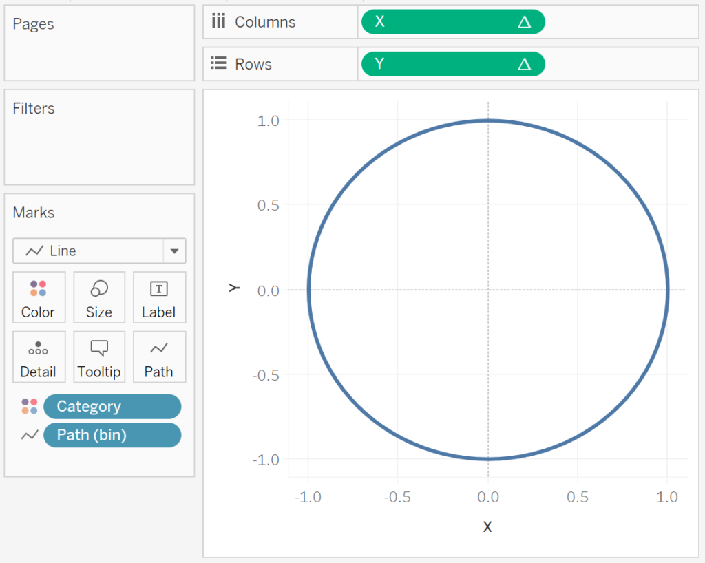
- Drag X onto Columns.
- Right-click on the object, go to
Compute Using and select Path (Bin).
- Right-click on the object, go to
- Drax Y onto Rows.
- Right-click on the object, go to Compute Using and select Path (Bin).
If all goes well, you should see the following:
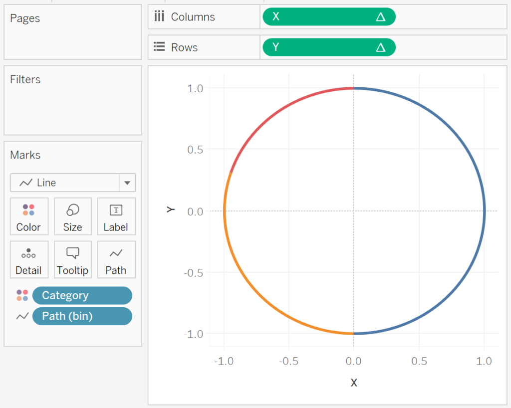
We will now add a little bit of magic by editing our Table Calculation for Y.
- Right-click on X and select Edit Table Calculations.
- In Nested Calculations select TC_Start Point.
- In
Compute Using, select Specific Dimensions and ensure that Path (bin) and Category is checked. - Ensure that Path (bin) is on top.
- In
- In Nested Calculations select TC_Total Value.
- In
Compute Using, select Specific Dimensions and ensure that Path (bin) and Category is checked. - Ensure that Path (bin) is on top.
- In
- In Nested Calculations select TC_Start Point.
- Right-click on Y and select Edit Table Calculations.
- In Nested Calculations select TC_Start Point.
- In Compute Using, select Specific Dimensions and ensure that Path (bin) and Category is checked.
- Ensure that Path (bin) is on top.
- In Nested Calculations select TC_Total Value.
- In Compute Using, select Specific Dimensions and ensure that Path (bin) and Category is checked.
- Ensure that Path (bin) is on top.
- In Nested Calculations select TC_Start Point.
If all goes well, you should now see the following:
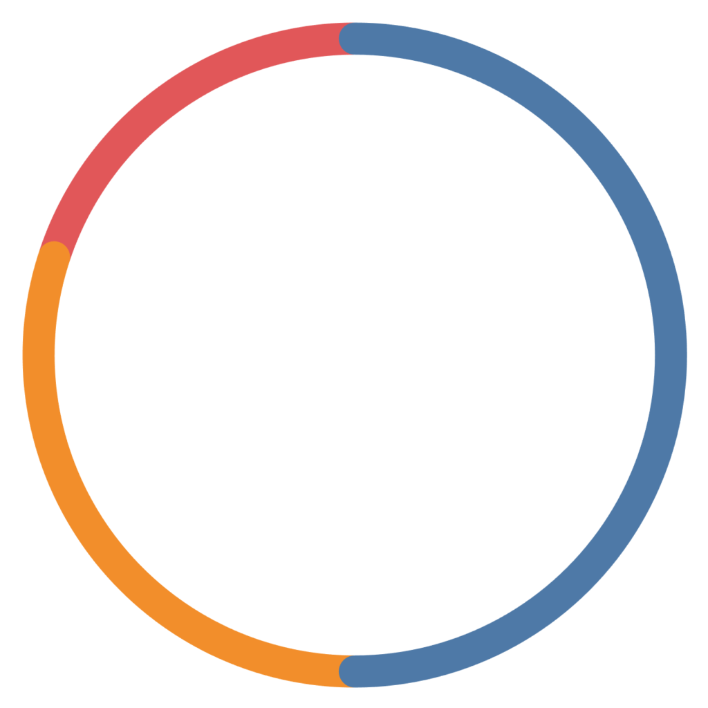
Now adjust the visuals cosmetics:
- Set the Zero Lines to None.
- Set the Grid Lines to None.
- Set the Axis Ruler to None.
- Set the Row Divider Pane to None.
- Set the Column Divider Pane to None.
- Double click on the X-Axis and Fix the range to be from -6 to 6.
- Hide all Column Headers.
- Update the Tooltip.
- Adjust the Size.
- Control-Drag Y from the Rows and onto Color. Control-Drag copies the object with all settings.
You should now have the following:
and boom, yes, this has been trickier than normal Quick Tip, but hey, it is all good. You can find my Rounded Doughnut Chart on Tableau Public at https://public.tableau.com/profile/toan.hoang#!/vizhome/RoundedDoughnutCharts/RoundedDoughnutCharts
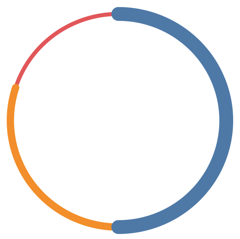
If you want to have some fun, you can drag TC_Value onto the Size Mark and adjust:
Summary
I hope you all enjoyed this article as much as I enjoyed writing it. Do let me know if you experienced any issues recreating this Visualisation, and as always, please leave a comment below or reach out to me on Twitter @Tableau_Magic.
If you like our work, do consider supporting us on Patreon, and for supporting us, we will give you early access to tutorials, exclusive videos, as well as access to current and future courses on Udemy:
- Patreon: https://www.patreon.com/tableaumagic
Also, do be sure to check out our various courses:
- Creating Bespoke Data Visualizations (Udemy)
- Introduction to Tableau (Online Instructor-Led)
- Advanced Calculations (Online Instructor-Led)
- Creating Bespoke Data Visualizations (Online Instructor-Led)
 Table Calculation")


Hi… mr Toan Hoang
This article is so awesome and help my work. but, actually I wanna ask you about your method. I just follow your step by step but my result is different from yours. how can you define number in path ? and if i have another case but need the similar chart, is the same step and calculation can help my problem?
Please answer my question, and thanks before
regards,
Rosy
Hi Rosy, I am glad that the tutorial has helped. Please check out my article on data densification which should give you a little more information. Basically, you can use which values makes sense for your visualisation l, it us about the difference in the Path values, and the size of the Bin.
Hi Toan
Thanks for your article, it’s awesome.
I have two problems:
1. Double click on the X-Axis and Fix the range to be from -6 to 6.
After I did this, the circle turned to be an ellipse, so I also do this step to Y-Axis, so do you mean this? Y is also needed to change the range?
2. Control-Drag Y from the Rows and onto Color. Control-Drag copies the object with all settings.
Once I do this step, there’s an error, because Y will replace category of Color, then there is mistake, I don’t know how to drag both Category and Y onto Color.