


")


This is a Quick Tip on how to build a Spiral Chart in Tableau, so less reading and more jumping in. We are going to spend 5 minutes or less building our Spiral Chart in Tableau.
Note: As always never choose a data visualisation type and try to fit your data into it, instead, understand your data and choose the best visualization for your data consumers.
Data
Load the following data into Tableau Desktop / Public.
Country,Path,Percentage
United Kingdom,1,0.95
United Kingdom,360,0.95
United States,1,0.77
United States,360,0.77
Germany,1,0.55
Germany,360,0.55
Note: we require path and duplicate lines for densification. See our tutorial on Data Densification for more information. Click here
Calculations
We will start by creating the following calculated fields.
Path (bin)
- Right-click on Path
- Go to Create, and select Bins…
- In the Edit Bins window:
- Set New field name to Path (bin).
- Set Size of bins to 1.5.
- Click OK.
Index
INDEX()-1TC_Percentage
WINDOW_MAX(MAX([Percentage]))Color
IF [Index]/WINDOW_MAX([Index]) <= [TC_Percentage] THEN
    WINDOW_MAX(MAX([Country]))
ELSE
    "Grey"
END
Size
IF [Index]/WINDOW_MAX([Index]) <= [TC_Percentage] THEN
    1
ELSE
    0
END
X
SIN(RADIANS([Index]*5))*[Index]Y
COS(RADIANS([Index]*5))*[Index]Worksheet
Now that we have created our Calculated Fields, we will build our Worksheet.
- Change the Mark Type to Line.
- Drag Country onto Columns.
- Drag Path (bin) onto Columns.
- Right-click on this object and ensure that Show Missing Values is selected.
- Drag this object onto the Path Mark.
- Drag Y onto Columns.
- Right-click on the object, go to Compute Using and select Path (bin).
- Drag X onto Rows.
- Right-click on the object, go to Compute Using and select Path (bin).
- Drag Color onto the Color Mark.
- Right-click on the object, go to Compute Using and select Path (bin).
- Drag Size onto the Size Mark.
- Right-click on the object, go to Compute Using and select Path (bin).
If all goes well, you should now see the following:
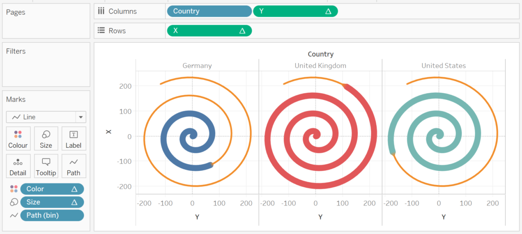
Now we will adjust the cosmetics:
- Edit the Colors.
- Edit the Size.
- Hide the Axis Header.
- Hide the Grid Lines.
- Hide the Zero Lines.
- Add a Label.
- Add the Percentage object.
- Ensure that you allow overlapping values.
- Ensure that you only show values at the end of the line.
You can really go to town with the formatting, but you will want to end up with the following:
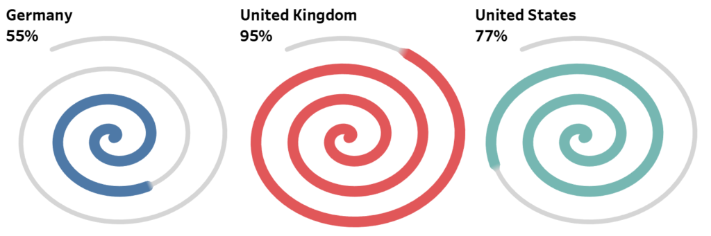
and boom, we are done, nice, simple and quick. You find my Spiral Chart Dashboard on Tableau Public at https://public.tableau.com/profile/toan.hoang#!/vizhome/SpiralCharts_15589761568080/SpiralChart
Variations 1
Click on Color and set Markers to All.
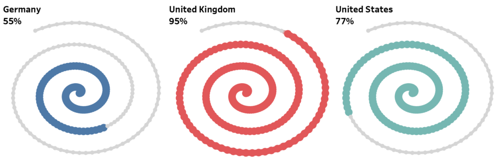
Variation 2
Edit the value of Path (bin) and change the Mark Type to Circle, and change the Color transparency to 50%.

Variation 3
Explore the Shape Mark Type to see what you can come up with.

Summary
I hope you all enjoyed this article as much as I enjoyed writing it. Do let me know if you experienced any issues recreating this Visualisation, and as always, please leave a comment below or reach out to me on Twitter @Tableau_Magic.
If you like our work, do consider supporting us on Patreon, and for supporting us, we will give you early access to tutorials, exclusive videos, as well as access to current and future courses on Udemy:
- Patreon: https://www.patreon.com/tableaumagic
Also, do be sure to check out our various courses:
- Creating Bespoke Data Visualizations (Udemy)
- Introduction to Tableau (Online Instructor-Led)
- Advanced Calculations (Online Instructor-Led)
- Creating Bespoke Data Visualizations (Online Instructor-Led)


Toan I have got it, thx for another awesome chart.
Awesome 🙂
This is so helpful, tks!!!
Your welcome, glad you enjoyed this 🙂
Hi
I tried to recreate the spiral but even though I followed the steps to the letter (twice), I only get a “partial” spiral. Nothing like the beautiful effect you created. Any thoughts where I might have gone wrong? Your public tableau post did not allow me to download the worksheet to compare to mine and see where I might have messed up.
Many thanks
If you can, please email the packaged workbook to admin@tableau.toanhoang.com or send me a downloadable Tableau Public link and I will have a look.
Hi and thanks for your help. I sent an email but got an error back that the mailbox was full.
Please try again.